  
|
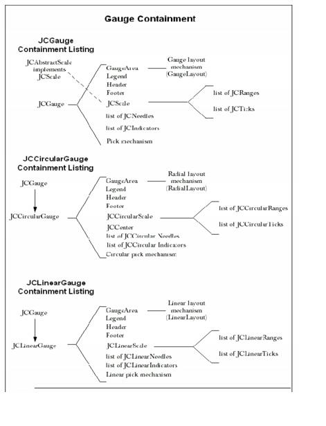
3
Circular and Linear Gauges
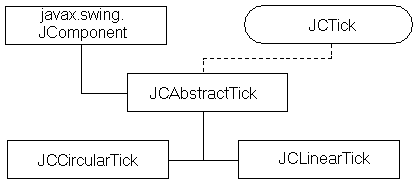
Circular and Linear Gauges
Features of JCCircularGauge
JCCircularGauge
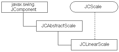
JCAbstractScale
The Range Object
The Constraint Mechanism in JCGauge
Utility Functions for JCGauge
Adding Other Components to a Gauge
3.1 Circular and Linear Gauges
The
JCGaugecomponents in JClass Elements provide you with realistic-looking instruments for your application's GUI design. End users can interact with colorful, easy-to-read meters on which they may view or set values. There are two basic types: circular and linear. Circular gauges may be used to give your application the flavor of an automobile instrument cluster, or alternatively an airline cockpit, control room, old time radio, or numerous other designs. Similarly, linear gauges may be made to look like thermometers (for hot and not-so-hot stock opportunities as well as temperature measurement), jazzed-up progress meters, and a variety of level and volume indicators. Your GUI design possibilities have been expanded, and you have the potential to make your GUIs even more visually appealing and user friendly.
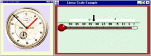
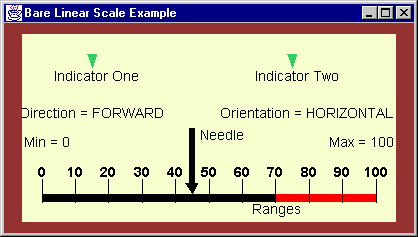
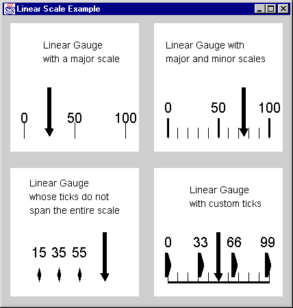
Figure 3 : Sample circular (left) and linear (right) gauges.
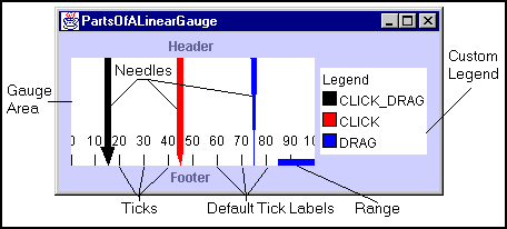
3.1.1 Parts of a Gauge
Gauges, whether circular or linear, consist of visible objects and objects whose purpose is functional. The visible objects are:
- Header. A header provides a title for the gauge. Headers are
JComponents, and by default they areJLabels.- Footer. A footer provides another option for titling a gauge. It too is a
JComponent, and by default aJLabel.- Placeable Labels. Any component may be placed on a gauge at a specified position by employing an
add()method that takes aLinearConstraintorRadialConstraintas its second parameter.- Scale. A scale on which values may be defined. The scale can have associated
JCTick,JCNeedle,JCIndicator, andJCRangeobjects.- Tick and Tick Label. A tick object is used to show the scale values. It is a collection of uniformly spaced marks and labels.
- Indicators and Needles. Whereas a tick object is actually a collection of tick marks, an indicator is a single marker placed at a particular scale value. A needle is a subclass of an indicator that may be made interactive, allowing end users to set a new value for a parameter by clicking and dragging the needle to a new position. Like indicators, needles may be non interactive, but made to point to values under program control.
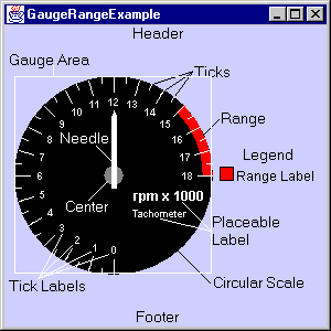
The diagram shows the various visible components of a gauge. Note that the gauge area (
JCGaugeArea) contains the scale and its objects, but not the header, footer, or legend.
Figure 4 : Objects within a gauge.
The non visible parts of a gauge are:
- Its Pick Mechanism and its Mouse Interaction Mechanism. These are described in Events and Listeners in JCGauge, in Chapter 3.
- Gauge Constraint and Gauge Layout. The gauge's layout and constraint classes assist in placing the gauge's various subcomponents.
Gauge appearance and interactivity
Because the gauge and many of its constituents are subclassed from
JComponent, you have considerable flexibility in designing its appearance. Interfaces for indicators, needles, ranges, scales, and ticks let you replace the built-in objects with those you design yourself. As well, it is easy to add additional items like numerical counters, images, and such to the gauge.Gauges behave like analog devices whose readings are only approximate. If a more precise digital readout is desired, the needle's
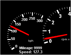
getValue()method, or the component's pick listener is employed to extract numeric values from the gauge. Figure 5 shows a circular gauge functioning as a speedometer. The needle points to the car's current speed. A numeric counter has been added to function as an odometer, and another counter displays a digital readout of the speed. This reading is more precise than the indication of the speed given by the needle.Interactions between mouse and needle may be turned on or off. When an interaction is enabled, an end user can control the placement of the needle. If you wish, interactions can be turned off and the component can be used simply as a display device.
Figure 5 : The odometer is a label positioned at the bottom of the speedometer.
You control the order in which objects are rendered to achieve your desired layering effect. See Rendering order for an explanation.
Caution: When setting a scale on a gauge, a center on a circular gauge, or adding indicators, needles, ranges, and ticks to a gauge, use the special set() and add() methods provided in JCGauge. Using standard
java.awt.Container'sadd()methods does not take into account the gauge's special requirements. When using the gauge's specialadd()methods you are still able to include an optional index that specifies the rendering order.A gauge may have multiple instances of indicators, needles, ranges, and tick marks. In this case, the gauge maintains a collection for each of the object groups. The gauge has indicator and needle lists for keeping track of scale pointers, a range list for keeping track of the bands, called ranges, that can be used to mark various regions around the scale, and a tick list to keep track of the different tick objects.
Labels, which may be any
JComponent, not just aJLabel, are created and manipulated individually rather than being stored in a list. There are special-purpose methods calledaddLabel(label, radialConstraint)andaddLabel(label, linearConstraint)for placing labels at a specified location on the gauge.Gauges may be added to other gauges. They may or may not share the same origin. See Section 3.21, Adding Other Components to a Gauge for a discussion on how to place components on a gauge and for an example of placing a smaller circular gauge on top of a larger one.
A gauge's size is determined by the size of its container. The container's layout manager, along with its preferred size setting, determine the gauge's initial size. Gauges may be resized as long as the layout manager permits it.
Rendering order
A render list, which in Java is often called the z-order of the components, is effectively created by the order in which components are added at execution time. This list determines in what order child objects are to be drawn. Components added last are drawn first. In a circular scale for example, by adding a needle and then a center, the center object is drawn first, then a needle, so that the needle is fully visible from center to tip instead of being partially covered by the center object. There are ways of manipulating the list so that a different drawing order can be specified. By drawing a needle first, it can appear to be attached to the edge of the center object rather than beginning at the center of the circle.
Inner and outer extents
The size of indicators, needles, ticks, and ranges is specified in part by two parameters called their inner and outer extents. These extents are defined as ratios based on the underlying scale. In the circular case, inner and outer extents refer to locations in a radial direction, with the center defined as 0.0. Thus, an object with an inner extent of 0.0 means that it is drawn from the center outwards to the position defined by the outer extent. If this outer extent is 0.8, the object extends out from the center a distance equal to 80% of the radius of the circular scale. Inner and outer extents on a circular scale are diagrammed in Figure 18.
In the linear case, how extents are measured depends on whether the orientation of the scale is horizontal or vertical. Since extents are measured in the direction transverse to the direction in which scale values increase, they are measured from the top edge of a horizontal scale, and from the left edge of a vertical scale. For example, an indicator on a vertical linear scale whose inner extent is 0.15 and whose outer extent is 0.75 is drawn beginning at 15% of the gauge's width from the left edge to 75% of the gauge's width.
3.1.2 Switches
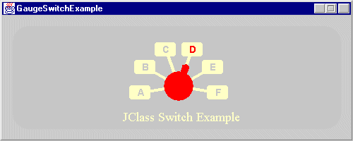
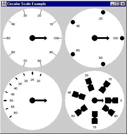
A switch is the software equivalent to its electrical counterpart, a device that has a set of discrete, selectable positions. A simple switch may have only two states, on and off, or it may possess a number of selectable states. Figure 6 shows a switch shaped like a pointer that has six discrete states.
Switches may be implemented by having your code control the way that the gauge reacts to user input, but the easiest way to implement a switch is to choose a scale with integer values that correspond to switch positions, then set the gauge's
// make it discretesnapToValue()property totrue:
gauge.setSnapToValue(true);By default,
snapToValueisfalse.See GaugeSwitchExample.java in the examples/elements/switchdemo directory for an example of a switch with six positions.
Figure 6 : A switch with six discrete states.
If you require a switch with irregularly spaced stops you will need to add a pick listener and place the needle yourself in response to an end user's actions.
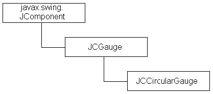
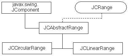
3.1.3 Organization of the Gauge Classes
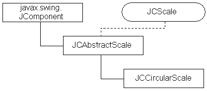
In keeping with the goal of making the gauges as configurable as possible, all gauge classes inherit from an abstract class
JCGauge, which is itself aJComponent.JCGaugeimplementsMouseListenerandMouseMotionListenerso that it may respond to mouse clicks and drags. This allows an end user to set a value by dragging a needle to a desired location on a scale, or by clicking on the scale and having the needle jump to the value determined by the position of the mouse pointer.The diagram shows where you'll find the components and sub-objects that make up the gauge. Objects are designated by their class names.
3.2 Features of JCCircularGauge
JCCircularGaugeis a subclass ofJComponentwhose on-screen representation looks like an analog circular measuring instrument.JCCircularGaugeBeanin the com/klg/jclass/swing/gaugebeans directory is a JavaBean. It wraps properties found inJCLinearGauge's contained objects so that they are easily accessible in an IDE.
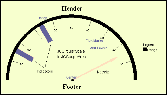
JCCircularGauges are containers for interactive circular meters that use a needle to point to a value and allow it to be measured on a scale. Circular gauges are constructed using an assortment of objects that provide structured functionality to the component as a whole.Figure 7 shows the components that may be used in a gauge. The central element is a circular scale, which resides in a
JCGaugeArea. The only way that a scale indicates its presence is if its foreground color is different from that of the gauge. The visible objects are a center, and collections of indicators, needles, ticks, and ranges. A center object, as its name implies, marks the center of a circular gauge. It may be a disk or an image. Needles perform measurement functions by pointing at scale values. Ticks provide visible scale markings with optional value labels so that scale values may be read. Ranges are bands that mark part or all of the scale to distinguish one part from another, like the red-line area of a tachometer. The range shown in Figure 7 runs along the circumference of the circular scale, thus marking its location. Outside the gauge area there is room for a header, footer, and legend. Header and footer elements areJComponents, typicallyJLabels, but the choice is yours. The legend is aJCLegend, a special type ofJComponentthat makes it easy to provide a legend that itemizes each component of a chosen type that the scale contains. Ranges are the default items for a legend, and may be itemized simply by naming the ranges and callinggauge.getLegend().setVisible(true).Alternatively, needles or other objects may be the items referred to in the legend list. If you do decide to place items other than ranges in the legend you will have to write your own legend populator. See Custom legends for details.
Also, through its inner class
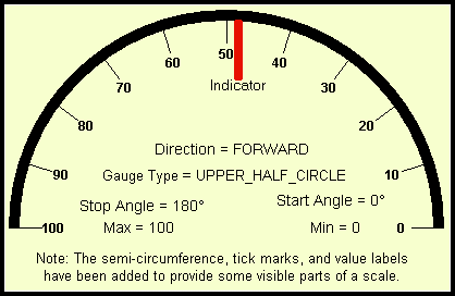
GaugeType,JCCircularGaugedefines a set of configurations for circular gauges, such asLOWER_RIGHT_QUARTER_CIRCLEorTOP_HALF_CIRCLE, allowing you to confine the gauge to a quadrant or a semicircle. There are nine choices in all. See Section 3.5.3, Properties, for the list of constants forGaugeType.Figure 7 : The major components in a circular gauge.
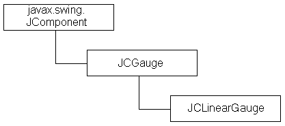
3.3 Features of JCLinearGauge
JCLinearGaugeis a subclass ofJComponentwhose on-screen representation looks like an analog linear measuring instrument.JCLinearGaugeBeanis a JavaBean. It wraps properties found inJCLinearGauge's contained objects so that they are easily accessible in an IDE.
JCLinearGauges are containers for interactive linear meters that use needles to point to values and allow these values to be measured on a scale. Linear gauges are constructed using an assortment of objects that provide structured functionality to the component as a whole.Figure 8 shows the components that may be used in a linear gauge. The central element is a linear scale, which resides in a
JCGaugeArea. The only way that a scale indicates its presence is if its foreground color is different from that of the gauge. The visible objects are collections of indicators, needles, ticks, and ranges. There is no center object in a linear gauge. Needles perform measurement functions by pointing at scale values. Ticks provide visible scale markings with optional value labels so that scale values may be read. Ranges are bands that mark part or all of the scale to distinguish one part from another, like range shown in Figure 8, which is the small rectangle that runs between 85 and 100. Outside the gauge area there is room for a header, footer, and legend. Header and footer elements may be anyJComponent, typically aJLabel. The legend is aJCLegend, a special type ofJComponentthat makes it easy to provide a legend that itemizes each component of a chosen type that the scale contains. Ranges are the default items for a legend, and may be itemized simply by naming the ranges and callinggauge.getLegend().setVisible(true).
Figure 8 : The major components of a linear gauge.
Note: Place a border around a linear gauge to ensure tick labels at the scale's extremities are fully visible.
3.4 JCGauge
JCGaugeis the abstract superclass forJCCircularGaugeandJCLinearGauge.JCGaugecreates a header, footer, and legend whenever a circular or linear gauge is instantiated, and it has methods for adding or removing indicators, needles, ranges, and ticks.Use the gauge's
add()methods rather than theadd()methods inJComponent. TheaddLabel()methods inJCCircularGaugeandJCLinearGaugeare there because these objects depend onLinearConstraintandRadialConstraintclasses to position labels based on a linear extent and a pixel value, or a specified angle and radial distance. (See Section 3.16.1, RadialConstraint and RadialLayout, for more information.)At any given time, each gauge contains one scale. A scale holds information about the minimum and maximum values for the scale, and the direction, forward or backward, in which scale values increase. The circular scale has start and stop angles that determine the portion of a full circle occupied by the scale. A needle object provides the visual indication of a particular value on the scale. Its length is specified by setting its inner extent and its outer extent. If the scale changes its size, the needle adjusts itself accordingly, maintaining a proper position and proportional length relative to the size of the scale. See Section 3.14, The Indicator and Needle Objects, for details.
3.4.1 Constructor
JCGaugehas an abstract no-argument constructor that is called when a circular or linear gauge is instantiated. It creates a default header and footer asJLabels, and a default legend as aJCGridLegend.
3.4.2 Methods and Properties for JCGauge
JCGaugehas these methods and properties:Methods
JCGauge Method
Description
Adds or removes an indicator to the indicator collection for this gauge. Both take an indicator as a parameter, and an optional second parameter, an index, specifying its position in the
Vectorof needles.Adds or removes a needle to the needle collection for this gauge. Both take a needle as a parameter, and an optional second parameter, an index, specifying its position in the
Vectorof needles.Adds or removes a pick listener for this needle. See Section 3.18, Events and Listeners in JCGauge.
A gauge maintains a list of ranges associated with it. These methods add or remove a specified range from the collection. They take the range as a parameter and an optional second parameter, an index, for its position in the Vector of ranges.
A gauge maintains a list of ticks associated with it. These methods add or remove a specified tick from the collection. They take the tick as a parameter and an optional second parameter, an index, for its position in the
Vectorof ticks.Returns the JClass component's subcomponent on which the gauge will be drawn.
Gets the height of the drawing area represented by this gauge.
Gets the width of the drawing area represented by this gauge.
mouseClicked()
mouseDragged()
mouseEntered()
mouseExited()
mouseMoved()
mousePressed()
mouseReleased()
mouseClickedandmouseDraggedsend pick events to listeners. The other methods are empty, and must be overridden in a subclass if you wish to use them for your own purposes.Given a screen location in pixels, returns the closest scale value as a
JCGaugePickEvent.Properties
3.5 JCCircularGauge
3.5.1 Constructors
Of the three constructors for
JCCircularGauge, the default no-argument one supplies its own scale, then populates it with a center (a disk or an image), a needle, and a set of tick marks. The constructor that takes a Boolean value creates a gauge with an associated circular scale if the Boolean parameter istrue, or an empty gauge otherwise. In either case, the center, indicators, needles, and ticks must be added separately. The third constructor takes a gauge type as a parameter. It too creates an empty gauge of the specified type. The scale, center, indicators, needles, and ticks must be added separately.
3.5.2 Methods for JCCircularGauge
JCCircularGaugesubclasses fromJComponent, making it aJComponentwith special capabilities for laying out subcomponents radially.
3.5.3 Properties
A
JCCircularGaugehas the same properties as aJComponentand these additional ones:
JCCircularGauge Property
Description
Returns or sets the gauge type, one of the
JCCircularGauge.GaugeTypeenums.For a full listing of the properties, see the API for com.klg.jclass.swing.gauge.JCCircularGauge.
Type constants for JCCircularGauge
The inner class
JCCircularGauge.GaugeTypehas these constants and methods:
Circular GaugeType Constant
Angular Span of the Circle, Semicircle, or Quadrant
180-0 degrees. See Section 3.10.3, Angles In a Circular Scale for a discussion of angular measurement in
JCCircularGauge.
3.6 JCLinearGauge
3.6.1 Constructors
JCLinearGaugehas a no-argument constructor that supplies its own scale, then populates it with a needle and a set of tick marks. The constructor that takes a Boolean value creates a gauge with an associated linear scale if the Boolean parameter istrue, or an empty gauge otherwise. In either case, indicators, needles, and ticks must be added separately.
3.6.2 Methods for JCLinearGauge
A linear gauge has methods for adding and removing labels, getting or setting its associated linear scale, and finding the needle closest to the point where a mouse click or drag occurred.
3.6.3 Properties
A
JCLinearGaugehas the same properties as aJCGauge.
3.7 Headers, Footers, and Legends
Both
// gauge is a reference to either type of JCGaugeJCCircularGaugeandJCLinearGaugecreate a header and footer, which by default is aJLabel, but may be anyJComponent. If you wish to choose some other header or footer than the default, methodssetHeader()andsetFooter()inJCGaugespecify whichJComponents, typicallyJLabels, to use. By default, the header, footer, and legend do not show. To display a header, use:
gauge.getHeader().setVisible(true);A gauge's legend is an instance of
// gauge is a reference to either type of JCGaugecom.klg.jclass.util.JCLegend, an abstract class that requires a subclass to provide a specific layout. By default, a gauge usesJCGridLegendto provide a default implementation ofJCLegendand delegatesDefaultLegendPopulatorRendererto populate and render the legend. In the default case, range names are the items in the legend. If you wish to itemize ranges in a legend, simply show the gauge's default legend andDefaultLegendPopulatorRendererdoes the rest.
gauge.getLegend().setVisible(true);A legend's built-in behavior is to use range names for its items. Ranges have default names like range0, range1, and so on. Give a range a name of your own choosing as follows:
// range is a reference to either type of range
range.setRangeName("Danger zone");Custom legends
If you need a legend that itemizes other things like needles or ticks then you can subclass
DefaultLegendPopulatorRendererand overridegetLegendItems()to provide your chosen item list with instances ofJCLegendItem. The method inDefaultLegendPopulatorRenderercalledcreateLegendItem()is used both for items and for the legend's title, the difference being that a nullColorspecification (the constructor's last parameter) indicates a title. Alternatively, you can usesetLegendTitle()to set a title on an existingJCLegend. Note thatgetLegendItems()returns a list of items. See GaugeInteractionExample.java, which creates a legend that lists the needles used in the gauge.
3.7.1 JCLegend
Interfaces
There are two interfaces associated with
JCLegend.JCLegendPopulatoris an interface implemented by classes that wish to populate a legend with data, andJCLegendRendereris an interface implemented by a class that wishes to help render the legend.
DefaultLegendPopulatorRendererimplements both interfaces and provides a built-in mechanism for itemizing range objects in a legend.Methods in JCLegend
3.8 JCScale
JCScaleis the interface that represents a graduated scale. A scale has a minimum value, a maximum value, and a direction. Lists of other objects likeJCTickandJCRangeobjects are associated with the scale. These associated objects use the scale to get information that they need to render themselves.Both circular and linear scale objects implement the
JCScaleinterface, whose methods are as follows.Those wishing to use their own type of scale should implement this interface.
3.9 JCAbstractScale
JCAbstractScaleimplementsJCScale. It is the superclass of bothJCCircularScaleandJCLinearScale, and it encapsulates the common properties of both these concrete classes. It does not add any methods beyond those in the interface it implements.
3.9.1 JCAbstractScale Properties
A
JCAbstractScaleholds the following information: the minimum and maximum values for the quantity being measured, a direction setting, and a zoom factor. Itspick()method is used for processing a scale value corresponding to the point at which a mouse click occurred. Here, it is declared abstract because circular and linear scales have differing implementations.Min, max
These
scale.setMax(25.0); // Maximum value for the scaleJCScaleproperties specify the beginning and ending values for the scale. Note that multi-turn functionality (multiple turns required to move from min to max) is not supported. Example:
scale.setMin(5.0); // Minimum value for the scaleSpecifying the direction of travel
By default, a circular scale increases in a counterclockwise direction. A linear scale increases from left to right if its orientation is horizontal or from bottom to top if its orientation is vertical. In these cases this is called the forward direction. To set this direction explicitly, call
setDirection(JCAbstractScale.Direction direction)on the scale. The two field values are:
The default value for
JCScale.DirectionisFORWARD.See Deprecated way of specifying the direction of travel for a circular gauge for the pre-JClass 5 constants for setting a direction. These have been retained for backwards compatibility, but their use is deprecated.
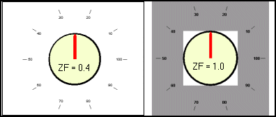
Zoom factor
By default, the scale is drawn so that it fills the gauge area. If labels, ticks, or other components need to be placed outside the scale they may be cropped. To prevent this, use the
zoomFactorproperty.A circular scale has a
zoomFactorproperty (called an extent before JClass 5) whose purpose is to avoid scaling problems when you want to have objects extend past the circumference of the scale. Objects exterior to the circumference may not resize properly because the border remains a fixed number of pixels no matter how greatly the window is resized, therefore there is a chance that the exterior objects may be clipped. By setting a scale's zoom factor to be less than 1.0 you can place objects outside the scale yet keep them on the interior of the gauge area, thus avoiding clipping problems if the scale is magnified.For example, the code that places tick marks and their labels seemingly well outside a circular scale's boundary is:
// Sets the scale factor
scale.setZoomFactor(0.4);
// Places the tick marks and labels
tick.setInnerExtent(1.85);
tick.setOuterExtent(2.0);
tick.setLabelExtent(1.75);These settings produce the scale shown in Figure 9 on the left.
Figure 9 : Placing ticks and their labels well outside the scale.
The left-hand figure is labeled "ZF = 0.4," which indicates the zoom factor setting. No border was used to pad the gauge's exterior. The effect has been accomplished just by setting the zoom factor.
The right-hand gauge in Figure 9 has a zoom factor of 1.0. If nothing else were done, the tick marks would lie outside the gauge area (the white rectangle), but by adding a border (the gray area enclosing the gauge), the tick marks are visible within it. If you are allowing end users to resize the gauge, use a zoom factor rather than a border.
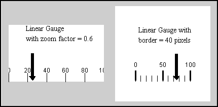
Borders are required for linear gauges. Setting a zoom factor on a linear gauge does not remove the necessity of setting a border to avoid the clipping of tick labels at the extremities of the scale. Figure 10 shows that setting a zoom factor on a linear scale compresses it in the direction perpendicular to the scale, but leaves the length of the scale unaffected.
Figure 10 : Comparison of a zoom factor (left) and a border (right) for a linear gauge.
On the other hand, setting a border around the scale allows room for the tick labels to be properly drawn. You can adjust the individual border thicknesses to suit your application. For more on setting a zoom factor for a linear gauge, see Setting a zoom factor, in Chapter 3.
3.10 The Circular Scale Object
The
JCCircularScaleobject and its superclassJCAbstractScaleform the basis of all the quantifiable elements of the circular gauge1. Since a circular scale belongs to a circular gauge, the constructor for aJCCircularScalerequires an argument of typeJCCircularGauge. One circular scale object at a time may belong to aJCCircularGaugecomponent. Also, the gauge keeps a reference to its circular scale inJCGauge.
3.10.1 Circular Scales
A
JCCircularScaleinherits its direction, minimum and maximum values, lists of ranges and ticks, and zoom factor fromJCAbstractScale. In addition it defines a start angle and stop angle, and a radius.
Other than being able to specify its foreground color, the circular scale contains no other visual information. Tick objects use the scale to determine what values to assign to tick labels, and needles have a value based on their location on a scale.
3.10.2 Notes on Circular Scale's Properties
The circular scale object's job is to hold the required numerical information for the construction of a circular gauge, but not any visual information except for the scale's foreground color. Displaying the information is the responsibility of indicators, needles, tick marks, ranges, and so on. Some of these are shown in Figure 11, along with the circular scale's property values that define the direction, set the numerical range values, determine the part of the circle that is to be displayed, and set the scale's start and stop angles.
Figure 11 : A circular scale showing representative values for its properties.
It is also possible to provide a foreground color such as the one shown in Figure 11.
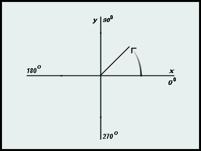
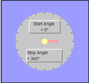
3.10.3 Angles In a Circular Scale
The convention for angular measurement in a circular scale defines due east as the zero degree line. Angles increase in a counterclockwise direction, so that 90° is due north, 180° is due west, and 270° is due south. This is the direction specified by the constant
JCAbstractScale.Direction.FORWARDFigure 12 illustrates the way that angular measurement is done in the circular scale, showing the X-axis, Y-axis, and location of the zero degree line.
The start angle is usually less than the stop angle but it is not a requirement. In the default situation, the direction is counterclockwise and the scale's min value is attached to the scale's start angle.
Once the start and stop angles of a circular scale have been chosen along with the maximum and minimum numerical values to be associated with them, one additional parameter, direction, sets whether the start angle corresponds to the minimum value or the maximum value. A maximum value may be attached to the scale's start angle by setting the direction parameter to backward.
For example, if the start and stop angles are chosen as 90° and 270°, and the values being measured begin at 100 and end at 200, setting the direction to
JCAbstractScale.BACKWARDcauses the value 200 to be located at 90°. The values decrease around the scale in a clockwise direction, ending at 270° where a value of 100 is located. Thus, while the coordinate system for angular measurement never changes, the direction in which the scale's value parameter increases can be reversed.
Figure 12 : Diagram of a circular scale's reference plane with direction set to `forward'.
Deprecated way of specifying the direction of travel for a circular gauge
Previously, before the release of JClass 5, the direction of travel for circular scales was defined as:
The default value for
JCScale.DirectionisCOUNTERCLOCKWISE.These constants have been retained. However, if you use the new constants defined in Specifying the direction of travel you will be able to switch between circular and linear gauge types without causing confusion over inappropriate direction names.
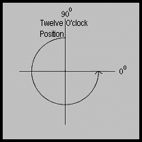
Start and stop angles
The start and stop angles specify where measurements begin and end on the circular scale. These two angles, defined in
JCCircularScale, specify the compass positions at which the min and max values are located. A circular scale positions zero degrees at due east. Angles increase in the counterclockwise direction no matter what the value ofJCAbstractScale.Directionis. A start angle may be greater than a stop angle, which would be the case if a scale's min value begins at the twelve o'clock position and its max value is at the three o'clock position. In this case, the start angle is 90° and the stop angle is zero degrees.These angles may be set in
JCCircularScale scale = new JCCircularScale();JCCircularScale's constructor. Alternatively, start and stop angles may be set usingsetStartAngle()andsetStopAngle(). For instance:
scale.setStartAngle(15);sets the scale's start angle at 15°.
Figure 13 : A case where the start angle is greater than the stop angle.
Radius
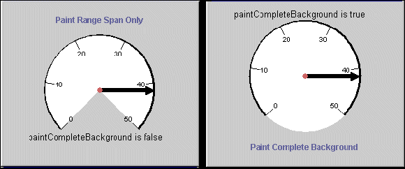
JCCircularScalehas agetRadius()method that returns the size of the circular scale. Initially, the size of the gauge may be set usingJComponent'ssetPreferredSize()method. Also, the size of the scale relative to its container is controlled by thezoomFactorproperty.Assigning a color
A scale's color may be assigned in a
(JCCircularScale)JCCircularScale's constructor, or you may useJComponent'ssetForeground()method. By default, only the portion of the scale between its start and stop angles is colored. Any remaining portion retains the color of the gauge. If you wish to assign the color to the full scale, set the scale'spaintCompleteBackgroundproperty totrue:
gauge.getScale().setPaintCompleteBackground(true);
Figure 14 : Using paintCompleteBackground to determine how much of the scale is colored.
If you want to color only the portion of the scale between the start and stop angles, use
setPaintCompleteBackground(false).Labels in a circular gauge
Labels in a circular gauge work similarly to the way they do in a linear gauge except that they use
CircularConstraints. See Labels in a linear gauge for information.
3.11 The Linear Scale Object
JCLinearScaleprovides a graduated scale drawn in a linear fashion. Figure 15 shows a simple linear scale. In addition to the scale, the gauge in the figure has two triangularly-shaped indicators, a needle, two ranges, a set of labeled tick marks, and a collection of labels. There is a border around the scale. It has the same color as the scale's background, but its presence is important to scale's layout. See the section on Borders.
Setting a linear scale's direction and orientation
By default, scale values increase from left to right, as shown in Figure 15. The direction may be controlled by setting either one of:
scale.setDirection(JCAbstractScale.Direction.BACKWARD);
scale.setDirection(JCAbstractScale.Direction.FORWARD);A linear scale is oriented either horizontally or vertically. The default orientation is horizontal, and the setting is controlled by
JCLinearScale.Orientation.HORIZONTALJCLinearScale.Orientation, whose values are:
JCLinearScale.Orientation.VERTICAL
JCLinearScale scale = new JCLinearScale();
scale.setOrientation(JCLinearScale.Orientation.VERTICAL);Borders
You will likely want to place a border around each of your linear gauges. If you don't, the tick label numbers may appear to be clipped by the sides of the container. The linear gauge in Figure 15 has a 20-pixel-wide border that was constructed as follows:
Border border = BorderFactory.createLineBorder(new Color(247, 255, 206), 20);
scale.setBorder(border);In this case, the scale's border has the same color as the scale's background color, so the viewer is not aware of its presence. The visible dark border is part of the gauge, not the scale. Note that it's possible to write into the border area. Parts of the Direction, Orientation, Min, Max, and Ranges labels are actually in the scale's border area.
You can use
createEmptyBorder()to assign different widths to all four sides.
Figure 15 : All elements shown, including the dark border, are parts of a linear gauge.
Labels in a linear gauge
Place labels using a
JLabel l1 = new JLabel("<html><font color=black>Indicator One");LinearConstraint. Its constructor takes a reference to the parent gauge, anextent, and anintrepresenting apositionalong the scale. Theextentparameter is the distance from the top-left corner of the scale2. This distance is vertical for horizontal scales and horizontal for vertical scales, and is specified as a ratio of the required distance to the height of the scale when its orientation is horizontal, or to the width of the scale when its orientation is vertical. The position parameter measures the distance in pixels from the left-hand side when the gauge's orientation is horizontal, or from the top of the scale when its orientation is vertical.
l1.setToolTipText("Indicator One");
gauge.getGaugeArea().add(l1, new LinearConstraint(gauge, 0.15, 75));Setting a zoom factor
Your design may require that indicators, labels, and the like should appear on the outside of the scale. You may be able to use a border to accomplish this task; however, a linear scale provides a more flexible mechanism called a
scale.setZoomFactor(0.6);zoomFactor. In a linear scale, a zoom factor less than one compresses the height of the scale (if the orientation is horizontal) while leaving the width (the scale direction) unchanged. In general, the zoom factor compresses the dimension at 90° to the scale no matter what the orientation is. Thus, settingcompresses the scale to 60% of its size and leaves room totalling 40% of the scale height evenly above and below the scale. Needles or ticks with inner extents less than one or with outer extents greater than one will display nicely even when the component is resized.
For even more control, two Boolean properties,
useZoomFactorForMinanduseZoomFactorForMaxare available. By default, both of these aretrue, but if one of these is set tofalse, the zoom factor will not be applied to the appropriate min and max extent portions of the scale. If bothuseZoomFactorForMinanduseZoomFactorForMaxare set to false, the zoom factor is ignored.Pick: getting values from the scale by user interaction
The
pick()method returns the scale value corresponding to an end user's mouse click.
3.11.1 Methods in JCLinearScale
The table lists the commonly used methods for a
JCLinearScale:
3.12 Tick Objects
Tick objects provide annotation marks on the circular or linear scale. They provide the usual graduations that are often found on measuring devices. It is possible to have many different tick objects associated with a scale; for instance, two tick objects can provide major and minor graduations. Typically, major tick marks have associated labels displaying numerical values, or you may supply your own definition for tick labels using the
JCLabelGeneratorinterface.
Both tick marks and tick labels may be turned on and off independently for each tick object. A property called
drawTickscontrols whether tick labels are drawn, and another calleddrawLabelscontrols whether the associated labels are drawn. Examples are given later in this section.You can set the start value, stop value, the tick increment value, and the inner and outer extents for the tick marks. These extent parameters control the length of the tick line in the radial direction in the case of a circular gauge, or the height/width in the case of a linear gauge. They are specified as decimal fraction of the scale's radius in the circular case, or the scale's height/width in the linear case. If you wish, you may specify a color and a width for the tick object. If you do not set a particular property, the object chooses a default value.
You can set the precision for values displayed on tick mark labels, but be aware that reducing the precision may introduce rounding issues that may make the scale markings confusing. See A note on precision for an explanation.
The following diagrams illustrate both circular and linear ticks.
Figure 16 : Some circular gauge tick objects and their associated labels.
Figure 17 : Linear gauge tick objects and their associated labels.
You specify where the tick marks are to begin and where they are to end. This allows you to place tick marks over a portion of the scale as shown in the bottom left scale in Figure 16 and Figure 17. Note the different tick styles in the figures. There are custom tick style set for the scales in the lower right of Figure 16 and Figure 17. See Defining your own tick style for details.
Since you can control the visibility of tick marks and tick labels independently, you may choose to have only the labels showing. This may be useful if you wish to have a single style of tick mark but label every second one.
3.12.1 Notes on the Tick Object
Associating a tick object with a scale
Tick objects need to know the scale for which they are to provide graduations. One of the parameters in the tick object's constructor is the scale associated with the tick object. Thus, a tick object cannot be instantiated without specifying its associated scale. Once you have a tick object, you still need to add it:
JCLinearTick tickMark;
// Instantiate the tick...
gauge.getScale().addTick(tickMark);Setting the tick type
There are six built-in types: circle, diamond, line, rectangle, reverse triangle, and triangle. The types are held in the
JCTick tick = new JCCircularTick(...);JCTickStyleclass. Example:
tick.setTickStyle(JCTickStyle.TRIANGLE);Defining your own tick style
You can define your own tick style by defining its shape using two arrays, one for the X-coordinates and one for the Y-coordinates. Pass these arrays and an
import com.klg.intspecifying the number of points toJCTickStyle's constructor. Alternatively you could subclassJCTickStyleand define your new styles as constants. In either case, define a shape as an array of X- and Y-coordinate points as you would for anyRectangle:jclass.swing.gauge.JCTickStyle;
public class MyTickStyle extends JCTickStyle {
public static final JCTickStyle NOTCHED_RECTANGLE = new JCTickStyle(
new int[] {-10, -2, 0, 2, 10, 10, 2, 0, -2, -10},
new int[] { 3, 3, 1, 3, 3, -3, -3, -1, -2, -2},
10);
}Use your newly defined tick style by calling
tick.setTickStyle(MyTickStyle.NOTCHED_RECTANGLE);Alternatively, you can use the
int xpoints[] = {-100, 0, 100, 100, 0, -100};JCTickStyleconstructor that allows you to define your own (x, y) coordinate pairs. This example can be seen in the lower right of Figure 17:
int ypoints[] = { 0, 100, 100, -100, -100, 0};
int numpoints = 6;
tick.setTickStyle(new JCTickStyle(ypoints, xpoints, numpoints));Note: The layout algorithm assumes that the center of the tick mark's bounding rectangle is at (0, 0).
Setting the tick object's placement
Tick marks are normally required at constant increments along a scale. The tick object accomplishes this objective by using the associated scale's min and max values, and the precision value, to determine appropriate values for the tick object's start, stop, and increment values. Alternatively, you can control the spacing by setting
automatictoFalse. You still control where the tick marks are to begin withstartValueand where they are to end withstopValue, but you set how many tick marks there are withincrementValue.Setting a tick object's dimensions
The placement of a tick mark is controlled with
innerExtentandouterExtent. The values for both of these properties are numbers representing a proportion relative to the size of the associated circular or linear scale. For instance, if the value set oninnerExtentis 1.0, tick marks begin right at the circumference of a circular scale, or at the edge3 of a linear scale. For circular scales, tick marks are drawn radially outward to the value set inouterExtent, which is also given as a ratio based on the radius of the associated circular scale. For linear scales, the outer extent of 1.1 causes the tick mark to terminate 10% of the scale's vertical dimension below the bottom edge of the scale when the orientation is horizontal, or 10% of the scale's horizontal dimension to the right of the right edge of the scale when the orientation is vertical.Note: If your tick marks extend outside the scale, that is, at extents less than 0 or greater than 1.0, and you allow the scale to be resized, you may have to increase the dimensions of the scale's borders to ensure that there is enough space to hold the tick marks, otherwise their outer extents may be clipped. Alternatively, set the scale's zoomFactor property to a value less than 1.0 and the tick's outer extent to 1.0 to give the appearance of tick marks lying outside the scale. In fact, they are within the scale's boundary, but they appear to lie outside the colored portion of the scale. See GaugeOutsideExample.java in the examples directory for an illustration of this technique.
If the inner extent is equal to the outer extent, no ticks are drawn, but the preferred way of hiding tick marks is to set
drawTickstofalse.The width in pixels of the tick marks is specified in the
tickWidthproperty. This property must be set for any tick style other thanJCTickStyle.LINE.Labeling tick increments
Labeling may be on or off, depending on the value of
drawLabels. In automatic mode, one of the ways the object manages the span between labeled tick marks is by using theprecisionproperty's value. If you are controlling the placement of labeled tick marks (tick.setAutomatic(false)), make sure you have setprecisionproperly, as explained in A note on precision.Note: If you do place labels outside the scale and you allow the scale to be resized, you may have to increase the dimensions of the scale's borders to ensure that there is enough space to hold the labels. Rather than using borders, the recommended method is to adjust the scale's
zoomFactorproperty. See the previous note in Setting a tick object's dimensions.Custom tick labels
Tick labels are drawn with the help of the
JCLabelGeneratorinterface. It contains a single method,makeLabel(), which takes three parameters: aJCTick, a scale value, and aGaugeConstraint4. Use the method inJCAbstractTickcalledsetLabelGenerator()to tell the gauge to use your custom labeling mechanism.The following code snippet uses an anonymous inner class to add an implementation of
// create a label generator to markJCLabelGeneratorto a tick object. ThemakeLabel()method is passed a reference to the tick object in question, the scale value for the tick mark in question, and a reference to the tick'sRadialConstraint. Only thevalueparameter is used in this example. Since the tick marks are supposed to display temperature values, the custom labels are coded to produce temperature values along with their units of measurement, for example, 20° C.
// the temperature values with their units
tick.setLabelGenerator(new JCLabelGenerator() {
public JComponent makeLabel(JCTick tick, double value, RadialConstraint constraint) {
String s = (value != 0) ? String.valueOf((int)value)
: "zero";
JLabel label = new JLabel(s + "\u00B0 C");
label.setToolTipText(s + "\u00B0 C");
return label;
}
});The code adds "° C" to each value except 0°, where it supplies the word "zero" instead.
For an example of a custom label in a user-defined class, see GaugeSwitchExample.java.
Another reason for using custom tick labels is to provide an offset between a label and its associated tick mark. Normally a label lines up with its tick mark so that a line joining the center of the scale and a tick mark also goes through the center of the tick mark's label. You can use
JCLabelGeneratorto offset the label, since aGaugeConstraintis passed as one of the parameters ofmakeLabel().A note on precision
If
precisionUseDefault()istrue, a default value for precision is determined. This value should be sufficient for most situations. However, you can specify your own precision usingsetPrecision(). This has the side effect of setting precisionUseDefault tofalse. The precision setting affects the width of the label and therefore the number of labels that may be used without overlapping. The effect is quite noticeable ifautomaticistrue. The number of labels changes as the scale is zoomed, becoming fewer during contraction so that the label on one number does not overlap adjacent labels, or becoming more numerous during expansion so that labeled marks do not become too widely separated. Wider labels will be fewer in number compared to the same scale with shorter tick labels. All this happens because the tick object automatically calculates the number of tick labels. Note thatdrawLabelsmust betrueor the labels won't show.The value of the
precisionproperty controls how tick labels are interpreted. There are three cases to consider:
- Positive values of
precisionindicate the number of places after the decimal place to include. For example, setting theprecisionproperty to 3 causes the labels to be multiples of 0.001.- Negative values indicate the positive number of zeros to use before the decimal place. For example, if the value of the
precisionproperty is -3, numbering will be in multiples of 1000.- A value of zero causes the labels to be integers.
Failure to set the precision property may be the source of a misleading scale. As an example, setting the start value of a tick object at -25, the stop value at 160, and allowing the default precision sets the precision to -1. In this case the first tick mark is where the scale starts, that is, at -20, which is probably not what was desired. Setting the precision to 0 rectifies the problem because this specifies that digits in the units column must not be rounded.
3.12.2 Methods
The tick object has the following get/set methods:
JCAbstractTick Method
Description
Controls whether the tick object is functioning in automatic mode or in manual mode. If it is in automatic mode, the associated scale's min and max values and the value of precision are used to determine "pleasing" tick start, stop, and increment values. Tick spacing is calculated by the gauge and any settings to these properties will be ignored, that is, the values reset to the automatic values. If the tick object is in manual mode, whatever values you set in
startValue,stopValue, andincrementValueare honored provided they are legal.Returns the Boolean controlling the drawing of labels. If
true, use the value ofprecisionto place a numeric label on each tick value.Returns the Boolean controlling the drawing of tick marks. If
true, use the value ofprecisionorincrementValueto determine how many tick marks to draw.Returns the
Fontused for tick mark labels (java.awt.Component).The tick increment value. In automatic mode, this value is read-only. In non automatic mode, this value can be changed.
The inner (towards the center of a circular scale) extent of each tick drawn. This value is related to the radius of an associated circular or linear scale. For example, a value of 0.9 means each tick's inner extent is 0.9 times the radius value of the scale away from the center, or a 0.9 times the scale's height/width away from the top left of the scale.
The location of the center of each label. This value is related to the radius of the associated circular or the height/width of the associated linear scale; a value of 1.1 means each label's extent is 1.1 times the radius value of a circular scale away from the origin, or 1.1 times the height of a linear scale away from its top edge, or 1.1 times the width away from the left edge, depending on its direction.
Note: extending the label outside the scale may require adjustment of the borders.
Returns the label generator associated with this tick. Consult the API for interface
JCLabelGeneratorand itsmakeLabel()method for information on defining your own labels. A minimal example is given in the section on Labeling tick increments in this chapter.The outer extent of each tick drawn. Outer extent values increase towards the component's boundary. This value is related to the radius of the associated circular scale, or the width/height of the associated linear scale. For example, a value of 1.1 means each tick's outer extent is 1.1 times the radius value of the scale in a direction away from the center, or 1.1 times the height of a linear scale away from its top edge or 1.1 times the width away from its left edge, depending on its orientation.
Note: extending the tick mark outside the scale may require adjustment of the borders.
Affects the format of the tick label. This property defines the number of digits of precision after the decimal point to be used for labels. If its value is zero or less, the labels will all be integers.
Positive values denote the number of places after the decimal point (for example, 3 means multiples of 0.001); negative values indicate the number of zeros to be used before the decimal place (for example, -3 means numbering will be in multiples of 1000).
A side effect of setting this property is to set the corresponding
precisionUseDefaultproperty tofalse.If
true, use the gauge-determined precision for tick labels, otherwise usestartValue,stopValueandincrementValueto place ticks along the scale. If you set this property to false you should set a value for precision as well (unless a value has been calculated previously).Returns the scale associated with this tick. Tick marks must be associated with a scale (this is enforced by the Tick object's constructor).
In non automatic mode use this value as the start value. The value must be between the associated scale's min and max values, including end points.
In non-automatic mode use this value as the stop value. The value must be between the associated scale's min and max values, including end points.
Predefined tick styles are
JCTickStyle.CIRCLE,JCTickStyle.DIAMOND,JCTickStyle.LINE,JCTickStyle.RECTANGLE,JCTickStyle.REVERSE_TRIANGLE, andJCTickStyle.TRIANGLE. ExtendJCTickStyleto define your own shape for tick marks, or define one by passing X- and Y-coordinate points toJCTickStyle's constructor.The width in pixels of the widest part of the object. Ticks whose style is circle or line ignore this property.
The reversed property is used to choose a mirror image of a tick mark. If the default mark is <, the reversed tick mark is >.
3.12.3 Sample Code
The following example illustrates using the tick object's constructor. If you create a gauge using one of the convenience constructors you already have a tick object associated with the scale that you can access using code; for example:
JCCircularTick tick = (JCCircularTick)
gauge.getScale().getTicks().elementAt(0);Then simply set the properties you wish to change from their default values. Nonetheless, it is often useful to create tick objects from scratch and set properties in the constructor. This way you inspect each property and determine its appropriateness for your application. Here's an example:
// create a Tick object and set its properties
JCTick tick = new JCCircularTick(
scale, // the associated circular scale
false, // automatic tick generation
0, // start
300, // stop
25, // increment
false, // precisionUseDefault
0, // precision
2, // width
true, // draw labels
true, // draw ticks
0.75, // label extent
0.85, // inner extent
1.0, // outer extent
Color.white,
JCTickStyle.LINE,
new Font("Helvetica", Font.BOLD, 18),
Color.white);
3.13 The Range Object
On circular scales, ranges are rings or partial rings used to emphasize certain sections of the scale by coloring them. By using range objects, an implementor can draw arcs (which may be full circles) and provide differently colored subdivisions on the scale.
On linear scales, ranges are rectangular bars running along the direction of the scale.
Ranges may be either colored bands or images.
If the range is narrow enough it has the appearance of a tick mark. This effect may be of use if you wish to provide special tick marks, such as those marking the dynamically changing maximum and minimum values on a temperature scale. See the demo TemperatureFluctuationExample.java.
Ranges are associated with a scale. There may be multiple ranges for the same scale.
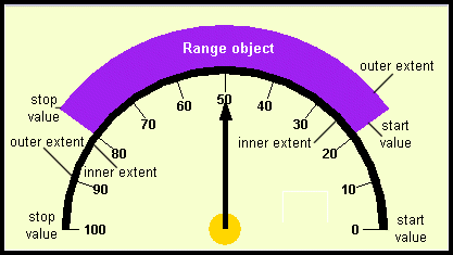
You can control the inner and outer radii (and thus the thickness) of the range. As well, you set start-stop values (and thus the breadth), and the color. Figure 18 shows two range objects on a circular scale. The thinner one spans the entire scale and appears as the circumference of the scale. The thicker one spans the region between tick marks 20 and 80. The diagram shows how a start value, stop value, inner extent, and outer extent determine the shape of a range.
Figure 18 : Two range objects for a Circular Scale object.
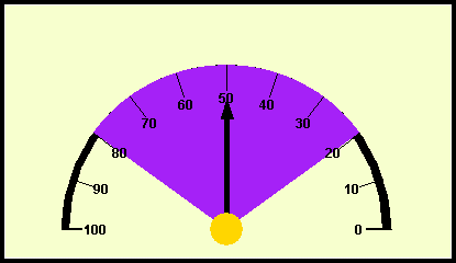
Figure 19 shows a Circular Gauge component in which one range object covers another, partially obscuring it. The drawing order in Figure 19 is first the semicircular range, followed in succession by the 20-80 range, the tick marks, the needle, and finally the center. If the objective is to show the semicircular range, draw the 20-80 range first. This topic is discussed in more detail in the next section.
Figure 19 : A range object that is the same size as its associated scale.
3.13.1 Notes on the Range Object's Properties
Coloring a range
A range object's color is set by the first parameter in its constructor. Use the
setForeground()method on aJCCircularRangeorJCLinearRangeobject to change the color of a range once it has been instantiated.Associating a range with a circular or linear scale
A range object has to be associated with a parent scale by providing a reference to it in the constructor, or by using the
setScale()method once a range has been instantiated.A range spans a region of its associated scale, but to be visible it must have a thickness as well as a span. Properties
innerExtentandouterExtentcontrol the inner and outer limits of its thickness. Values for these properties are given as ratios based on the size of its associated scale. For example, in a circular gauge an inner extent of 0.75 and an outer extent of 1.25 mean that the thickness is half the radius of the associated circular scale and is placed symmetrically over the circumference.Extending past the scale
If you wish to use an offset to shift a range beyond the end of the tick marks, create a circular scale spanning all the values you need to display but supply tick marks for one portion of the scale and a range for another portion.
Figure 20 : An offset is applied to the outer range of Figure 18.
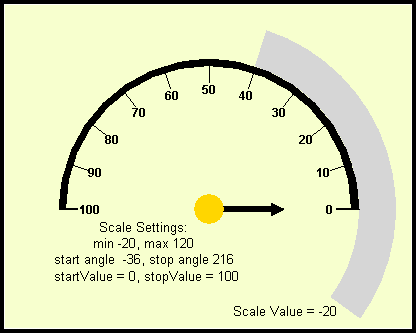
As shown in Figure 20, an offset appears to begin before the start of the scale. The scale's settings are max = 120, min = -20, startAngle = -36°, stopAngle = 216°. These were calculated to be consistent with the offset given to the range, and to maintain a semicircular appearance for the labeled part of the scale.
3.13.2 Constructors for JCCircularRange and JCLinearRange
JCCircularRange(java.awt.Color foreground,
JCCircularScale scale,
double innerExtent,
double outerExtent,
double startValue,
double stopValue)
public JCLinearRange(java.awt.Color foreground,
JCLinearScale scale,
double innerExtent,
double outerExtent,
double startValue,
double stopValue)All range properties are set in the constructor, along with associating a range with a circular scale. Range properties are listed next.
3.13.3 Methods and Properties for JCRange and JCAbstractRange
3.13.4 Sample Code
Set the property values for the range object in its constructor using the sample below as a guide.
// create a range that marks the circumference of the scale
circumference = new JCCircularRange(
Color.black, // range color
gauge.getScale(), // one way of referencing a scale
0.95, // range inner extent
1.00, // outer extent is at the radius
0, // start value for the range
100); // stop value for the range
3.14 The Indicator and Needle Objects
Indicators are a general mechanism for placing static5 markers on a scale. Needles are meant for user interaction, so the
JCAbstractNeedlesubclass ofJCAbstractIndicatorhas built-in capabilities for control by end users. If you permit it, an end user can reposition a needle by clicking, dragging, or both.Indicator and needle objects are the visible pointers on a scale object in a
JCGaugecomponent. Any number of indicators may be displayed on the same scale. Each indicator has its own value and this value determines where on the scale it is positioned. The gauge manages its list of indicators by keeping them in aVector.
You can control the indicator's color, length, width, and shape. The shape scales itself by using its length and width parameters.
The needle is drawn using its shape attribute. Basic constants exist for drawing triangles, pointers, and arrows, or you may provide your own shape.
The position of an indicator, and therefore its associated value on a scale may be controlled programmatically, and the needle subclass may be controlled via an end user action. A needle can be positioned by either clicking or dragging on the scale so long as a needle interaction is enabled. You can add a
ChangeListenerto a needle to respond to mouse actions. Additionally, the gauge has aJCGaugePickListenerinterface that permits retrieval of the scale value corresponding to the spot where a mouse click occurs. You can enable click and drag interactions with a needle via the inner class calledJCNeedle.InteractionType, which contains constants that specify the possible types of interactions between mouse actions and needles.When a needle's value changes, a value changed callback is called to allow the program to disable or limit the change. Use
sendEvents()to control whether an event is generated as a result of an action taken in the callback.
3.14.1 Notes on the Indicator's Properties
Indicator shapes
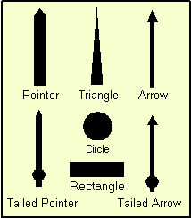
An indicator has seven possible built-shapes: arrow, tailed arrow, circle, pointer, rectangle, tailed pointer, or triangle, as shown in Figure 21. These shapes are controlled by the constants in
JCIndicatorStyle. They areARROW,CIRCLE,POINTER,RECTANGLE,TAILED_ARROW,TAILED_POINTER, andTRIANGLE.Setting an indicator's length
The indicator's length is based on the associated scale and is set as a decimal fraction of the scale's dimensions using its
innerExtentandouterExtentproperties. In the circular case, an indicator begins at the center of the circular scale and extends outwards. For example, if itsouterExtentproperty is set to 1.0, the indicator's tip lies on the circumference of the associated circular scale. In the linear case, an indicator's extents are measured from the top of the gauge area when the orientation is horizontal, or from the left-hand edge when the scale is vertical.Setting a needle's length
As a subclass of
((JCLinearNeedle)JCAbstractIndicator, a needle has inner and outer extents, and because it is a subclass ofJCAbstractNeedle, it has a length property as well. Setting the needle's length is equivalent to setting its outer extent. If you want to have the needle begin away from the center of a circular gauge, set its inner extent to some positive value. The value is expressed as a ratio based on the radius. Likewise, a linear needle may be offset from the top of a linear horizontal scale by setting its inner extent. In this case, the inner extent may be positive or negative, but you will have to set a border on the scale to prevent the needle from being clipped. Example:
gauge.getNeedles().firstElement()).setInnerExtent(0.3);
Figure 21 : The seven built-in indicator shapes.
Setting an indicator's width
An indicator's width is set using the
indicatorWidthproperty, or theneedleWidthproperty in the case of a needle.Defining a custom indicator style
It is possible to provide your own indicator style if you require a custom shape. The method is the same as in Defining your own tick style. The simplest way is to use the
import com.klg.JCIndicatorStyleconstructor that allows you to define a new shape. If you wish to keep your new indicator styles for general reuse as class constants, extendJCIndicatorStyleand define a shape as arrays of coordinate points using the same format as you would forjava.awt.Rectangle. Here is an example:jclass.swing.gauge.JCIndicatorStyle;
public class MyIndicatorStyle extends JCIndicatorStyle {
/**
* A needle in the form of a diamond using these array values
*/
public static final JCIndicatorStyle DIAMOND = new JCIndicatorStyle(
new int[] { -100, 0, 100, 0},
new int[] { 0, 100, 0, -100},
4);The
JCIndicatorStyleconstructor that allows you to define a new shape has been used here to define the class constant.Often an indicator style is defined so that the shape starts at the center of a circular scale. A shape defined this way also starts at the inner edge of a linear scale. Since the
DIAMONDdefined above starts at -100, it does not start at the scale's center or edge when it is drawn. Instead, thisDIAMONDstraddles the center. You'll need to test your design to see that it scales properly if you begin your needle away from the center and you intend to allow scaling.Indicators may be sized however you wish, but if the inner or outer extent specification causes the indicator to be drawn outside the component's boundary the indicator will be clipped. You may increase the border size to compensate, but borders are not scaled when components are resized. Since the indicator's length is defined as a fraction of its associated scale's radius, it may still elongate past the border if the component is expanded too much. An alternative approach is to use the scale's
zoomFactorproperty, set to some value less than one. This has the effect of shrinking the scale so that its boundary is less than its true radius. An indicator whose length is greater than 1.0 appears to extend beyond the scale. Because it is really inside the scale's actual boundary it can be resized without clipping.Coloring an indicator object
An indicator's color is set in its constructor or by using
javax.swing.JComponent.setForeground().Controlling a indicator's visibility
You can show or hide an indicator by setting its
java.awt.Component.setVisible()method totrueorfalserespectively. Test the visibility withjava.awt.Component.isShowing().Positioning an indicator with the mouse
Use the
JCAbstractNeedle.InteractionTypeconstants to determine how the needle responds to mouse clicks within the Circular Gauge component. To stop the needle from responding to the mouse, useInteractionType.NONE. Other possible values areCLICK,DRAG, orCLICK_DRAG.
3.14.2 Constructors
Both
public JCAbstractIndicator(JCAbstractIndicatorandJCAbstractNeedlehave two constructors. The first takes aJCScaleobject and creates an indicator or needle with default settings. The following ones allow you to set properties, associate it with its parent scale, and, in the case of a needle, specify an interaction type:
Color foreground, // foreground color
double indicatorWidth, // indicatorWidth
JCScale scale, // associated scale
boolean visible, // true: indicator is visible
double inner_extent, // inner extent
double outer_extent, // outer extent
JCIndicatorStyle indicatorStyle, // indicator style
double value // where to place this indicator
)
public JCAbstractNeedle(
java.awt.Color, // foreground color
double width, // needleWidth
JCScale scale, // associated scale
JCAbstractNeedle.InteractionType, // needle interactionType
boolean visible, // true: needle is visible
double, // length
JCIndicatorStyle, // needleStyle
double value, // where to place this needle
)
3.14.3 Methods and Properties
JCAbstractIndicatoris the super class forJCCircularIndicator,JCLinearIndicator, andJCAbstractNeedle. Indicators are used to point to zero or more selected values on a scale.Indicator methods and properties
Needle methods and properties
Needle properties allow you to control most aspects of the needle's appearance save for its drawing order (z order) with respect to the other gauge components. By managing the order in which
gauge.addNeedle()is called relative to the other gauge.addComponent methods you achieve your intended layering effect. For instance, by adding a center and then a needle, the part of the needle under the center is obscured.
JCAbstract Needleinherits all the methods of:
3.14.4 Code Sample
If you have used the default gauge constructor, a needle is supplied. You can obtain a handle to it as follows:
JCNeedle needle = ((JCNeedle)gauge.getNeedles().firstElement());You can completely configure a needle at the time it is created. The following code sample shows how:
JCNeedle needleOne =
new JCCircularNeedle(
Color.red, // needle's color
10, // needle width
cscale, // associated circular scale
true, // visible?
0.0, // inner extent
1.0, // outer extent
JCNeedleStyle.POINTER, // needle style
25.0 // needle value
);The remaining step is to add the needle to the gauge:
gauge.addNeedle(needleOne, 0); // Ensure the needle is on topAdding a change listener for needle movements
If you wish to take some action when a needle is moved you can use the fact that a needle movement generates a change event. You may add a change listener to the needle, for example:
needleOne.addChangeListener(this); // For needle movementsThe class (referenced by the
thispointer in our example here) that is to respond to needle movements defines astateChanged(ChangeEvent e)method to handle whatever action needs to be taken.
3.15 The Center Object
Center object
A center object is associated with a gauge. You can set the center's radius and its color, then add it using the gauge's
setCenter()method. Alternatively, you can specify an image for the center object.
A center object is used to mark the position of the center of a circular scale in a
JCCircularGaugecomponent. It can be a colored circle or a user-supplied image. If an image is specified, the circular disk will not be drawn.A center object must be associated with a circular scale. Each of its three constructors demands a scale as one of its parameters.
Figure 22 : An image used as a center object.
3.15.1 Notes on the Center Object
Setting the center's color
Set the color of the center object using the
setForeground()method, or in the center object's constructor. The result is a circular disk of this color at the center of the scale. The size of the disk is controlled by the center'sradiusproperty.Associating a center with a circular scale
Each circular gauge may have zero or one center objects. A center is associated with the gauge through its circular scale object. Specify the circular scale using the
scaleparameter in the center object's constructor. The center object may be replaced with an image if desired. The image does not rotate.Sizing the disk
Set the size of the disk using the
radiusproperty. The value you pass it is a fraction based on the size of the radius of its associated circular scale. For instance, if you set a value of 0.2, the circular disk marking the center has a radius 20% as long as the radius of the circular scale.Using an image as the visual
If you require anything other than a circular disk to mark the center of your scale, you can supply an
Image. The image is scaled to the radius of the center object ifsetScaleImage()istrue. In this case resizing the gauge causes a proportionate change in the image. See Section 3.15.3, Sample Code, for an example.The center image can be sized to fill the entire scale. In this case it can be made to appear as a background image on which needles, ranges, and extra tick marks may be placed as desired.
Figure 23 : Using a center image as a background.
In Figure 23 the parameters for the circular scale have been chosen so that they match the scale markings on the image, which fills the entire circular scale area. The result is an interactive dial with a distinctive look.
Controlling visibility
Use the
visibleparameter in the constructor to control whether the Center object is visible initially. After the object is created, control its visibility using thesetVisible()method.
3.15.2 Constructors, Properties, and Methods
Constructors
JCCenter(JCCircularScale scale)
JCCenterhas three constructors. The one-parameter version requires a reference to the parentJCCircularGauge. The other two require a color parameter and either a size parameter in the case of a circular disk, or an image parameter if an image is to be used.
// Creates a drawn, black center disk using a default radius
// that is 10% of the scale's radius.
JCCenter(JCCircularScale scale,
java.awt.Color foreground, // color of the disk
double radius) // Center is a disk
JCCenter(JCCircularScale scale,
java.awt.Color foreground,
java.awt.Image image) // Center is an imageProperties
Methods
Protected methods
drawDisc()anddrawImage()are used to draw the Center, and are used bypaintComponent()to actually draw the center object on the screen.getPreferredSize()is overridden so that the center object's proportional size relative to the circular scale can be maintained. These methods are only of concern to those who wish to subclass the center for custom purposes.
3.15.3 Sample Code
Follow these examples if you want to provide a center in your circular scale.
To use a colored disk as the center of circular scale, use this code:
// create a center
JCCenter center = new JCCenter(circularScale, Color.white, 0.1);
gauge.setCenter(center);To provide an image, use this code:
// use an image
Image image;
image = Toolkit.getDefaultToolkit().getImage("arrow.gif");
JCCenter center = new JCCenter(circularScale, Color.white, image);
gauge.setCenter(center);
3.16 The Constraint Mechanism in JCGauge
3.16.1 RadialConstraint and RadialLayout
The
RadialLayoutclass uses an instance ofRadialConstraintto position a component at a given angle and at a specified proportional distance from the center of the associated circular gauge. Thus, the gauge employsRadialConstraintclasses to facilitate laying out gauge objects in such a way that the objects' angular positions are maintained as the gauge is resized, as well as maintaining their proper radial proportions.It supports the placement of any component on the gauge area, not just indicators, needles, ranges, and ticks. Usually these are labels used to annotate a Circular Gauge, but they may be any
JComponent, even another gauge.Constructors
JCCircularGauge gauge = new JCCircularGauge();
RadialConstrainthas a single constructor which is passed a gauge, an extent, and an angle. Theextentparameter specifies the radial distance for the placement of the component. Theangleparameter specifies the angle. The center of component's bounding rectangle is placed on the gauge at the point defined by the two parameters. Typically an instance ofRadialConstraintis passed via theaddLabel()method inJCCircularGauge, which passes it to anadd()method that knows how to useRadialLayoutto position the component.
JLabel label = new JLabel("<html>Pressure (lbs/in²)");
gauge.addLabel(label, new RadialConstraint(gauge, 0.35, 90));
3.16.2 Linear Constraint and Linear Layout
The
LinearLayoutclass uses an instance ofLinearConstraintto position a component at a given extent and at a specified pixel distance from the origin of the associated circular gauge. Thus, the gauge employsLinearConstraintclasses to facilitate laying out gauge objects in such a way that the objects' relative positions are maintained as the gauge is resized.It supports the placement of any component on the gauge area, not just indicators, needles, ranges, and ticks. Usually these are labels used to annotate a linear gauge, but they may be any
JComponent, even another gauge.Constructors
JCLinearGauge gauge = new JCLinearGauge();
LinearConstrainthas a single constructor which is passed a gauge, an extent, and a position. Theextentparameter specifies the proportional distance from the top left of the rectangle enclosing the gauge. The distance is vertical for horizontal scales and horizontal for vertical scales, and is specified as a ratio of this distance to the height or width of the scale. Thepositionparameter specifies the distance as an integer representing a percentage of the height or width from the top or left of the scale. The center of the positioned component's bounding rectangle is placed on the gauge at the point defined by these two parameters. Typically an instance ofLinearConstraintis passed via theaddLabel()method inJCLinearGauge, which passes it on anadd()method that knows how to useLinearLayoutto position the component.
JLabel label = new JLabel("Pressure Point");
gauge.addLabel(label, new LinearConstraint(gauge, 0.35, 90));
3.17 Labels
Labels are used to annotate a gauge. Any number of them may be placed anywhere within the boundaries of the gauge area using a gauge's
addLabel()method, which in turn uses aRadialConstraintor aLinearConstraint. Because it is aJLabel, it has user-controllable text, position, background and foreground color, images, and borders.The
RadialConstraintclass, whose constructor isRadialConstraint(JCGauge gauge, double extent, double angle), lets you specify a label's position by giving a distance from the center of the scale and an angle. The constructor for a linear constraint isLinearConstraint(JCGauge gauge, double extent, int position), which lets you specify a label's position by giving the extent in the transverse direction to the scale and a position along the scale in pixels.Note that there is an automatic mechanism for providing numeric labels on tick objects or for specifying labeled ticks in user-specified formats. See Section 3.12, Tick Objects, for a discussion of tick labels.
3.17.1 Notes on the Using Labels
You can choose a location within the gauge area by specifying the location of the center of the rectangle containing the
RadialConstraintorLinearConstraintclass.You can choose a border type using
setBorderand adjust its appearance using the various border factory methods.One way of setting the font is by using a
JLabel l1 = new JLabel("<html><font color=black>Start Angle = 90\u00B0");JLabel's ability to process HTML tags. Set a font using the<font>tag and the color usingcolor = HTMLcolorValuewithin the tag. If you are adding text to a circular gauge, you can do the following:
l1.setToolTipText("Start Angle = 90\u00B0");
gauge.addLabel(l1, new RadialConstraint(gauge, 0.60, 15), 0);You can control whether a text object is drawn using
setVisible()and determine its visibility withisVisible.Aligning text
The lines of text within a label may be centered, or right justified. If text is not centered it may appear that
JLabel l1 = new JLabel(RadialConstraintis not positioning the text at the correct angle. In Figure 24 both text areas are aligned vertically, but without the borders on the components it appears that the lower label is not vertically aligned. Here is the code that produces this layout:
"<html><font color=black><P ALIGN=CENTER>Start Angle <br>= 0\u00B0");
l1.setToolTipText("Start Angle = 0\u00B0");
l1.setBorder(new BevelBorder(BevelBorder.RAISED));
gauge.getGaugeArea().add(l1, new RadialConstraint(gauge, 0.50, 90), 0);
JLabel l2 = new JLabel("<html><font color=black><P>Stop Angle <br>= 360\u00B0");
l2.setToolTipText("Stop Angle = 360\u00B0");
l2.setBorder(new BevelBorder(BevelBorder.RAISED));
gauge.getGaugeArea().add(l2, new RadialConstraint(gauge, 0.50, 270), 0);
Figure 24 : If text is not centered it may appear to be placed at the wrong angle.
Adding a component
A label (in reality, any
JComponent) is an independent rectangular region that can be placed anywhere within the gauge area by specifying the center of the component using either theLinearConstraintor theRadialConstraintclass.
3.17.2 Sample Code
The first code snippet shows the addition of a label positioned half way from the center of a gauge to its circumference at an angle of 45°.
RadialConstraint rConstraint = new RadialConstraint(gauge, 0.50, 45)
JLabel label = new JLabel("Start Angle = 0");
label.setToolTipText("Start Angle = 0\u00B0");
gauge.getGaugeArea().add(label, rContstraint, 0);Usage is the same for a linear constraint. This one puts a label at (0, 0) on a linear scale:
JLabel l0 = new JLabel("<html><font color=black>0");
l0.setToolTipText("0 marks the spot!");
gauge.getGaugeArea().add(l0, new LinearConstraint(gauge, 0.0, 0));This snippet shows how to label tick marks with a String that specifies the units of the measurement. It uses the
// create a label generator to mark ticks with their unitsJCLabelGeneratorinterface and its method,makeLabel().
tick.setLabelGenerator(new JCLabelGenerator() {
public JComponent makeLabel(JCTick tick, double value, RadialConstraint constraint) {
String s = String.valueOf((int) value) + " units";
JLabel label = new JLabel(s);
label.setToolTipText(s);
return label;
}
});
3.18 Events and Listeners in JCGauge
JCGaugePickEventrepresents a pick event inJCGauge. A pick event occurs when aJCGaugePickListeneris installed on a gauge and the mouse button is pressed over aJCGaugeobject.Interface
JCGaugePickListenerhas one method,pick(). It is called on the object that has installed itself as a listener by invokinggauge.addPickListener(). See GaugePickExample.java for an example of the use of a pick listener.
3.19 Utility Functions for JCGauge
Static utility functions are found in
com.klg.jclass.swing.gauge.GaugeUtil. They perform conversions or other common functions needed withinJCGauge.
3.19.1 GaugeUtil
The following table lists some methods that you might find useful. Consult the API for full details.
3.19.2 JCPolygon
JCPolygonis the abstract super class forJCIndicatorStyleandJCTickStyle. It is aPolygonthat retains the dimensions of its bounding box.
3.20 JCCircularGaugeBean and JCLinearGaugeBean
The two JavaBeans in the gauge package are
JCCircularGaugeBeanandJCLinearGaugeBean. Their purpose is to make it easy to set gauge properties at design time in an integrated development environment (IDE) tool.The
JCGaugecomponents are designed to be highly configurable. Interfaces support the possibility of replacing indicators, needles, ranges, scales, and ticks with custom-designed components. In the same vein, the concrete objects in JClass Elements based on these interfaces may be subclassed to provide extra functionality. All this flexibility comes at the price of having a gauge's properties distributed throughout the sub objects, making them hard to get at via an IDE's property sheet. To solve this problem, the gauge's JavaBeans provide accessors for the most-needed properties, placing them all within the JavaBean so that they are presented in one table by the IDE.The property names as they appear in an IDE are listed in Appendix A.
The following figure shows the property sheets for
JCCircularGaugeandJCCLinearGaugein JBuilder. You see that you can set many needle, scale, and tick properties.
Figure 25 : The properties tables for JCGaugeBeans in JBuilder.
3.21 Adding Other Components to a Gauge
As an example of adding any
JCCircularGauge bigGauge;JComponentto a gauge, consider a case where the need is to provide a smaller circular gauge within a larger one, such as a stopwatch whose larger scale counts off seconds and whose smaller scale indicates the number of minutes that have elapsed. In the code snippet that follows,bigGaugeis the one containing the second hand andsmallGaugeis the one containing the minute hand. It does not show the details of setting up the properties of the two scales, but once they are configured it is easy to place the smaller gauge within the larger.
JCCircularGauge smallGauge;
bigGauge.addLabel(smallGauge, new RadialConstraint(smallGauge, 0.35, 90), -1);
Figure 26 : One circular gauge within another.
3.22 JClass 4 to JClass 5: A Mini-porting Guide
The gauge classes have been extensively reorganized for the JClass 5 release, but you should find that there is little or no impact on your existing applications that use circular gauges. You may find that your code compiles against the new classes without the need to change anything; however, if you discover that your application does not run with JClass 5 or newer releases, you can refer to the table below. It should encompass almost all the issues that need attention.
1JCCircularGauge uses a start angle and a stop angle to define the angular range, rather than employing Java's notion of a start angle and a sweep angle. For example, a scale that occupies a lower half circle has a start angle of 180° and a stop angle of 360°. Avoid the temptation to specify these two angles as 180° and 180°! See Section 3.10.3, Angles In a Circular Scale, for a discussion on how angles are measured in a
JCCircularScale.2The extent is measured from the scale boundary, not from any border that may enclose the scale.
3The lower edge of a linear scale whose orientation is horizontal, or the right edge of a linear scale whose orientation is vertical. An inner extent of 1.0 is definitely a case for surrounding the scale with a border.
4The two subclasses of
GaugeConstraintareLinearConstraintandRadialConstraint.5As far as direct end user interaction is concerned. Indicators may be repositioned under program control if desired.
|
|