  
|
9
Text and Style Elements
Header and Footer Titles
Legends
OutlineStyle
Positioning Chart Elements
This chapter describes the different formatting elements available within JClass Chart, and how they can be used. If you are developing your chart application using one of the JClass Chart Beans, please refer to Bean Reference, in Chapter 4.
9.1 Header and Footer Titles
A chart can have two titles, called the header and footer. By default they are
JLabelinstances and behave accordingly (AJLabelclass is a Swing class.) AJLabelobject can display text, an image, or both.You can specify where in the label's display area the label's contents are aligned by setting the vertical and horizontal alignment. By default, labels are vertically centered in their display area. Text-only labels are left-aligned by default. Image-only labels are horizontally centered by default.
A title consists of one or more lines of text with an optional border, both of which you can customize. You can also set the text alignment, positioning, colors, and font used for the header or footer.
See "How to Use Labels" in the Java Tutorial for further documentation.
9.2 Legends
A legend shows the visual attributes (or
ChartStyle) used for each series in the chart, with text that labels the series. You can customize the series label and positioning. The legend is aJComponent, and all properties such as border, colors, font, and so on, apply.
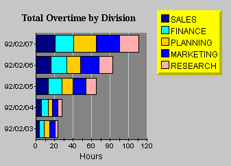
Figure 32 : Vertically oriented legend anchored NorthEast.
New Location for the Legend Classes
In order to make the legend classes more accessible to the JClass products, all four legend classes -
JCLegend,JCGridLegend,JCMultiColLegend, andJCLegendItem- have been moved from com.klg.jclass.chart to com.klg.jclass.util.legend.For most users, all you will need to do when converting from 4.0.x to 4.5 and higher, is to change the import statements to import the legend classes (
JCLegend,JCGridLegend,JCMultiColLegend, andJCLegendItem) from the com.klg.jclass.util.legend package.This converting can be done either by hand or via running the provided porting script (please see the second bullet). Each method will yield the same result.
import com.klg.jclass.chart.JCLegend;
import com.klg.jclass.chart.JCGridLegend;
import com.klg.jclass.chart.JCMultiColLegend;
import com.klg.jclass.chart.JCLegendItem;
import com.klg.jclass.chart.*;
import com.klg.jclass.util.legend.JCLegend;
import com.klg.jclass.util.legend.JCGridLegend;
import com.klg.jclass.util.legend.JCMultiColLegend;
import com.klg.jclass.util.legend.JCLegendItem;
import com.klg.jclass.chart.*; import com.klg.jclass.util.legend.*;
- Convert the import statements via running the porting script. This Perl script changes the above import statements automatically. The porting script is named legend4to45.pl and is provided at JCLASS_HOME/bin/. You must have Perl installed on your system for the script to work.
Here is an example of how one would run the script:
perl legend4to45.pl filenamewhere filename is the name of the file you want to convert from 4.0.x to 4.5 or higher.
As noted, for most users the above changes to the import statements are all that is required when converting from 4.0.x to 4.5 or higher. However, for users who are already overriding
JCLegendand implementing custom layouts, converting may require dealing with changes to JClass Chart'sJCLegendandJCLegendItemclasses. These items are not covered by the porting script so will need to be done manually.
- These fields have been added to
JCLegendItem:
int drawType(determines drawing type; takes as its parameter one ofJCLegend.NONE, JCLegend.BOX, JCLegend.IMAGE, JCLegend.IMAGE_OUTLINED, JCLegend.CUSTOM_SYMBOL, orJCLegend.CUSTOM_ALL)Object itemInfo(refers to data related to this legend item - in JClass Chart, this is aJCDataIndexobject containing the data view and series to which this legend item is related)- The new
Object itemInfofield replaces these three fields:JCLegend'sdrawLegendItem(Graphics gc, JCChart chart, Font useFont, JCLegendItem thisItem)has been changed to:Legend Text and Orientation
The legend displays the text contained in the
Labelproperty of eachSeriesin aDataView. TheVisibleInLegendproperty of the series determines whether theSerieswill appear in theLegend.
SeriesLabelssupport the use of HTML tags. The use of HTML tags overrides the defaultFontandColorproperties of the label. Please note that HTML labels may not work with PDF, PS, or PCL encoding.Use the legend
Orientationproperty to lay out the legend horizontally or vertically.Legend Positioning
Use the legend
Anchorproperty to specify where to position the legend relative to theChartArea. You can select from eight compass points around theChartArea.See Section 9.9, Positioning Chart Elements, for more information.
9.2.1 Customizing Legends
JClass provides two types of legend objects:
JCGridLegend(the default) for a single-column layout andJCMultiColLegendfor a multiple-column layout. If these legends do not provide the desired functionality, the user can customize the legend using the JCLegend Toolkit.Single-Column Legends
The classic single-column legend layout is provided by
JCGridLegend. This is the default layout in JClass Chart.Multi-Column Legends
Multi-column legend layout is available using
JCMultiColumnLegend. To designate this layout, follow these steps:Multi-Column Legends example
JCMultiColLegend mcl = new JCMultiColLegend();
mcl.setNumColumns(2);
c.setLegend(mcl);This example will create a legend for the current chart that has two columns. The number of rows depends on the number of items in the legend. To fix the number of rows, use
setNumRows(). Both the number of rows and the number of columns are variable by default.To reset the number of rows and columns to a variable state after they have been fixed, call the appropriate set method with a negative value. If both the
NumRowsandNumColumnsproperties are set to fixed values, the legend will be of that exact size and will ignore any extra items.JCLegend Toolkit
The JCLegend Toolkit allows you the freedom to design your own legend implementations. The options range from simple changes, such as affecting the order of the items in the legend, to providing more complex layouts.
The JCLegend Toolkit consists of a
JCLegendclass that can be subclassed to provide legend layout rules and two interfaces:JCLegendPopulatorandJCLegendRenderer.JCLegendPopulatoris implemented by classes wishing to populate a legend with data, andJCLegendRendereris implemented by a class that wishes to help render the legend's elements according to the user's instructions. Examples of how to use the JCLegend Toolkit are provided in JCLASS_HOME/examples/chart/legend/ .
JCChartLegendManageris the class used by JClass Chart to implement both theJCLegendPopulatorandJCLegendRendererinterfaces, and to provide a built-in mechanism for itemizing range objects in a legend.Custom Legends - Layout
JClass provides a Legend Toolkit that allows creation of custom legend implementations.
JCLegendis an abstract class that can be subclassed by users wishing to customize the legend layout or other legend behavior.To provide a custom layout, override the method:
public abstract Dimension layoutLegend(List itemList, boolean
vertical, Font useFont)The
itemlistargument is aListcontaining aVectorfor each data view contained in the chart. Each of these sub-vectors contains oneJCLegendIteminstance for each series in the data view and one instance for the data view title.The
verticalargument istrueif the orientation of the legend is vertical, andfalseif the orientation of the legend is horizontal.The
useFontargument contains the default font to use for the legend.Each item in the legend consists of a text portion and a symbol portion. For example, in a Plot Chart, the text portion is the name of the series, and is preceded by the symbol used to mark a point on the chart. For the title of the data view, the text portion is the name of the data view and there is no symbol.
JCLegendItemis a class that encapsulates an item in the legend with the properties.When the
itemListis passed tolayoutLegend, it has been filled in withJCLegendIteminstances representing each data series and data view title. These instances will have thesymbolDim,textDim,symbol,contents,itemInfo, anddrawTypealready filled in.The value of
drawTypewill determine whether a particular default symbol type will be drawn or whether user-provided drawing methods will be called.The
layoutLegend()method is expected to calculate and fill in the pos, symbolPos, textPos, and dim fields. Additionally, the method must return aDimensionobject containing the overall size of the legend. Optionally, it may also calculate thepickRectanglemember of theJCLegendItemclass. ThepickRectangleis used in pick operations to specify the region in the legend that is associated with the series that this legend item represents. If left null, a defaultpickRectanglewill be calculated using the dim and pos members.Any of the public methods in the
public int getSymbolSize()JCLegendclass may be overridden by a user requiring custom behavior. One such method is:
getSymbolSize()returns the size of the legend-calculated symbols to be drawn in the legend. DefaultJCLegendbehavior sets the symbol size to be equal to the ascent of the default font that is used to draw the legend text. It is overridable by users who wish to use a different symbol size. One possible implementation is to use a symbol size identical to that which appears on the actual chart.Custom Legends - Population
public List getLegendItems(FontMetrics fm)
JCLegendPopulatoris an interface that can be implemented by any user desiring to populate the legend with custom items. This interface comprises two methods that need to be implemented:
public boolean isTitleItem(JCLegendItem item)
getLegendItems()should return aListobject containing any number ofVectorobjects where eachVectorobject represents one column in the legend. EachVectorobject contains theJCLegendItemobjects for that column. In JClass Chart, each column generally represents one data view.
isTitleItem()should returntrueorfalse, depending on whether the passedJCLegendItemobject represents a title for the column. This is used to determine whether a symbol is drawn for a particular legend item.If implemented, the legend should be notified of the new populator with the
setLegendPopulator()method ofJCLegend.Custom Legends - Rendering
public void drawLegendItem(Graphics gc, Font useFont, JCLegendItem thisItem)
JCLegendRendereris an interface that can be implemented by any user desiring to custom render legend items. This interface consists of four methods that need to be implemented:
public void drawLegendItemSymbol(Graphics gc, Font useFont, JCLegendItem thisItem)
public Color getOutlineColor(JCLegendItem thisItem)
public void setFillGraphics(Graphics gc, JCLegendItem thisItem)void drawLegendItemText (Graphics gc, Font useFont, JCLegendItem thisItem);
JCLegendRendereralso has the capacity to implement custom text objects for drawing, and is called when the legend cannot interpret an object placed in thecontentsfield of theJCLegendItem. This interface consists of one method that needs to be implemented:
drawLegendItem()provides a way for a user to define a custom drawing routine for an entire legend item. It is called when a legend item's draw type has been set toJCLegend.CUSTOM_ALL.
drawLegendItemSymbol()provides a way for a user to define a custom drawing routine for a legend item's symbol. It is called when a legend item's draw type has been set toJCLegend.CUSTOM_SYMBOL.
getOutlineColor()should return the outline color to be used to draw the legend item's symbol. If null is returned, the legend's foreground color will be used.getOutlineColor()is called when a legend item's draw type has been set to eitherJCLegend.BOXorJCLegend.IMAGE_OUTLINED.
setFillGraphics()should set the appropriate fill properties on the providedGraphicsobject for drawing the provided legend item.setFillGraphics()is called when the legend item's draw type has been set toJCLegend.BOX.If implemented, the legend should be notified of the new renderer with the
setLegendRenderer()method ofJCLegend.Examples of Simple Custom Legends
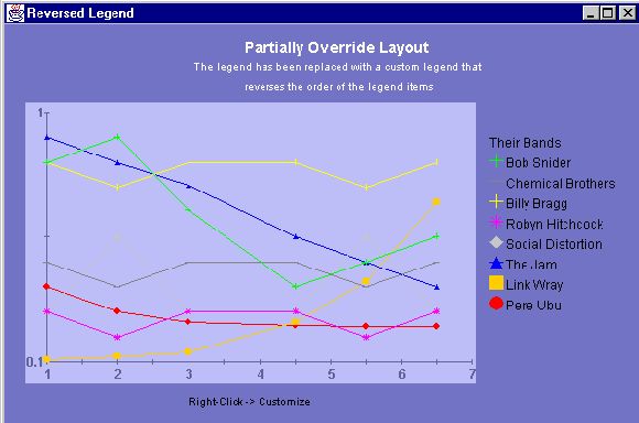
The easiest way to perform simple legend customizations is to extend an existing legend. This is clearly demonstrated in the Reversed Legend example in JCLASS_HOME/examples/chart/legend/. This example overrides the
JCChartLegendManagerclass (the class that implements theJCLegendPopulatorandJCLegendRendererinterfaces in JClass Chart) to reverse the order of the legend items. This class overrides thegetLegendItems()method, first calling the superclass' method to get the list of legend items and then rearranging the order before returning the newly reversed list of legend items.
Figure 33 : The Reversed Legend example, which extends
JCChartLabelManagerto reverse the order of the legend items.
public ReverseLegend() {
setLayout(new GridLayout(1,1));
// replace standard legend with custom legend that reverses
// the order of the legend items
JCChart c = new JCChart(JCChart.PLOT);
...
RevLegendManager legMan = new RevLegendManager(c);
c.getLegend().setLegendPopulator(legMan);
c.getLegend().setLegendRenderer(legMan);
c.getLegend().setVisible(true);
...
}
/** RevLegendManager overrides the standard legend representation
* to reverse the drawing order of the legend items. It does this by
* overriding getLegendItems() method of the JCChartLabelManager
* class to reverse the order of the items in the legend
* vector.
*/
class RevLegendManager extends JCChartLegendManager
{
RevLegendManager(JCChart chart)
{
super(chart);
}
/** Override getLegendItems(). Reverse order of items in legend
* vector.
*/
public List getLegendItems(FontMetrics fm)
{
// get the list of legend items from the superclass
List itemList = super.getLegendItems(fm);
// reverse the list
for (int i = 0; i < itemList.size(); i++) {
List viewItems = (List) itemList.get(i);
List reverseView = new Vector();
for (int j = viewItems.size() - 1; j >= 0; j--) {
JCLegendItem thisItem = (JCLegendItem) viewItems.get(j);
// reverse items in list, but keep the title at the top.
if (isTitleItem(thisItem)) {
reverseView.add(0, thisItem);
} else {
reverseView.add(thisItem);
}
}
itemList.set(i, reverseView);
}
// now that we've set up the list correctly, let the superclass
// position it
return itemList;
}
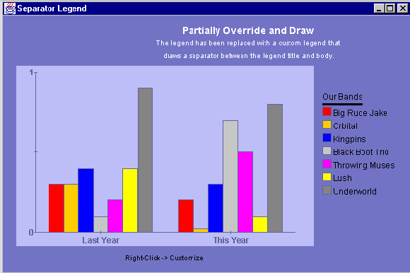
}The Separator Legend example in JCLASS_HOME/examples/chart/legend/ shows how to place a separator between the data view title and the series beneath it. Similar to the Reversed Legend example, the Separator Legend example overrides the
JCChartLegendManagerclass.In the Separator Legend example, a new
JCLegendItemis inserted into the list after the data view title item as part of thelayoutLegend()method. This newJCLegendItemhas only itstextDimensionfilled in with the size of the separator, but the actualcontentsfield remains null - which is how one recognizes the separator when it is time to draw it.The
drawTypefield of theJCLegendItemis set toJCLegend.CUSTOM_ALLto ensure that thedrawLegendItem()method will be called. Finally, the example returns the item list with the newly added item and lets the superclass do the positioning and sizing calculations.The
drawLegendItem()method is also overridden so that the separator can be drawn. Before drawing, however, it is first determined whether the provided legend item is, indeed, the separator created above.
Figure 34 : The Separator Legend example places a separator between the data view title and the series beneath it, and extends JCChartLabelManager.
public SeparatorLegend() {
setLayout(new GridLayout(1,1));
// replace standard legend with custom legend that draws a
// separator between the title and the body
JCChart c = new JCChart(JCChart.BAR);
...
SepLegendManager sepMan = new SepLegendManager(c);
c.getLegend().setLegendPopulator(sepMan);
c.getLegend().setLegendRenderer(sepMan);
c.getLegend().setVisible(true);
...
}
/** sepLegendManager overrides the standard legend populator and
* renderer implementations to draw a separator between the legend
* title and body. It does this by overriding the
* JCChartLegendManager's getLegendItem() method (to insert an item
* to take the place of a separator) and drawLegendItem() (to draw
* the separator) methods.
*/
public class SepLegendManager extends JCChartLegendManager
{
public SepLegendManager(JCChart chart)
{
super(chart);
}
/** Override getLegendItems() to insert separator item into
* legend vector.
*/
public List getLegendItems(FontMetrics fm)
{
// get the list of legend items from the superclass
List itemList = super.getLegendItems(fm);
// go through the list to find the spot for the separator
for (int i = 0; i < itemList.size(); i++) {
List viewItems = (List) itemList.get(i);
for (int j = 0; j < viewItems.size(); j++) {
JCLegendItem thisItem = (JCLegendItem) viewItems.get(j);
// Insert separator item after title item
// our separator is identified by having null contents
// but an existing text dimension. Make the separator as
// wide as the text portion of the title.
if (isTitleItem(thisItem)) {
JCLegendItem newItem = new JCLegendItem();
boolean vertical = chart.getLegend().getOrientation() ==
JCLegend.VERTICAL;
if (vertical) {
newItem.textDim = new Dimension(thisItem.textDim. width, 3);
} else {
newItem.textDim = new Dimension(3,
thisItem.textDim.height);
}
// make sure to set draw type as CUSTOM_ALL so that
// drawLegendItem() will be called.
newItem.drawType = JCLegend.CUSTOM_ALL;
viewItems.add(j+1, newItem);
break;
}
}
}
// now that the list is set up, let the superclass worry about
// positioning everything
return itemList;
}
/** Override drawLegendItem() to draw the separator item
* when encountered.
*/
public void drawLegendItem(Graphics gc, Font useFont, JCLegendItem thisItem)
{
// if our separator, draw it
if (thisItem.contents == null && thisItem.textDim != null) {
if (gc.getColor() != getForeground())
gc.setColor(getForeground());
gc.fillRect(thisItem.pos.x + thisItem.textPos.x,
thisItem.pos.y + thisItem.textPos.y,
thisItem.textDim.width,
thisItem.textDim.height);
}
}
}Remember to use the
setLegendPopulator()andsetLegendRenderer()methods of theJCLegendclass to notify the legend of the new class.Examples of Complex Legends
More complex customizations are also possible. Legends that require full-scale changes to the rules of layout can override the
JCLegendclass and create their own implementation. Have a look at JCLASS_HOME/examples/chart/legend/FlowLegend for an example of a custom legend layout.
9.3 Chart Labels
Chart labels allow you to add more information to your chart. There are static labels that display continuously and interactive labels that pop-up when a cursor moves over a data item. Labels can be attached to different parts of a chart: absolute coordinates, coordinates in the plotting area, or a specific data item. To see a wide range of label uses, browse the demos in the JCLASS_HOME/demos/chart/labels/ directory.
9.3.1 Label Implementation
JClass Chart contains a list of labels, managed by the
ChartLabelManager. This property is initially null. By callinggetChartLabelManager(), JClass Chart will create a manager class with an empty list of labels. When you create a label, you must add it to the manager withaddChartlabel(). Labels are instances of theJCChartLabelclass.
9.3.2 Adding Labels to a Chart
Labels are added to a chart in two ways: with the
AutoLabelsproperty ofChartDataView, or by attaching an instance ofJCChartLabelto a chart element.Individual labels are attached in three ways: to coordinates on the chart area (
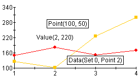
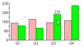
ATTACH_COORD), coordinates on the plot area (ATTACH_DATACOORD), or to a data item (ATTACH_DATAINDEX). Interactive labels must use theATTACH_DATAINDEXmethod.Each label on the chart below uses a different attachment method. The "Point(100,50)" label, is attached to coordinates originating from the top left corner of the chart area. "Value(2,220)" is attached to axes coordinates, and "Data(Set0,Point2)" is attached to a specific data item.
Attaching a Label to a Data Item
To attach a label to a point, bar or slice, set the
cl = new JCChartLabel("Fourth data point");AttachMethodproperty toATTACH_DATAINDEX. The labels move with the data element; the labels also move when the chart is resized. Note that the points and series are zero-based. The following example puts a label on a chart next to the fourth data point in the second data series.
cl.setDataIndex(new JCDataIndex(view, series, 1, 3));
cl.setAttachMethod(JCChartLabel.ATTACH_DATAINDEX);
cl.setAnchor(JCChartLabel.AUTO);
chart.getChartLabelManager().addChartLabel(cl)Attaching a Label to Chart Area Coordinates
To attach a label to a point on the chart area, set the
JCChartLabel cl = new JCChartLabel("Point( 100.50 )");AttachMethodproperty toATTACH_COORD. The coordinate origin for this method is the top left corner of the chart area.
cl.setAttachMethod( JCChartLabel.ATTACH_COORD );
cl.setCoord( new Point( 100, 50 ) );
chart.getChartLabelManager().addChartLabel(cl)Attaching a Label to Plot Area Coordinates
To attach a label to coordinates on the plot area, set the
JCChartLabel cl = new JCChartLabel("Attached to the data coordinate", false);AttachMethodproperty toATTACH_DATACOORD. The plot area is defined by the chart's X- and Y-axes. The following example places a label in the plot area at X-value 2.5, y-value 160.
cl.setDataCoord( new JCDataCoord( 2.5, 160 ) );
cl.setAnchor( JCChartLabel.NORTH );
cl.setAttachMethod( JCChartLabel.ATTACH_DATACOORD );
cl.setBorderType( Border.ETCHED_OUT );
cl.setBorderWidth( 5 );
chart.getChartLabelManager().addChartLabel(cl)
9.3.3 Interactive Labels
You can have labels pop-up as a cursor dwells over a point, bar or slice (a dwell label). This allows you to create an interactive chart where information is hidden until the user wants to see it. The
AutoLabelproperty will set up a complete series of dwell labels for your chart. In the example below, `225' appears on top of the bar as the cursor passes over it, to indicate the value of the bar.
Automatically Generated Labels
The
chart.getDataView(0).setAutoLabel(true);AutoLabelproperty ofChartDataViewwill generate a complete series of dwell labels if set totrue. It attaches dwell labels to every data index. The following code adds automatic dwell labels to the data:Adding Individual Dwell Labels
Attaching an individual dwell label follows the same procedure as attaching a static label to a data item, except that the
cl.setDwellLabel(true);DwellLabelproperty is set totrue:A dwell label can only be used when the
AttachMethodproperty is set toATTACH_DATAINDEX.
9.3.4 Adding and Formatting Label Text
JCChartLabelis just a holder for anyJComponent. By default it is aJLabelinstance, and text can be set the same way you would set text on aJLabel. You can access the component portion of the chart label with thegetComponent()method.
JLabelssupport the use of HTML tags. The use of HTML tags overrides the defaultFontandColorproperties of the label. Please note that HTML labels may not work with PDF, PS, or PCL encoding.Adding Label Text
You can add text to a label by passing it to the constructor, or by using the
JCChartLabel cl = new JCChartLabel("I'm a Label", false);Textproperty. To add text to a label when it is constructed, include the text in the constructor's argument, as follows:To add text using the
((JLabel)cl.getComponent()).setText("I'm a Label");Textproperty, use thesetTextmethod, as follows:Formatting Label Text
Font f = new Font("timesroman", Font.BOLD, 24);
cl.getComponent(),setFont(f)
JComponentproperties such as fonts, borders, colors, an so on, are set in the same manner.
9.3.5 Positioning Labels
The
cl.setAnchor(JCChartLabel.EAST);Anchorproperty determines the position of the label, relative to the point of attachment. Valid positions include:NORTH,NORTHEAST,NORTHWEST,EAST,WEST,SOUTHEAST,SOUTHWEST, andSOUTH. The following example shows the syntax:
9.3.6 Adding Connecting Lines
You can add lines that connect a label to its point of attachment. This can help the end-user pinpoint what a label refers to on a chart.
To add a connecting line to a label, set the
cl.setConnected(true);Connectedproperty totrue, as follows:
9.4 Chart Styles
Chart styles define all of the visual attributes of how data appears in the chart, including:
- Lines and points in plots and financial charts.
- Color of each bar in bar charts.
- Slice colors in pie charts.
- Color of each filled area in area charts.
Each series in a data view has its own
JCChartStyleobject; as new series are added, newJCChartStyleobjects are created automatically by the chart. JClass Chart automatically defines a set of visually different styles for up to 13 series, so while you can customize any chart style, you may not need to.Every
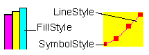
ChartStylehas aFillStyle, aLineStyle, and aSymbolStyle.FillStyles are used for Area, Bar, Candle, Hi-Lo, Hi-Lo-Open-Close, Pie, and Stacking Bar charts.LineStyles andSymbolStyles are used for plots.
Figure 35 : Types of ChartStyles available.
arr.setChartStyle(0, new JCChartStyle());
ChartStyleis an indexed property ofChartDataViewthat "owns" theJCChartStyleobjects for that data view. It can be manipulated like any other indexed property, for example:This adds the specified
ChartStyleto the indexed property at the specified index. If theChartStyleis null, theJCChartStyleat the specified point is removed. The following lists some of the other waysChartStylecan be used:
getChartStyle(index)- retrieves the chart style at the specified index.setChartStyle(List)- replaces all existing chart styles.List getChartStyle()- retrieves a copy of the array of chart styles.Normally, you will not need to add or remove
JCChartStyleobjects from the collection yourself. If aJCChartStyleobject already exists when its corresponding series is created, the previously createdJCChartStyleobject is used to display the data in this series.Customizing Existing ChartStyles
Each
JCChartStyleobject contains three smaller objects that control different aspects of the style:JCFillStyle,JCLineStyle, andJCSymbolStyle.The most common chart style sub-properties are repeated in
JCChartStyle. For example,FillColoris a property ofJCChartStylethat corresponds to theColorproperty ofJCFillStyleobject. The following lists all of the repeated properties:
LinePattern,LineWidth, andLineColorrepeatJCLineStylepropertiesSymbolShape,SymbolColor,SymbolSize, andSymbolCustomShaperepeatJCSymbolpropertiesFillColor,FillPattern, andFillImagerepeatJCFillStyleproperties.FillStyle
JCFillStylecontrols the fills used in bar, pie, area, and candle charts. Its properties includeColorandPattern. UsePatternto set the fill drawing pattern andColorto set the fill color. The default pattern is solid fill.For JDK 1.3.1 and higher, available fill patterns include none, solid, 25%, 50%, 75%, horizontal stripes, vertical stripes, 45 degree angle stripes, 135 degree angle stripes, diagonal hatched pattern, cross hatched pattern, custom fill, custom paint, or, for bar charts only, custom stack fill.
Custom fill and custom stack fill draw using the image set in the
Imageproperty. Custom paint draws using theTexturePaintobject, which is set in theCustomPaintproperty.Note that filled areas are not supported for Polar charts.
LineStyle
JCLineStylecontrols line drawing, used in line and hi-lo charts. Its properties areColor,PatternandWidth. UsePatternto set the line drawing pattern,Colorto set the line color, andWidthto set the line width.Custom line patterns can be set with a
setPattern()method that specifies the line pattern arrays to use.SymbolStyle
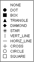
JCSymbolStylecontrols the symbol used to represent points in a data series, used in plot or scatter plot charts. Its properties areShape,ColorandSize. UseShapeto set the symbol type,Sizeto set its size, andColorto set the symbol color.Valid symbols are shown below:
Figure 36 : Symbols available in JCSymbolStyle.
You can also provide a custom shape by implementing an abstract class
JCShapeand assigning it to theCustomShapeproperty.Customizing All ChartStyles
By looping through the
JCChartStyleindexed property, you can quickly change the appearance of all of the bars, lines, or points in a chart. For example, the following code lightens all of the bars in a chart whenever the mouse is clicked:
for (Iterator i = c.getDataView(1).getChartStyle().listIterator(); i.hasNext();)
{
JCChartStyle cs = (JCChartStyle) i.next();
JCFillStyle fs = cs.getFillStyle();
fs.setColor(fs.getColor().brighten);
}
9.5 OutlineStyle
The
ChartDataView'sOutlineStyleproperty controls the outlines of area, stacking area, area radar, bar, stacking bar, and pie charts. It is of typeJCLineStyleand thus the properties of the line can be controlled by getting theJCLineStyleobject usinggetOutlineStyle()and setting its properties.The default outline style is a solid line of width one in the chart area's foreground color.
9.6 Borders
One way to highlight important information or improve the chart's appearance is to use a border. You can customize the border of the following chart objects:
Border properties are set using the standard
JComponentborder facilities,getBorder()andsetBorder().
9.7 Fonts
A chart can have more impact when you customize the fonts used for different chart elements. You may also want to change the font size to make an element better fit the overall size of the chart. Any font available when the chart is running can be used. You can set the font for the following chart elements:
Changing a Font
Font properties are set using the standard
JComponentfont facilities,getFont()andsetFont().Use the font properties to set the font, style, and size attributes.
9.8 Colors
Color can powerfully enhance a chart's visual impact. You can customize chart colors using Java color names or RGB values. Using an interactive tool like The Chart Customizer can make selecting custom colors quick and easy. Each of the following visual elements in the chart has a background and foreground color that you can customize:
- the entire chart
- Header and Footer titles
- Legend
- Chart Area
- Plot Area (foreground colors
JCChartArea'sAxisBoundingBox)- each
ChartLabeladded to the chartOther chart objects have color properties too, including
ChartDataView(bar/pie outline color) andChartStyles.Color Defaults
All chart subcomponents are transparent by default with no background color. If made opaque, the legend, chart area and plot will inherit background color from the parent chart. The same objects will always inherit the foreground color from the chart.
Headers and footers are independent objects and behave according to the rules of whatever object they are.
However, once the application sets the colors of an element, they do not change when other elements' colors change.
Specifying Foreground and Background Colors
Each chart element listed above has a
BackgroundandForegroundproperty that specifies the current color of the element. The easiest way to specify a color is to use the built-in colornames defined injava.awt.Color. The following table summarizes these colors:Alternately, you can specify a color by its RGB components, useful for matching another RGB color. RGB color specifications are composed of a value from 0 - 255 for each of the red, green and blue components of a color. For example, the RGB specification of Cyan is "0-255-255" (combining the maximum value for both green and blue with no red).
The following example sets the header background using a built-in color, and the footer background to an RGB color (a dark shade of Turquoise):
c.getHeader().setBackground(Color.cyan);
mycolor = new Color(95,158,160);
c.getFooter().setBackground(mycolor);Take care not to choose a background color that is also used to display data in the chart. The default
ChartStylesuse all of the built-in colors in the following order: Red, Orange, Blue, Light Gray, Magenta, Yellow, Gray, Green, Dark Gray, Cyan, Black, Pink, and White. Note that JClass Chart will skip colors that match background colors. For example, if the chart area background is Red, then the line, fill, and symbol colors will start at Orange.For all JClass Chart charts, the foreground and background colors of the plot area are adjustable.
Transparency
If the JClass Chart component is meant to have a transparent background, set the
Opaqueproperty toFalse; then generated GIFs and PNGs will also contain a transparent background.
9.9 Positioning Chart Elements
Each of the main chart elements (
Header,Footer,Legend, andChartArea) has properties that control its position and size. While the chart can automatically control these properties, you can also customize the following:When the chart controls positioning, it first allows space for the
Header,Footer, andLegend, if they exist (size is determined by contents, border, and font). TheChartAreais sized and positioned to fit into the largest remaining rectangular area. Positioning adjusts when other chart properties change.
ChartLabelsdo not figure into the overall Chart layout. Instead, they are positioned above all other Chart elements.Changing the Location and Size
To specify the absolute location and size of a chart element, call
chart.setLayoutHints(legend, newRectange(0,150,200,200))setLayoutHints()in JClass Chart with the object you wish to move and a rectangle containing its desired X- and Y-location, width, and height. If you desire any of those values to be calculated rather than set, make them equal toInteger.MAX_VALUE.will set the legend to be 200 x 200 and place it at (0,150), while
chart.setLayoutHints(legend, Rectange(0,150,Integer.MAX_VALUE,Integer.MAX_VALUE, Integer.MAX_VALUE))will leave the legend's size alone but still move it to (0,150).
9.10 3D Effect
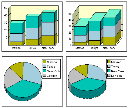
Data in bar, stacking bar and pie charts can be displayed with a three-dimensional appearance using several
JCChartAreaproperties:
Depth- Specifies the apparent depth as a percentage of the chart's width. No 3D effect appears unless this property is set greater than zero.Elevation- Specifies the eye's position above the horizontal axis, in degrees.Rotation- Specifies the number of degrees the eye is positioned to the right of the vertical axis. This property has no effect on pie charts.You can set the visual depth and the "elevation angle" of the 3D effect. You can also set the "rotation angle" on bar and stacking bar charts.
Depth,Rotation, andElevationare all properties of theChartArea.
Figure 37 : Four JClass Charts illustrating 3D effects.
9.11 Anti-Aliasing
Anti-aliasing is the process of smoothing out lines and curves to remove the pixelated appearance of text and graphics. The smoothing is done by padding pixels with intermediate colors. For example, a black and white image would be smoothed out using gray.
Figure 38 : The appearance of text with and without anti-aliasing.
JClass Chart is equipped with the
antiAliasingproperty which can turn anti-aliasing on or off when the chart and its subcomponents are painted.
|
|