  
|
5
MultiChart
Introduction to MultiChart
Getting Started with MultiChart
5.1 Introduction to MultiChart
MultiChartis the next generation charting Bean from JClass Chart. It contains a richer set of features than previous Beans, highlighting the superiority of JClass Chart as a charting application tool.
Highlights of the MultiChart Bean
- Handles multiple data sources.
- Plots data against multiple X- and Y-axes.
- Fully customizable axes.
- Extensive control of font, colors, borders, and styles for each chart element.
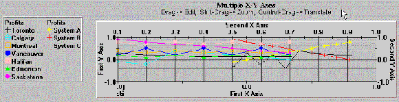
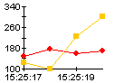
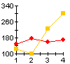
5.1.1 Multiple Axes
MultiChartcan have two X- and two Y-axes, as in the example below:
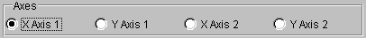
Setting Properties on Multiple Axes
Axis properties can be set for each axis individually. At the top of each axis editor you will see four radio buttons:
When a radio button is selected, all that follows below will apply to that axis.
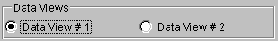
5.1.2 Multiple Data Views
MultiChartallows you to load data from two different sources at the same time. When loading data from two different sources, they are each assigned to a separate data view.
By default, both data views are showing, but you can hide or reveal data views depending on your application's needs. Both sets of data can be mapped to the same set of X- and Y-axes, or, mapped to different axes.
Note: Radar, area radar, and pie charts do not support multiple data views. For more information on Data Views, see Data Views, in Chapter 8.
5.1.3 Intelligent Defaults
MultiCharthas a sophisticated set of dynamic default settings in the custom property editors. You can override these defaults to suit your needs. When you override a default value in a text editor, it becomes static, and will not automatically adjust anymore.Returning to Default Values
If you want to return to default settings in the custom editors after overriding them, all you have to do is delete the contents of the changed field, and leave it blank. The next time you bring the editor you will see that the automatic values have returned.
5.2 Getting Started with MultiChart
MultiCharthas a sophisticated set of dynamic default settings that adjust to your data and other settings. This means that you only have to make a minimum of settings to have a respectable chart. The following list describes the most common start-up tasks and the editors used for them:
- Load Data. To load data in the chart, use the DataSource editor. This editor allows you to load data from one or two sources. There is also a default set of data built-in that you can use to experiment with. Alternately, you can use a Swing
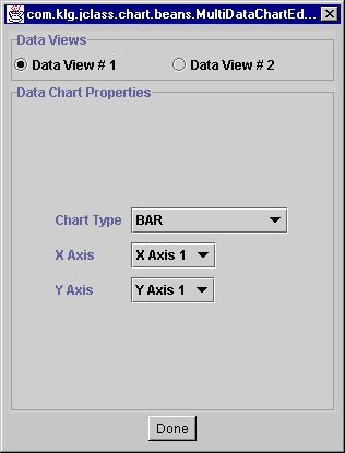
TableModeldata object as the chart's data source using theSwingDataModelproperty.- Select Chart Types. For each data view, you can select a chart type and the axes that the data will be plotted against with the DataChart editor.
- Set BackGround Color. Use ChartAppearance to set the color of the chart background.
- Set Axis Annotation. By default,
MultiChartuses values to annotate the axes. You can also use value labels, point labels, or time labels by setting the annotation type with the AxisAnnotation editor.- Add a Legend. Add a legend by checking the Visible box in the LegendAppearance editor.
- Add a Header and Footer. To add a header, use HeaderText to add the text, and then select the Visible check box in HeaderAppearance. The footer is the same, but uses the FooterText, and FooterAppearance editors
- Add Extra Axes. By default a standard X-Y axis set is displayed. If you require, you can display a second X- or Y-axis. Display them with the AxisMisc editor's Visible property. Then use the many axis editors, such as AxisPlacement, to set up and align the axes.
5.3 MultiChart Property Reference
The following property reference section covers all of
MultiChart'sfeatures.
5.3.1 Axis Controls
This group of editors sets up the axes.
MultiCharthas a sophisticated set of automatic default values that adjust to your data. This makes chart development fast and easy.MultiChartis also extremely flexible, and every aspect of the axes can be adjusted.AxisAnnotation
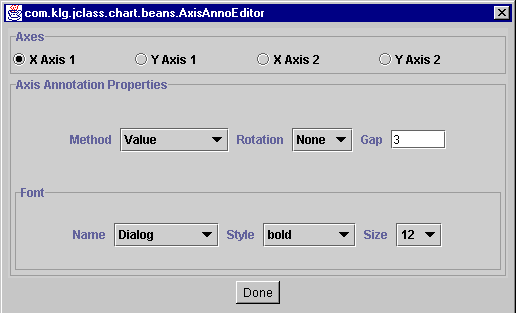
With the
AxisAnnotationeditor, you can set the annotation type for each axis, and control how they look. Axis annotations are numbers or text that appear along the axes. Options in the Method menu are:Value,Time_Labels,Point_Labels, andValue_Labels.
For each of the labelling methods, there is a corresponding editor that gives you more control over the behavior and appearance. For Value, use AxisScale, for
Point_Labels, use AxisPointLabels, forTime_Labels, use AxisTimeLabels, and forValue_Labels, use AxisValueLabels.The following examples illustrate the different label types:
With the Rotation property, you can rotate the labels on the axis. The following example shows Value_Labels, rotated by 270 degrees and with bold, 12pt font:
Gap controls the space between annotations, in pixels. If, for example, you used point labels, you could use the Gap property to make sure they have enough room to display properly.
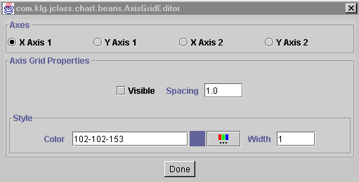
AxisGrid
Use the
AxisGrideditor to set up gridlines on each of the axes. There are also controls for color, line spacing, and line width of the gridlines.
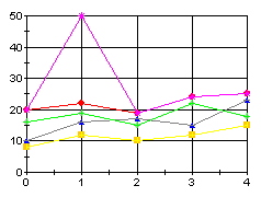
The following example sets X Axis 1 grid and Y Axis 1 grid to Visible with Spacing = 1 and Width = 1 for the X Axis, and with Spacing = 1 and Width = 10 for the Y Axis:
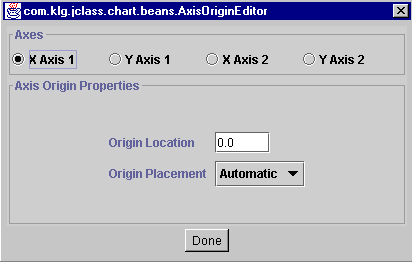
AxisOrigin
The
AxisOrigineditor allows you to specify an origin by coordinates, or by choosing an option from a pull down menu. By default, axes origins are set automatically, based on the available data.To place the origin, you can select one of the locations from the pull-down menu, such as Min or Max. If you want to set the origin to a specific value on the axis, select
Value_Anchoredfrom the menu and then enter the value in the Origin field:
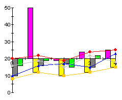
The following example anchors the origin of Y Axis 1 at 20 (default data):
Note that, by default, X Axis 1 is placed at the origin of Y Axis 1. To override this default, use the AxisPlacement editor.
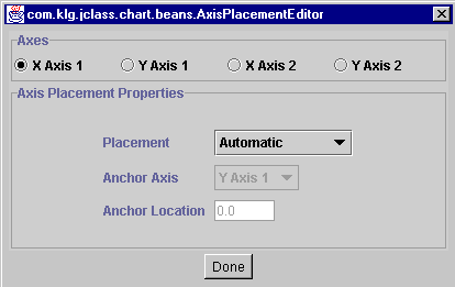
AxisPlacement
Axis placement determines the placement of an axis in relation to another. By default, this is set automatically by
MultiChart, based on the given data. Sometimes, however, you may want to locate an axis in a different location.
Using the Placement field, select the type of placement for the axis selected. Placement options include:
Min,Max,Automatic.Origin, andValue_Anchored.The Axis field selects the anchor-axis that you want to place the current axis against (for example, place X Axis 1 in relation to Y Axis 2). If you select
Noneas an Axis,MultiChartwill use the default axis.To place the axis at a specific value along another axis, select
Value_Anchoredfrom the pull-down menu, and enter the value in the Location field.The following example shows X Axis 1, with a Placement of
Maxin relation to Y Axis 1:
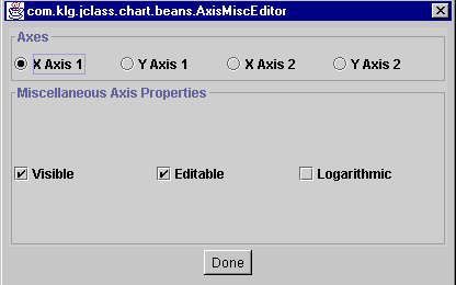
AxisMisc
Use
AxisMiscto show or hide any of the axes. It also allows you to make any axis logarithmic. TheEditableproperty, when selected, allows zooming, editing, and translation for the selected axis. For more information on interactive events, see Section 5.3.6, Event Controls.
The following example hides X Axis 1 from view by deselecting
Visible.
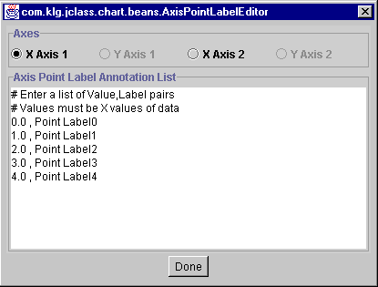
AxisPointLabels
Use the
AxisPointLabelseditor to create point labels (applies to X1 and X2 axes only). Point labels label specific points of data on the X-axes.The editor reads data from the data source associated with the selected axis and provides a list of point labels. To change the text in these labels, change the text alongside the point. Note that the format is "point value then comma then the name of the label". For example,
3.0, PointLabel3In order for the labels to appear on the chart, you also have to set the annotation method to Point_Labels in the
AxisAnnotationeditor. See below for an example.
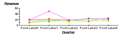
The following example shows how the default data's point labels appear on
X Axis 1:
Note that if you are mapping multiple data sources against a single axis, then you will want to use value labels instead, as the
AxisPointLabelseditor only uses points from the first data source associated with the selected axis.AxisRelationships
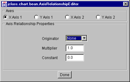
The
AxisRelationshipeditor allows you to create a mathematical relationship between two axes. For example, if you want to create a thermometer chart with Celsius values on the left and the Fahrenheit values on the right, you could create a Celsius axis, and then base the Fahrenheit axis values on it.There are three properties included in this calculation: Originator, Multiplier, and Constant. The calculation is based on the formula:
New Axis Value = Constant + Multiplier X Originator.
To use this editor, first click on the radio button next to the Axis that you want to alter. Next, select an axis from the Originator menu that your calculation will be based on, and then enter a value in the Multiplier field that represents the relationship. The Constant value is optional; its default value is 0.0.
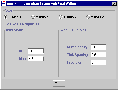
AxisScale
The
AxisScaleeditor controls the range on each axis, the interval of the numbering, and Tick Spacing. It is used primarily for the Value method of axis annotation (see the AxisAnnotation). Precision determines the numeric precision of the axis numbering.The effect of Precision depends on whether it is positive or negative:
- Positive values add that number of places after the decimal place. For example, a value of 2 displays an annotation of 10 as "10.00".
- Negative values indicate the minimum number of zeros to use before the decimal place. For example, a value of -2 displays annotation in multiples of 100.
The default value of Precision is calculated from the data supplied.
The Min and Max fields determine the range of data that is displayed on the chart. There are intelligent defaults in this editor that adjust to your data and other chart settings. You can override these settings with the fields provided.
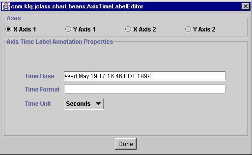
AxisTimeLabels
The
AxisTimeLabeleditor allows you to control how the time labels appear. When you select the annotation method withAxisAnnotations, you can select time labels, which represent the values on the axis as units of time.Time Base determines the date and time that the labelling starts from (default is current time/date). Time Unit is the unit of time the labels use, such as year, month, day, minute, second, and so on. The default time unit is minutes.
Time Format allows you to customize the text in the time labels with a set of formatting codes. See Axis Labelling and Annotation Methods, in Chapter 7, for a list of these codes.
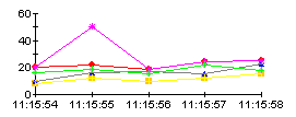
The following example uses time labelling on X Axis 1, with seconds as the time unit:
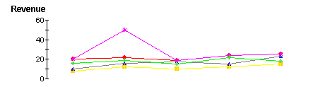
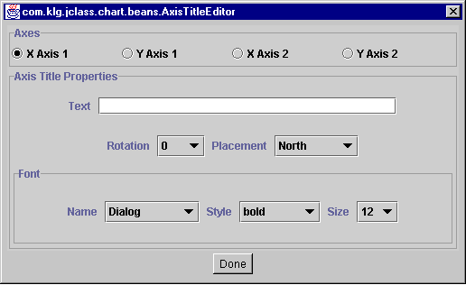
AxisTitle
Using the
AxisTitleeditor, you can add axis titles to each axis. There are also settings for the font, point, rotation, and placement of the title.
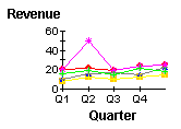
In the Placement field's pull-down menu are a list of compass directions for title placement. Not all options are available to X- and Y-axes. If you select a placement, and it returns to the previous selection, that placement is not available for that axis. The following image shows the effects of adding titles to X Axis 1 and Y Axis 1, and setting the font to bold, with a size of 12:
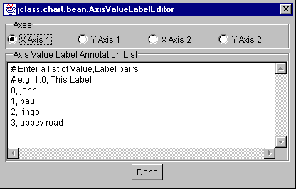
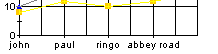
AxisValueLabels
Use the
AxisValueLabeleditor to enter value labels for the axes. Value labels appear along the axis at specified values. You also have to set the annotation method to Value_Labels, in theAxisAnnotationeditor before the labels will display.
To add value labels, enter the value, followed by a comma and a label (see above). The following example shows how the labels in the editor above appear on X Axis 1.
5.3.2 Headers, Footers, and Legends
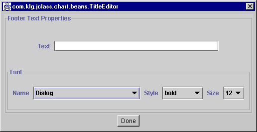
FooterText
The
FooterTexteditor allows you to enter text that will appear at the bottom of the chart area. You can also select a font, font style, and size for the footer.
Note that the footer will not display unless you check the Visible box, in the FooterAppearance editor (this editor also controls footer opacity, background, and foreground).
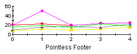
The following example shows how a `pointless footer' appears on the chart area:
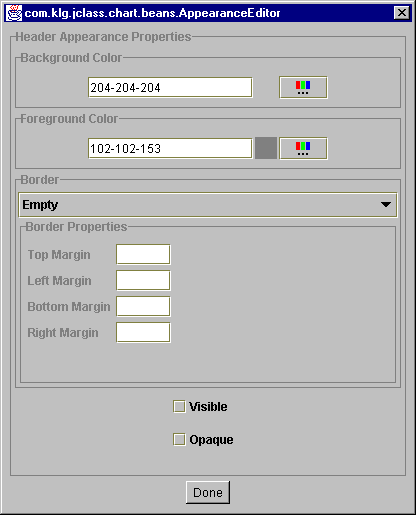
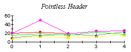
HeaderText
The
HeaderTexteditor allows you to enter header text, that will appear at the top of the chart area. You can also select a font, font style, and size of the header.
Note that the header will not display unless you check the Visible box, in the HeaderAppearance editor (which also controls header opacity, background and foreground).
The following example shows how a `pointless header' displays on the chart:
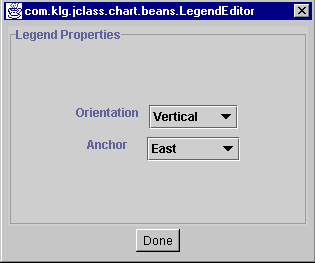
LegendLayout
The
LegendLayouteditor controls the layout of the legends. Orientation determines how the legend items are placed in the legend (either vertically or horizontally). The Anchor property positions the entire legend on the chart, based on compass directions.In order for the legend to display on your chart, the Visible checkbox in the LegendAppearance editor must be selected.
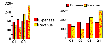
Below are two examples of legend layout:
The example on the left uses the default settings with Anchor =
Eastand Orientation =Vertical. In the example on the right, Anchor =Northand Orientation =Horizontal.
5.3.3 Data Source and Data View Controls
This group of editors manages the properties that control the data source, and the views on the data.
MultiChartcan load data from two different sources. Each of the data sources is assigned to a data view.DataChart
The
DataCharteditor allows you to select the chart type of each data view, and which axes each data view will be mapped against.
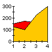
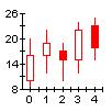
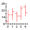
The ChartType property selects from the following chart types:
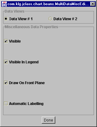
DataMisc
The
DataMisceditor controls several aspects of the data views.
With the Visible property, you can show or hide each data view from the display area. Visible In Legend will show/hide a data view from the legend (but the data will still be charted).
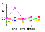
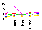
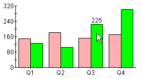
Automatic Labelling attaches a dwell label to every data point in the chart. A dwell label is an interactive label that shows the value of a point, bar or slice, when a user's mouse moves over it. In the example below, `225' appears on top of the green bar as the cursor passes over it, indicating that the value of the bar is 225.
When Draw on Front Plane is selected, the data view will be mapped on the front plane of a three dimensional chart space. Applies only in cases where there are multiple data series, displayed on multiple axes, using 3D effects.
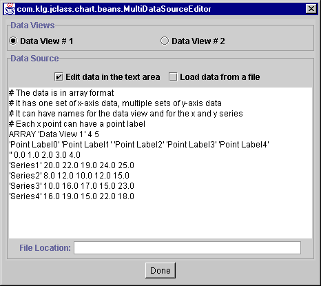
DataSource
There are three ways of loading data with the
MultiChartBean. Two are handled by this property: from a .dat file, or by entering data directly into the custom editor. Both methods are managed by theDataSourceeditor.The third method is to use a Swing
TableModel-type data object as a data source, instead of using the JClass Chart built-in data source. SeeSwingDataModelbelow for details.The first step is to select a data view with one of the radio buttons. Then, follow the procedure below for each data view.
To load data from a file into a data view, click Load data from a file, enter the name of the file in the File Location field, and click Done:
Specify the full path of the file. The file must be pre-formatted to the JClass Chart Standard (see Data Sources, in Chapter 8). Sample data files are located in the JCLASS_HOME/jclass/chart/examples directory.
You can use the data provided in the editor, as is, or you can modify it. To use existing data, just check the Edit data in the text area radio button, and click Done. Change data by deleting and inserting text in the area provided. Be careful to preserve the punctuation surrounding the original text:
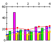
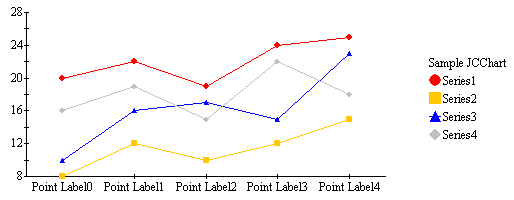
The chart below shows how the default data for Data View 1 appears as a plot. Notice where the different elements are positioned. Each point on the X-axis is labelled with the names specified in the default data. The name of each series of y-values appears in the legend. The name of the data view is positioned directly above the legend.
In order for the default data to display this way, you must first set the
xAxisAnnotationproperty toPoint_Labels, and thelegendVisibleproperty totrue.
SwingDataModel
Instead of using the chart's internal data source, you can use a Swing
TableModel-type data object that you have already created for your application, if your IDE supports an editor forTableModel. This saves reformatting your data to match the format used by JClass Chart.Use the
SwingDataModel1property to specify an already-created SwingTableModelobject to use as the data source for the first data view. UseSwingDataModel2to specify aTableModelobject to use for the chart's second data view.
5.3.4 Appearance Controls
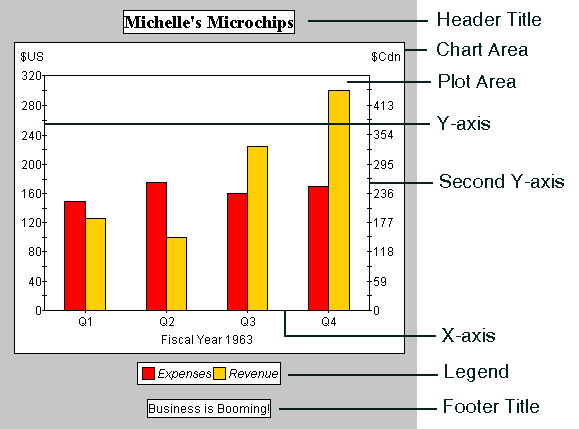
This group of editors allows you to control the look of specific chart subcomponents. You can control font, borders, background, and foreground for the chart, chart area, plot area, header, footer, and legend. The following diagram illustrates the different chart subcomponents.
All of the editors have the same basic functionality that apply to a specific chart subcomponent, as follows:
Small differences in each editor will be discussed below. Note that for most of the appearance editors, there are corresponding editors for controlling other properties of that chart element.
ChartAppearance
The
ChartAppearanceeditor sets the foreground/background border, and opaque values for the chart. This editor affects the areas behind all other chart elements.ChartAreaAppearance
The
ChartAreaAppearanceeditor sets the foreground/background border, visible, and opacity values for the chart area (see diagram above).FooterAppearance
The
FooterAppearanceeditor sets the foreground/background border, visible, and opaque values for the footer. When Visible is checked, the footer will be displayed in the chart. By default the footer is not showing. TheFooterAppearanceeditor works in conjunction with the FooterText editor, which is used to enter the footer text.HeaderAppearance
The
HeaderAppearanceeditor sets the foreground/background border, visible, and opaque values for the header. When Visible is checked, a header will be displayed in the chart. By default the header is not showing. This editor works in conjunction with the HeaderText editor.LegendAppearance
The
LegendAppearanceeditor sets the foreground/background border, visible, and opaque values for the legend and determines if it is displayed. By default, the legend will not appear. When Visible is checked, a legend will be displayed in the chart.The content of the legend comes from the information in the data source. In order to change the contents of the legend, you have to change what is in the data source. For information on how to set up legend items in the data source, see Data Formats, in Chapter 8.
Other legend settings are found in the LegendLayout editor.
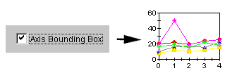
PlotAreaAppearance
The
PlotAreaAppearanceeditor sets the foreground and background for the plot area, and allows you to add an Axis Bounding Box. A bounding box is a graphical feature that closes off the axes, thus forming a square.
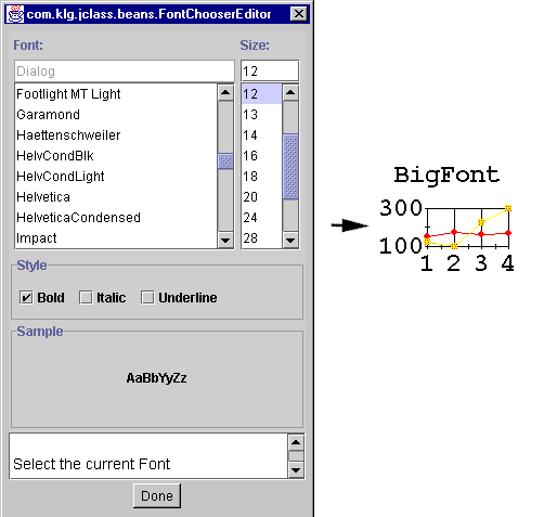
Font
The
Fonteditor sets the font defaults for your chart.The font you choose will apply to all text on the chart simultaneously. The following example sets the font to Courier, Bold, 24 point:
This font editor sets up a default font for the chart (not including the header and footer). You can, however, change font for selected elements using custom editors for each property. For example, the HeaderText, FooterText, and AxisAnnotation editors allow you to override the default font settings.
5.3.5 View3D
To add 3D effects to your chart, click the
View3Dproperty.First drag the red square in the editor until it has the desired Elevation and Rotation. Then, check the Change Depth option box, and drag the red square until it has the Depth you want to see on your chart. The degree of depth, elevation and rotation is displayed in numbers at the top of the editor. Click Done to set the changes:
5.3.6 Event Controls
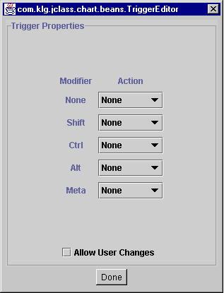
TriggerList
The
TriggerListeditor sets up what user events the chart will handle, either from a mouse, or mouse-keyboard combination.
Actions are the available event mechanisms, such as
Zoom,Rotate,Depth,Customize,Pick, andTranslate. By setting up these triggers, the end-user can examine data more closely or visually isolate part of the chart. The following list describes these interactions:
- Translate allows moving of the chart.
- Zoom allows zooming into or out from the chart.
- Rotate allows rotation (only for bar or pie charts displaying a 3D effect).
- Depth allows adding depth cues to the chart (only for bar or pie charts displaying a 3D effect).
- Customize allows the user to launch the chart Customizer. To use this feature, you must also check the Allow User Changes box.
- Pick allows you to set up pick events. The
pickmethod is used to retrieve an x,y coordinate in a Chart from user input and then translate that into the data point nearest to it. This feature requires some non-bean programming. See Using Pick and Unpick, in Chapter 10, for more details.A Modifier is a keyboard event that can `modify' a mouse click.
It is also possible in most cases for the user to reset the chart to its original display parameters. The interactions described here affect the chart displayed inside the
ChartArea; other chart elements, like the header, are not affected.
|
|