  
|
7
Axis Controls
Creating a New Chart in a Nutshell
Axis Labelling and Annotation Methods
Chart Orientation and Axis Direction
Logarithmic Axes
Adding Gridlines
JClass Chart can automatically set properties based on the data, so axis numbering and data display usually do not need much customizing. You can however, control any aspect of the chart axes, depending on your requirements. This chapter covers the different axis controls available. If you are developing your chart application using one of the JClass Chart Beans, please refer to Bean Reference, in Chapter 4.
7.1 Creating a New Chart in a Nutshell
- If one exists, use an existing chart as a starting point for the new one. The sample charts provided in JCLASS_HOME/examples/chart/ are a good starting point. Load a chart description resembling the new chart.
- Load your data into the chart.
- Set the chart type.
- Annotate and format the axes and data if necessary, described as follows:
7.2 Axis Labelling and Annotation Methods
There are several ways to annotate the chart's axes, each suited to specific situations.
- The chart can automatically generate numeric annotation appropriate to the data it is displaying.
- You can provide a label for each point in the chart (X-axis only).
- You can provide a label for specific values along the axis.
- The chart can automatically generate time-based annotations.
Please note that none of the axis properties discussed in this section apply to Pie charts because Pie charts do not have axes. To annotate a Pie Chart, use Chart Labels; for more information, please see Chart Labels, in Chapter 9.
Whichever annotation method you choose, the chart makes considerable effort to produce the most natural annotation possible, even as the data changes. You can fine-tune this process using axis annotation properties.
User-set annotations support the use of HTML tags. The use of HTML tags overrides the default
FontandColorproperties of the label.Please note that HTML labels may not work with PDF, PS, or PCL encoding.
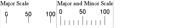
7.2.1 Choosing Annotation Method
A variety of properties combine to determine the annotation that appears on the axes. The
JCAxisAnnotationMethodproperty specifies the method used to annotate the axis. The valid annotation methods are:Notes:
- Point labels annotation (
JCAxis.POINT_LABELS) is only valid for an X-axis when it has been added to the X-axis collection inJCChartArea. This means that a newJCAxisinstance that has not yet been added toJCChartAreawill not be considered an X-axis.- The spokes of Area Radar and Radar charts are automatically labelled "0", "1", "2", and so forth, unless the X-annotation method is
JCAxis.POINT_LABELS.NumSpacinghas no effect on value labels.- For Polar charts, the default annotation for
JCAxis.VALUEdepends on the angle units specified. If it is radians, the symbol for pi will not be used (it will be represented by 3.14 instead). Also, the X-axis will always be linear; that is, setting the logarithmic properties totruewill be ignored.The following topics discuss setting up and fine-tuning each type of annotation.
7.2.2 Values Annotation
Valuesannotation produces numeric labelling along an axis, based on the data itself. The chart can produce very natural-looking axis numbering automatically, but you can fine-tune the properties that control this process.Axis Annotation Increments, Numbering, and Precision
When a
JCAxisis instantiated, a pair ofJCAnnoobjects representing default labels and ticks are automatically created and set on the axis. Those defaultJCAnnoobjects may be modified, deleted, or augmented with otherJCAnnoobjects.The following describes the different properties that can be set on a
JCAnnoobject in order to fully customize the labels and tick marks:When the annotation method for an axis is
VALUE_LABELS,POINT_LABELS, orTIME_LABELS, the labels are either user-supplied or internally generated without the use ofJCAnnoobjects. The booleanUseAnnoTicksproperty of aJCAxisdetermines how tick marks are drawn in those cases. IfUseAnnoTicksistrue, tick marks are drawn at the labels. If the value isfalse, ticks defined byJCAnnoobjects are drawn instead.Using multiple
JCAnnoobjects, an axis can be drawn with major and minor ticks. Labels can be turned on or off for the individual tick series, as can the actual tick marks, enabling further flexibility.
Figure 20 : Different tick styles that can be applied to a chart axis.
Please refer to the
AnnoGrid.javaexample included in the examples/chart/intro package to view different tick marks in a JClass Chart example.
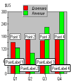
7.2.3 PointLabels Annotation
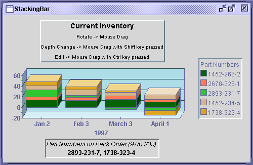
PointLabelsannotation displays defined labels along an X-axis. This is useful for annotating the X-axis of any chart for which all series share common X-values.PointLabelsare most useful with bar, stacking bar, and pie charts. It is possible to add, remove, and editPointLabels. In JClass Chart,PointLabelsare typically defined with the data.
Figure 21 : PointLabels X-axis annotation.
PointLabelsare a collection of labels. The first label applies to the first point, the second label applies to the second point, and so on.The labels can also be supplied by setting the
String[] labels = {"Q1", "Q2", "Q3, "Q4"}; c.getChartArea().getXAxis(0).setAnnotationMethod(JCAxis.POINT_LABELS);PointLabelsproperty of theChartDataViewobject for this chart. For example, the following code specifies labels for each of the three points on the X-axis:
ChartDataView cd = c.getDataView(0);
ArrayList pLabels = new ArrayList();
for (int i = 0; i < labels.length; i++) {
pLabels.add(labels[i]);
}
cd.setPointLabels(pLabels);For Polar, Radar, and Area Radar charts, if the X-axis annotation is
POINT_LABELSand the data is of type array, then a point label is drawn at the outside of the X-axis for each point. (Series labels are used in the legend as usual.)
7.2.4 ValueLabels Annotation
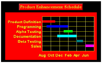
ValueLabelsannotation displays labels at the axis coordinate specified. This is useful for displaying special text at a specific axis coordinate, or when a type of annotation that the chart does not support is needed, such as scientific notation. You can set the axis coordinate and the text to display for eachValueLabel, and also add and remove individualValueLabels.
Figure 22 : Using ValueLabels to annotate axes.
Every label displayed on the axis is one
ValueLabel. EachValueLabelhas aValueproperty and aLabelproperty.If the
String[] labels = {"Sales", "Beta Testing", "Documentation",AnnotationMethodproperty is set toJCAxis.VALUE_LABELS, the chart places labels at explicit locations along an axis. TheValueLabelsproperty ofJCAxis, which is aValueLabelscollection, supplies this list of Strings and their locations. For example, the following code sets value labels at the locations 10, 20, and 30:
"Alpha Testing", "Programming",
"Production Definition"};
JCAxis y = c.getChartArea().getYAxis(0);
y.setAnnotationMethod(JCAxis.VALUE_LABELS);
JCValueLabel[] valueLabels = new JCValueLabel[labels.length];
for (int i = 0; i < labels.length; i++) {
valueLabels[i] = new JCValueLabel(10.0 * (i + 1), labels[i], y);
}
y.setValueLabels(valueLabels);The
JCAxis x = c.getChartArea().getXAxis(0);ValueLabelscollection can be indexed either by subscript or by value:
// The following retrieves the second value label
JCValueLabel v1 = x.getValueLabels(1);
// The following retrieves the closest label to chart coordinate 2.0
JCValueLabel v2 = x.getValueLabel(2.0);
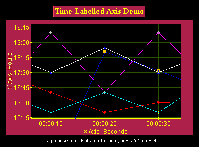
7.2.5 TimeLabels Annotation
TimeLabelsannotation interprets the value data as units of time. The chart calculates and displays a time-axis based on the starting point and format specified. A time-axis is useful for charts that measure something in seconds, minutes, hours, days, weeks, months, or years.
Figure 23 : TimeLabels annotating X- and Y-axes.
Four properties are used to control the display and behavior of
TimeLabels:
AnnotationMethod(set toJCAxis.TIME_LABELSto use this annotation method)TimeUnitTimeBaseTimeFormatTime Unit
Use the
TimeUnitproperty to specify how to interpret the values in the data. Select eitherJCAxis.SECONDS,JCAxis.MINUTES,JCAxis.HOURS,JCAxis.WEEKS,JCAxis.MONTHS, orJCAxis.YEARS. For example, when set toJCAxis.YEARS, values that range from 5 to 15 become a time-axis spanning 10 years. By default,TimeUnitis set toJCAxis.SECONDS.Time Base
Use the
TimeBaseproperty to set the date and time that the time-axis starts from. Use the JavaDateclass (java.util.Date) to specify theTimeBase. The default forTimeBaseis the current time.For example, the following statement sets the starting point to January 15, 1985:
c.getChartArea().getXAxis(0).setTimeBase(new Date(85,0,15));Time Format
Use the
TimeFormatproperty to specify the text to display at each annotation point. TheTimeFormatIsDefaultproperty allows the chart to automatically determine an appropriate format based on theTimeUnitproperty and the data, so it is often unnecessary to customize the format.
TimeFormatspecifies a time format. You build a time format using the Java time format codes from thejava.text.SimpleDateFormatclass. The chart displays only the parts of the date/time specified byTimeFormat. The format codes are based on the default Java formatting provided by java.text.The default for
TimeFormatis the same as the default used by Java'sSimpleDateFormatclass (located in thejava.textpackage).Using Date Methods
The
dateToValue()method converts a Java date value into its corresponding axis value (a floating-point value). ThevalueToDate()method converts a value along an axis to the date that it represents. Note that the axis must already be set as a time label axis.Here is a code example showing the
JCAxis y = chart.getChartArea().getYAxis(0);dateToValue()method converting a date (in this case, February 2, 1999) to a Y-axis value, and showing thevalueToDate()method converting a Y-axis value (in this case, 3.0) to the date that it represents.
Date d = y.valueToDate(3.0);
double val = y.dateToValue(new Date(99,1,2));
7.2.6 Custom Axes Labels
JClass Chart will label axes by default. However, you can also generate custom labels for the axes by implementing the
JCLabelGeneratorinterface. This interface has one method -makeLabel()- that is called when a label is required at a particular value.Note that the spokes of Radar and Area Radar charts will be automatically labelled "0", "1", "2", and so forth, unless the X-annotation method is
JCAxis.POINT_LABELS.To generate custom axes labels, the axis'
AnnotationMethodproperty, which determines how the axis is labelled, must be set toVALUE. Also, thesetLabelGenerator()method must be called with the class that implements theJCLabelGeneratorinterface.The number of labels, that is, the number of times
makeLabel()is called, depends on theNumSpacingparameter of the axis. Not all labels will be displayed if there is not enough room.The
makeLabel()method takes two parameters:value(the axis value to be labelled) andprecision(the numeric precision to be used).class MyLabelGenerator implements JCLabelGenerator
- In the usual case, the
makeLabel()method returns aString, and thatStringwill be used as the axis label atvalue.- If the
makeLabel()method returns aChartTextobject, then thatChartTextobject will be used as the axis label atvalue.- If an object other than
StringorChartTextis returned, theStringderived from calling that object'stoString()method will be used as the axis label atvalue.Here is a code example showing how to customize the labels for a linear axis by implementing the
JCLabelGeneratorinterface. In this case, Roman numeral labels are going to be generated (instead of the usual Arabic labels) for the numbers 1 through 10.
{
public Object makeLabel(double value, int precision) {
int intvalue = (int) value;
String s = null;
switch (intvalue) {
case 1 :
s = "I";
break;
case 2 :
s = "II";
break;
case 3 :
s = "III";
break;
case 4 :
s = "IV";
break;
case 5 :
s = "V";
break;
case 6 :
s = "VI";
break;
case 7 :
s = "VII";
break;
case 8 :
s = "VIII";
break;
case 9 :
s = "IX";
break;
case 10 :
s = "X";
break;
default :
s = "";
break;
}
return s;
}
}Note that the user will need to specify the label generator as follows:
axis.setLabelGenerator(new MyLabelGenerator());Also note that JClass Chart calls the
makeLabel()method for each needed label (recall that each axis requests needed labels based on itsNumSpacing,Min, andMaxproperties). Thus, if JClass Chart needs n labels, themakeLabel()method is called n times.
7.3 Positioning Axes
Use the
axis.setPlacement(JCAxis.MIN);Placementproperty to make a specific axis placement or use thePlacementIsDefaultproperty to specify whether the chart is meant to determine axis placement. When making a specific axis placement, the axis may be placed against its partner axis at the partner axis' minimum value, maximum value, origin value, or a user-specified value.will place the axis against its partner axis' minimum value, and
axis.setPlacement(otherAxis, 5.0)will place the axis against
otherAxisat the value 5.0.Note: When
Placementis set to Origin, changing the axis origin will move the placed axis to the new origin value.
Figure 24 : An example of axes positioning; the X-axis is placed against the Y-axis' minimum value.
Polar Charts - Special Minimum and Maximum Values
Note that for Polar charts, the X-axis max and min values are fixed, and these fixed values change depending on the angle unit type. The Y-axis max and min values are adjustable, but are constrained to avoid data clipping. The Y-axis min will never be less than zero (unless the Y-axis is reversed). (theta, -r) will be interpreted as (theta+180, r). The Y-axis min will always be at the center unless the axis is reversed, in which case the Y-axis max will be at the center.
Radar and Area Radar Charts - Minimum Values
The minimum value for a Y-axis in Radar and Area Radar charts can be negative.
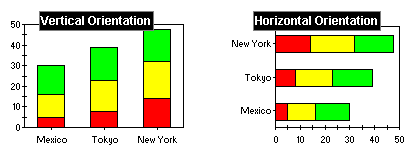
7.4 Chart Orientation and Axis Direction
A typical chart draws the X-axis horizontally from left-to-right, and the Y-axes vertically from bottom-to-top. You can reverse the orientation of the entire chart, and/or the direction of each axis.
7.4.1 Inverting Chart Orientation
Use the
ChartDataViewobject'sInvertedproperty to change the chart orientation. When set totrue, the X-axis is drawn vertically and the Y-axis horizontally for the data view. Any properties set on the X-axis then apply to the vertical axis, and Y-axis properties apply to the horizontal axis.Note: To switch the orientation of charts with multiple data views, you must set the
Invertedproperty of eachChartDataViewobject.
Figure 25 : Normal and inverted orientation.
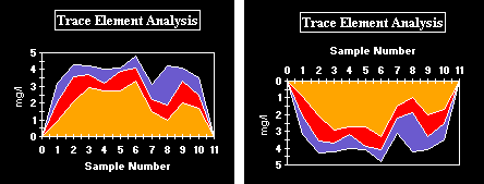
7.4.2 Changing Axis Direction
Use the
Reversedproperty ofJCAxisto reverse the direction of an axis. By default,Reversedis set tofalse.
Figure 26 : Two charts depicting a normal and reversed Y- axis.
For Polar charts, data points with positive X-values will be displayed in a counterclockwise direction starting at the origin base. When the
XAxis.reversedflag istrue, positive X-values will be displayed clockwise.
7.5 Setting Axis Bounds
Normally a graph displays all of the data it contains. There are situations where only part of the data is to be displayed. This can be accomplished by fixing axis bounds.
Min and Max
Use the
MinandMaxproperties ofJCAxisto frame a chart at specific axis values. TheMinIsDefaultandMaxIsDefaultproperties allow the chart to automatically determine axis bounds based on the data bounds.
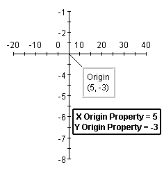
7.6 Customizing Origins
The chart can choose appropriate origins for the axes automatically, based on the data. It is also possible to customize how the chart determines the origin, or to directly specify the coordinates of the origin.
Figure 27 : Defining origins for X- and Y-axes.
Origin Placement
The easiest way to customize an origin is by controlling its placement, using the Axes'
OriginPlacementproperty. It has four possible values:AUTOMATIC,ZERO,MIN, andMAX. When set toAUTOMATIC, the origin is placed at the axis minimum or at zero, if the data contains positive and negative values or is a bar chart.ZEROplaces the origin at zero.MINplaces the origin at the minimum value on the axis.MAXplaces the origin at the maximum value on axis.Origin Coordinates
When the origin of a coordinate must be set to a value different from the default (0,0), use the
Axes'Originproperty. TheOriginIsDefaultproperty allows the chart to automatically determine the origin coordinate based on the data.Note: When an origin coordinate is explicitly set or fixed, the chart ignores the
OriginPlacementproperty.
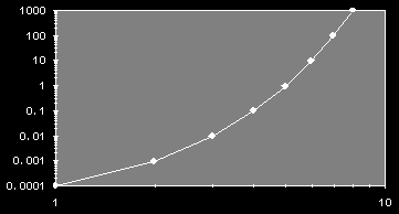
7.7 Logarithmic Axes
Axis annotation is normally interpreted and drawn in a linear fashion. It is also possible to set any axis to be interpreted logarithmically (log base 10), as shown in the following image. Logarithmic axes are useful for charting certain types of scientific data.
Figure 28 : Logarithmic X- and Y-axes.
Because of the nature of logarithmic axes, they impose the following restrictions on the chart:
- any data that is less than or equal to zero is not graphed (it is treated as a data hole), since a logarithmic axis only handles data values that are greater than zero. For the same reason, axis and data minimum/maximum bounds and origin properties cannot be set to zero or less.
- axis numbering increment, ticking increment, and precision properties have no effect when the axis is logarithmic.
- the X-axis of bar and stacking bar charts cannot be logarithmic.
- the annotation method for the X-axis cannot be
PointLabelsorTimeLabels.Specifying a Logarithmic Axis
Use the
Logarithmicproperty ofJCAxisto make an axis logarithmic.Note: Pie charts are not affected by logarithmic axes.
7.8 Titling Axes and Rotating Axis Elements
Adding a title to an axis clarifies what is charted along that axis. You can add a title to any axis, and also rotate the title or the annotation along the axis, as shown below.
Figure 29 : Rotated axis title and annotation.
Adding an Axis Title
Use the
Titleproperty to add a title to an axis. It sets theJCAxisTitleobject associated with theJCAxis.JCAxisTitlecontrols the appearance of the axis title.JCAxisTitle'sTextproperty specifies the title text.Axis Title Rotation
Use the
Rotationproperty ofJCAxisTitleto set the rotation of the title. Valid values are defined inChartText:DEG_0(no rotation),DEG_90(90 degrees counterclockwise),DEG_180(180 degrees), andDEG_270(270 degrees).Rotating Axis Annotation
Use the
AnnotationRotationproperty ofJCAxisto rotate the axis annotation to either 90, 180, or 270 degrees clockwise from the horizontal position. 90-degree rotation usually looks best on a right-hand side axis.This property can also be used to rotate the annotation at any other specified angle, if it is set to
AnnotationRotation.ROTATION_OTHER. The new angle will be determined by theAnnotationRotationAngleproperty's value. By default, the angle is 0.0 degrees.It is important to know that some fonts may not draw properly at an angle; therefore, they might not be visually appealing. If you are using rotated labels, your font choice should be made with care.
Note: In some cases, rotated labels will overlap. When labels overlap, the
visibleproperty for the higher indexed label is cleared, and only the lower indexed label is visible.
7.9 Adding Gridlines
Displaying a grid on a chart can make it easier to see the exact value of data points. The spacing between lines on the grid can be defined to determine how a grid is displayed.
Figure 30 : JClass Chart illustrating the effects of gridlines.
Horizontal gridlines are a property of the Y-axis. Vertical gridlines are a property of the X-axis. Set
GridVisibletotrueto display gridlines.Note that for Polar charts, Y-gridlines will be circular while X-gridlines will be radial lines from the center to the outside of the plot. For both Radar and Area Radar charts, radar lines are represented by the X-axis gridlines. You may choose normal gridlines (circular) or "webbed" gridlines. For the Y-axis, you may also have gridlines on (default is off).
Grid Spacing
Use the
GridSpacingproperty to customize the grid spacing for an axis. TheGridSpacingIsDefaultproperty allows the chart to space the grid automatically, drawing a gridline wherever there is annotation. By default, gridlines will correspond with axis annotations.Grid Appearance
Use the grid
otherXAxis.setGridVisible(true);GridStyleproperties to customize the line pattern, thickness, and color of the gridlines. The following code fragment provides a sample ofGridStyleandGridVisibleused within a program:
otherXAxis.getGridStyle().getLineStyle().setColor(Color.green);
otherYAxis.setGridVisible(true);
otherYAxis.getGridStyle().getLineStyle().setColor(Color.green);
7.10 Adding a Second Axis
There are two ways to create a second Y-axis on a chart. The simplest way is to define a numeric relationship between the two Y-axes, as shown in the following illustration. Use this to display a different scale or interpretation of the same graph data.
Note that for Polar, Radar, and Area Radar charts, there is no second Y-axis.
Defining Axis Multiplier
Use the
Multiplierproperty to define the multiplication factor for the second axis. This property is used to generate axis values based on the first axis. The multiplication factor can be positive or negative.Using a Constant Value
Use the
Constantaxis property to define a value to be added to or subtracted from the axis values generated byMultiplier.
Figure 31 : Chart containing multiple Y-axes.
In some cases, it may be desirable to show two sets of data in the same chart that are plotted against different axes. JClass Chart supports this by allowing each
// Create a Y-axis and set it verticalDataViewto specify its ownXAxisandYAxis. For example, consider a case in which a second data setd2is to be plotted against its own Y-axis. AJCAxisinstance must be created and added to theJCChartArea, as shown:
otherYAxis = new JCAxis();
otherYAxis.setVertical(true);
// Add it to the list of Y-axes in the chart area
c.getChartArea().setYAxis(1, otherYAxis);
// Add it to the data view
d2.setYAxis(otherYAxis);Hiding the Second Axis
Set the
Visibleproperty tofalseto remove it from display. By default, it is set totrue.Other Second-Axis Properties
All axes have the same features. Any property can be set on any axis.
|
|