  
|
2
JClass Field's Properties
Introduction
Field's Key Properties
Property Summaries
2.1 Introduction
This chapter discusses how to use JClass Field's key properties, and provides a quick summary of the properties arranged by data type. See Appendix A, JClass Field Property Listings, for a complete summary of JClass Field's properties, and the API for complete reference information.
Date, number, and format tables are included for reference purposes, since JClass Field components may be used for date and time information, for displaying and editing numbers and currencies, and for validating text entries. These formats follow standard Java conventions.
2.2 Field's Key Properties
The key properties of JClass Field components are contained in three objects:
JCValueModel,JCValidator, andJCInvalidInfo. The properties, which you set to dictate the format and behavior of the JClass Field components, are not directly exposed by the Bean, but are accessed through the property customizer, DataProperties, or can be set programmatically.JClass Field is designed to be used within an IDE, so almost all of its properties, including the property customizer, can be manipulated by using the property sheet in the IDE. Of course, you can set the properties programmatically as well.
2.2.1 The Value Model
value
valueis the fundamental property of a field. A field's value changes dynamically as the end-user supplies data and has it validated. Becausevalueis initially null, andallowNullisfalseby default, the field starts out in an invalid state.The data member
valueis used to record both the initial value given to a field and its current value. It is initially set to null. If theallowNullproperty istrue, the field may be left in this condition. However, the field is usually edited by the user and its null value changed to the value set by the user's input. After it has been inspected and approved by the field's validator, this change becomes the new value. Thus, in a typical application,valueis updated through user interaction with the field. You see the current value displayed in the field and you can inspectvalueprogrammatically using the methodgetValue()to determine this central property of a field.
2.2.2 The Validator Property
By setting a data type with a JClass Field component, you associate a corresponding validator with that component. Here are some of the important properties contained in one or more of the JClass Field validators:
displayPattern, editPattern
You use these properties to control the appearance of values in number fields. When the field has focus,
editPatternis in effect. When the field loses focus,displayPatterncomes into effect. Both properties take their formats from one of the possible conventions for number formatting in the current locale, but you can choose a different format while in edit mode from that in display mode. Thus, you can allow the user to type a minus sign when entering a negative number, yet display it in the accounting fashion, using brackets instead of the minus sign.It is possible to supply a type of feedback to users by appending a text String to the number that was entered, perhaps to remind users of the units that are expected in the field. For example, if the application is using a
JCTextFieldwith a property set for integer to collect a length measurement, and the required unit of measurement is feet, you could cause "ft." to display after the number by incorporating that String in the number format that you specify fordisplayPattern. The internal value of the field is unchanged; it remains a pure number, and no units are associated with it.For JDK 1.3.1 and higher, numeric validators support scientific notation.
editFormats
This is a list of String formats that are used to match a user's input in fields that contain date and time values. The input is assumed to represent a partially completed field that the validator attempts to expand into a full date. There are a number of standard locale specific formats that can be used. The default edit formats are listed here:
The symbols dd, mm, M, and so on, must follow the convention specified in the javadoc entry in the
setFormatmethod ofJCDateTimeValidator. You can construct a date format in any way you choose, so long as you assemble it from date format elements. This manual contains a copy of the date format conventions in Section 2.3.1, Date Formats, and in Appendix A, JClass Field Property Listings.Note that the
maskInputproperty potentially has an effect oneditFormats. If you setmaskInputtotrue, its format specification may override the one ineditFormats.mask, numMaskMatch
TextFieldInstance.setMask("\\Licence \\#: UUU @@@");
maskis a property ofJCStringValidatorandJCDateTimeValidator. You use it to specify the type of character that is admissible at each position. For example, in an instance of aJCTextFieldwith a String validator, the line:results in the following being displayed:
The cursor is placed at the first editable position, where an alphabetic character is expected. The effect of a U in the mask is to convert lower case input to upper case. After three letters are typed, which match the three Us in the mask, the cursor skips over the space, and then is ready to accept three numeric characters, represented by the three "at" signs (@) in the mask. Note that the prompt String, Licence #, contains both a letter L and a number sign. These are mask characters which have special meaning. To use them as character literals, you need to preface them with double backslashes. For a list of the special mask characters and their meaning, see Section 2.3.2, Mask Characters.
TextFieldInstance.setMask("Phone \\#: (@@@) @@@-@@@@ Ext. @@@@");
numMaskMatchis a property ofJCStringValidator. With it, you set the number of characters to match against the mask, going from left to right. This number does not include any literals that you may have embedded between mask characters. If the value is negative, the entire mask will be matched. An example of the use of this property is in a field that is designed to collect an office telephone number and extension. The mask might be:If the value of numMaskMatch is set as follows:
TextFieldInstance.setNumMaskMatch(10);then only the first ten digits are needed for the input to be considered valid, although fourteen digits will be accepted. Note that in the absence of a
placeHolderCharsString, the field will be blank; the pattern used insetMask()will not appear in the field.placeHolderChars
You can use the property
placeHolderCharsto override the appearance of a field when a mask has been used. Notice that in our mask, numMaskMatch example, the part of the field where the licence plate number is to be typed is blank. You can give the end-user a better idea of what the contents of the field should be by extending the prompt String to appear as follows.Using a
TextFieldInstance.setPlaceHolderChars("Licence #: FLX 999");JCTextFieldwith type String as an example, the commandresults in the following being displayed:
The field now contains characters in the editable part of the field that give the user a good idea of what is expected.
If you use
placeHolderChars, it is a good idea to match the mask String character by character. This means that you supply the same number of characters in theplaceHolderCharsString as there are in themaskString. If themaskString andplaceHolderCharsString have differing lengths or character placement, the field will use the character spacing of the mask and the display of theplaceHolderCharsString, which will likely confuse the user.maskInput
The
maskInputproperty exists for the date and time validators. If this Boolean property istrue, the user's input must exactly match the date format that has been specified for the field. If it isfalse, the validator will attempt to complete a partial date as long as the input matches one of the currently set date formats.When you use
CalendarComponent.setMaskInput(true);placeHolderCharswith Calendar objects,maskInputmust betrue. The format is then transformed into a non-ambiguous form, and it is possible to use aplaceHolderCharsString as long as you are aware of the possible pitfall presented by ambiguous date formats. For example, if you use the ambiguous date formath:mm:ss, it is internally converted tohh:mm:ss. Thus, an acceptableplaceHolderCharsString is shown in the following code fragment:
CalendarComponent.setPlaceHolderChars("HH:MM:SS");The best approach is to use only non-ambiguous date format Strings.
Note that if you are using the
JCDateTimeValidatororJCTimeValidator, theincrementFieldof theJCSpinFieldsdepends on themaskInputproperty. In this case, ifmaskInputis set totrue, the subfield will spin where the cursor is located. Otherwise, it will spin the subfield indicated by theincrementFieldproperty if it is explicitly set, or thehourssubfield if it is not.pickList, matchPickList, displayList
// create validator
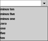
pickListis a property which provides a list of values for combo and spin fields with numeric and String data types. You can restrict the choices to just those given in the pick list by setting the Boolean propertymatchPickListtotrue. The propertydisplayListprovides further control over the way that the field displays its values. By defining a display list, values in the pick list are associated with the corresponding items in the display list. This additional capability is useful if you want to display Strings, yet couple them with integer values, in effect forming an associative array. The user sees the array element, and the field reports the index corresponding to that element as the value of the field. The following code snippet shows how:
JCIntegerValidator IntVal= new JCIntegerValidator();
// set validator properties
Integer picklist[] = {new Integer(-10), new Integer(-5),
new Integer(-1),new Integer(0), new Integer(1),
new Integer(5), new Integer(10)};
String[] displaylist = {"minus ten", "minus five", "minus one", "zero",
"one", "five", "ten"};
IntVal.setPickList(new JCListModel(picklist));
IntVal.setMatchPickList(true);
IntVal.setDisplayList(displaylist);The code creates a
JCIntegerValidatorand declares a pick list of seven integer values. SincematchPickLististrue, these values would be the only ones capable of being displayed in the field, except that a display list is also declared and set. Thus, instead of seeing the sequence of values from the pick list, -10, -5, -1, 0, 1, 10, in the combo box, the user sees the display list values, "minus ten", "minus five", "minus one", "zero", "one", "five", "ten". The value of the field is the associated integer, not the String that is displayed.
defaultValue
All fields are given a default value when they are created. You may decide to change this value as part of your own initialization of the field, but one way or the other a field has an initial default value as well as a value. Typically, the default value is zero for numeric fields, null for String fields, and the current date and time for calendar fields. The data member
defaultValueis used to hold a representative value for the field that does not get changed by user input or by the validation process. Note that the default value only displays in the field when theJCInvalidInfo.RESTORE_DEFAULTpolicy is in effect and the user has entered an invalid value. If you set the default value in a spin field without setting a value for the field, the field will be blank until the users clicks one of the arrows. The field will then spin from the default value to the next value.You may wish to replace an invalid input with the default value as a way of providing the user with a reasonable starting place for further data entry. See invalidPolicy below for a description of how the
invalidPolicyproperty is useful in this regard.isCurrency
The
isCurrencyproperty allows you to specify whether a numeric type should be treated as currency. If the property is set totrue, the value is displayed in the currency format appropriate to the set locale. The default value for this property isfalse. Note that if you set the property totruein a integer, short, byte, or long validator, the value will display with zero sub-units and the field will not allow the user to enter any fraction of the currency unit.
2.2.3 InvalidInfo Properties
invalidBackground, invalidForeground, beepOnInvalid
You use these three properties to provide visual and auditory warnings that an attempt has been made to enter invalid data in a field. By default, colors are inherited and
invalidInfoInstance.setInvalidBackground(Color.red);beepOnInvalidistrue. Examples are:
invalidInfoInstance.setInvalidForeground(Color.white);
invalidInfoInstance.setBeepOnInvalid(false);invalidPolicy
This property gives you four choices for the behavior of the field when invalid data is entered.
JCInvalidInfo.SHOW_INVALIDis the default value. It leaves the data in the field even after the field loses focus. To highlight the fact that the data is invalid, you can show it in different colors using theinvalidBackgroundandinvalidForegroundproperties.JCInvalidInfo.RESTORE_DEFAULTdisplays the default value. If the field loses focus, still containing an invalid value, settinginvalidPolicyto this parameter causes the field to replace the invalid entry with the default.JCInvalidInfo.RESTORE_PREVIOUSreplaces an invalid entry by the last valid value that was committed in the field.JCInvalidInfo.CLEAR_FIELDclears a field containing invalid data upon loss of focus. In this case, the field is blank and the value of the field is undefined.
2.2.4 Other Properties
state
stateis one of the few read-only properties in JClass Field. UsinggetState(), you can determine if the value of the field is valid, invalid, or indeterminate. An indeterminate value arises when the field is currently being edited, so the validator must defer its decision until editing is complete. A field becomes "under edit" when the user types a key, and remains so until the field loses focus, the user presses the Enter key, or the field is resolved programmatically by thecommit()method.editable
This boolean property lets you decide whether or not a field can be edited via the keyboard. If you are concerned that it will be all too easy for the user to make a mistake if keyboard entry is allowed, you can set this property to
falseand restrict the user to employing the mouse. The items that you have placed in spin, combo, and popup fields contain (presumably) valid choices, so your users are constrained to one of these valid choices. You would set editable totruewhen the user must supply more generalized and unpredictable information, such as names and addresses.You can make spin and combo fields extensible by allowing users to type new values into the field, but you are responsible for adding the programming code that adds these new values to the pick list. See Event Programming, in Chapter 4 for an example of this code. See pickList, matchPickList, displayList for a description of pick lists.
max and min
These properties set the minimum and maximum values of numeric fields. A convenience method,
setRange(), allows you to set both properties in a single command. There are examples of its use in the code snippets in Chapter 4. In an IDE only theminandmaxproperties are available.
2.2.5 addValueListener, removeValueListener
Changes to JClass Field are handled by invoking
myField.addValueListener(new MyJCValueListener);addValueListener(). Just as with any other listener, you supply the code to implement theJCValueListenerinterface, and add the event handler to the Field. For example:The
removeValueListener()method removes the named listener object.
2.3 Format Tables
The format Strings for date and time validators, the mask characters for the String validator, and number format characters for fields using numeric validators are listed in the next three sections.
2.3.1 Date Formats
2.3.2 Mask Characters
2.3.3 Number Format Characters
Notes:
If there is no explicit negative sub-pattern, - is prefixed to the positive form. That is, "0.00" alone is equivalent to "0.00;-0.00".
Illegal formats, such as "#.#.#" or mixing '-' and '*' in the same format, will cause a
ParseExceptionto be thrown. From thatParseException, you can find the place in the String where the error occurred.The grouping separator is commonly used for thousands, but in some countries for ten-thousands. The interval is a constant number of digits between the grouping characters, such as 100,000,000 or 1,0000,0000.
If you supply a pattern with multiple grouping characters, the interval between the last one and the end of the integer is the one that is used. So, the grouping interval for each of "#,##,###,####", "######,####", and "##,####,####" is four.
2.4 Property Summaries
The first property list shown below details the properties common to all fields. The following lists are organized according to properties contained in the three main validators of the JClass Field components and the
InvalidInfoandValueModelobjects. You can use these lists for quick reference to the properties that a particular object possesses; however, the best reference is the API for a particular component.These lists differ from the single list given in Appendix A, JClass Field Property Listings, where the property is listed and the JClass Field types which can be customized by it are listed in the second column.
A small number of properties are read-only variables, and therefore only have a get method. These properties are marked with a "(G)" following their property name. There is also one property that has only a set method, and is marked with an "(S)" f following the property name.
2.4.1 Properties for JClass Field Components
2.4.2 Properties for Numeric and IPAddress Validators
Property
Type
Default
allowNull
boolean
false
casePolicy
int
JCValidator.AS_IS
continuousScroll
boolean
false
currency
boolean
false
currencyLocale
Locale
locale dependent
currencySymbol (G)
String
locale dependent
defaultValue
Object
0
displayList1
String
null
displayPattern
String
locale dependent
editPattern
String
Byte,Short,Integer,Long: 0
Float,Double,BigDecimal: 0.###
firstValidCursor
Position (G)
int
usually 0, but dependent on mask set
increment
Number
1
invalidChars
String
null
locale
Locale
Locale.getDefault
matchPickList
boolean
true
max
int
type dependent
min
int
type dependent
pickList
ListModel
null
pickListIndex (G)
Object
N/A
range (S)
int
type dependent
spinPolicy
int
JCValidator.SPIN_FIELD
useIntlCurrencySymbol
boolean
false
validChars
String
null
1Only byte, short, integer and long types possess these properties.
2.4.3 Properties for JCStringValidator
2.4.4 Properties for Date/Time Validators
2.4.5 InvalidInfo Properties
2.4.6 ValueModel Properties
2.5 Exploring the Form Demo
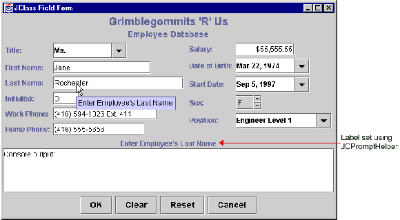
JClass Field includes more extended sample programs. For example, the Form demo implements a complete data-entry form containing all of the elements needed by such an application. The code is located in the demos/field/form directory.
This program uses two additional classes of JClass Field. The following sections describe them.
2.5.1 JCPromptHelper
JCPromptHelperextends the function of thetoolTipTextproperty. This class allows you to set a label in the specified container that takes the value of the tool tip text associated with the field in focus.For example, in the illustration above, the text above the console output area is the tool tip text for the field containing the cursor Last Name.
2.5.2 JCFormUtil
The class
JCFormUtilprovides several useful methods for collecting different sets of information based on the JClass Field components in a container.
- The
clearFieldComponents()method allows you to set the values in all of the JClass Field components in a specified container to null. TheresetFieldComponents()method can be used to reset all fields to their default values.- The
getFieldComponents()method returns a list of the JClass Field components in a specified container.- The
getInvalidRequiredFieldComponents()method returns a list of the required JClass Field components in the container that are in an invalid state.- The
getRequiredFieldComponents()method returns a list of the required JClass Field components in a container.- The
isFieldComponentContainerComplete()method returns a value oftrueif all the required JClass Field components in a container have valid values.The form program demonstrates all of these functions. You can view the return values in your command window. In addition,
demos.field.form.Formhas a scrollable text window where you can view the values directly. It also displays messages that inform the user of invalid input and incomplete entries.
|
|