  
|
3
JClass HiGrid Beans
JClass HiGrid JavaBeans
Properties of JCHiGrid Bean
Overview of the Customizer's Functions
Joining Tables
Setting a Column's Edit Status Properties
3.1 JClass HiGrid JavaBeans
The main Bean for HiGrid development is
JCHiGridBean. With it, you can bind and configure the DataSource, and use the HiGrid portion as a viewer/editor on the data. WithJCHiGridBean, the DataSource and HiGrid are tightly coupled as one Bean. The data model can be thought of as 'internal'.The second Bean,
JCHiGridExternalDS, is provided for developers who want to separate the DataSource from HiGrid, to have a data source that is 'external' to the HiGrid component.JCHiGridExternalDSis almost identical toJCHiGridBean, except that the data source features have been disabled. WithJCHiGridExternalDSyou can bind with an existing data source component, such asTreeDataBean.This chapter covers using the
JCHiGridBean as one of the components in your application. With the exception of data handling, the two HiGrid Beans are the same. Minor differences are discussed in Section 3.12, The JCHiGridExternalDS Bean.
- Placing the
JCHiGridBean on a form (we'll use the BDK BeanBox as a generic example) and viewing theJCHiGridCustomizer's "general" property page.- Inspecting the
JCHiGridCustomizer's property sheet.- Launching the
GridPropertiesEditor's custom editor.- Configuring and saving a serialization file.
- Giving the grid's root table a name and defining the database connection.
- Adding the remaining tables and specifying the queries that select the desired columns and define the appropriate join statements.
- Determining which cells are editable.
- Declaring the commit policy for each level.
- Using the customizer to configure the visual aspects of the grid, such as font and color.
- Selecting which row types to include.
- Setting properties for cells on a per-column basis.
3.1.1 Placing the JClass HiGrid Bean on a Form
After you have installed its JAR file where the IDE you are using can find it, you can place the bean on a form. In the BeanBox, the Properties - JCHiGrid Bean window lists the top-level properties, including the
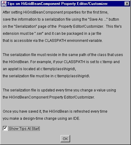
GridProperties, which is a custom property editor for the description of the hierarchical design, the data binding, and the visual properties of the grid.Single-click on its Click to edit... field and a modal dialog appears, reminding you to specify a name and location for the serialization file that will store the changes you make to the bean's default properties. Decide where the serialization file is to be located relative to the class loader in your distributed application. Type this path along with the name of the serialization file in the Resource Name field.
Figure 20 : JClass HiGrid Bean's opening dialog.
Uncheck Show Tips At Start if you do not want this screen to reappear each time you place a new JClass HiGrid Bean component on the workspace, but be aware that if you change your directory, your IDE will not find the saved properties file and you will see this screen again. This does not happen in the BeanBox because the startup directory never changes.
3.1.2 Using the HiGrid Bean in an IDE
JClass HiGrid is designed to be used in an IDE. Use HiGrid's powerful customizer to set up the database connection, build a query in a point-and-click fashion, and bind the retrieved data to the grid for display. The upcoming sections demonstrate the use of the customizer. Please refer to your IDE's documentation or the JClass DesktopViews Installation Guide for more information on integrating JClass HiGrid with an IDE.
3.2 Properties of JCHiGrid Bean
After you have placed the
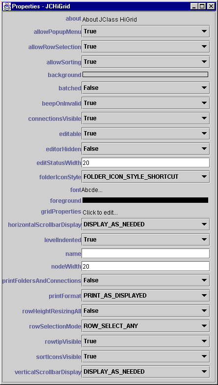
JCHiGridBean component on your form (which may be the BeanBox or one of the supported IDEs), you can inspect the main property sheet. It contains property editors for a number of global properties that either apply to the grid as a whole or are included at the top level as a convenient place for inspecting and possibly modifying their default values.The following figure lists these properties and their default values.
Figure 21 : JCHiGrid's top-level properties and their default values.
The following table lists the properties and their descriptions. This is not the full list of properties. Nestled in the middle of the table is the property called
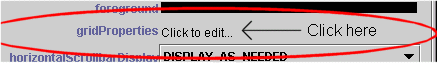
GridPropertieswhich contains an extensive custom editor. You use this customizer to specify the data source connection, define the meta data model, and set many more visual properties of individual levels. You also use the customizer to manage the appearance of non-database-record rows, such as headers and footers.You launch the customizer with a single click on the GridProperties' Click to edit field, as shown in the next figure.
Figure 22 : Click on "Click to edit..." to start the Component Editor.
Note: A single click (mouse-down, mouse-up at the same place) is all that is required to bring up the customizer.
3.3 Using the Customizer
The customizer provides a way of guiding you through the rather large number of options you have in setting up your grid. Use this JClass HiGrid JavaBean design-time element to specify the database connection and to set most of the visual properties of the grid. At run time, end-users modify the appearance of the grid in ways that were described in the previous chapter, like clicking and dragging, or using the edit popup menu.
You launch the customizer/custom editor as shown in Figure 22.
3.4 Overview of the Customizer's Functions
If you are using an IDE, you use the custom editor to configure the properties of the grid. With it, you can add or remove columns containing unbound data. (Header columns are a special case. They cannot be removed, but they can be made invisible.) You cannot delete bound columns because they are defined by the meta data, and can only be modified by changing it. You can specify Before Details and After Details formats, except at the root level. You may decide to change the meta data design while still in the development phase of your application. If this is the case, you can use the Retrieve Columns button to retrieve the new column information and continue using the customizer. The Clear Format button is used to start formatting all over again.
The customizer displays the class names for the cell renderer and cell editor objects that it will use automatically for the selected column. The choice is based on the column's data type, and is determined by the underlying database data type for that field. If you decide to define your own cell editor, you will have to enter its class name manually.
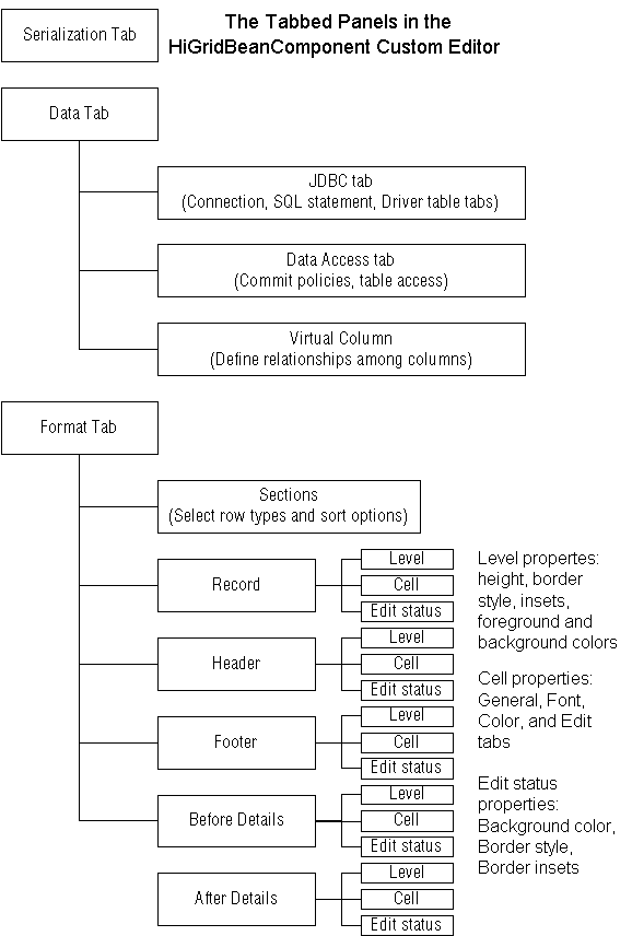
The custom editor's main areas are: a panel containing a Data tab and a Format tab. The data tab contains three main areas: Data Source Type, Data Access, and JDBC.
The tab structure is shown in the diagram. The contents of each panel is described in detail in the subsequent sections.
Figure 23 : The GridProperties Custom Editor's tabbed dialogs.
3.5 The Serialization Tab
You begin the process by choosing a name and location for your serialization file, then clicking on the Add button in the meta data outliner on the left hand side of the Component Editor's main page.
Figure 24 : The GridPropertiesEditor's opening page.
- Click the Serialization tab.
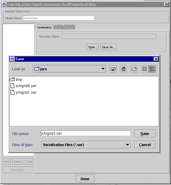
- Click Save As....
- A file dialog appears. A default filename is supplied, which you can change if you wish. Click Save.
- Now the Add button is enabled. Click Add and give the root level data table a name.
Important: You need to name the root level of the data source's meta- data, or choose the default name, before you can make a database connection.
Figure 25 : The Add button is at the lower left of the grid properties editor.
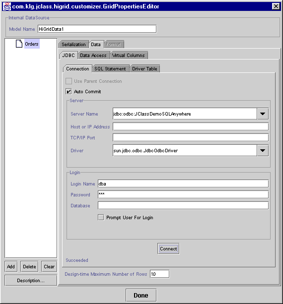
- Click OK. The root table will have the name you give it, but you can change it at any time. This can be useful, since you may want to use an exact name from the database to which you are about to connect. You can revise the label for the data table after the connection is made and the table names are available by clicking the Description... button. We have chosen the name Orders for the data table. The name appears next to a folder icon in the left-hand panel, as shown in Figure 26. The connection tab is similar to the
JCDataand theJCTreeDatathat will be discussed later on. It is shown below.Figure 26 : JClass HiGrid's connection panel.
The Connection panel is described both in the JClass DesktopViews Installation Guide and in the Data Bean chapter1. You supply the server name, the driver, and you give any additional information that may be necessary, such as a login name and password. If, as part of database connection URL, a host address and port number are required, they are specified as well.
3.6 Specifying the Data Sources
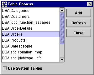
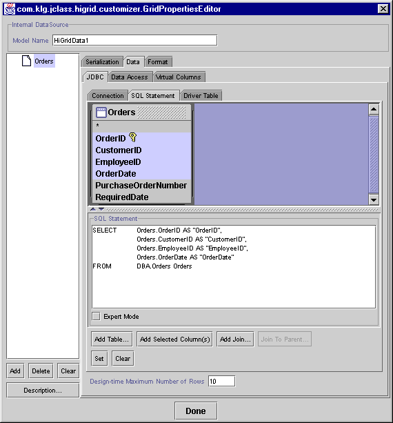
Up to this point we have not specified which of the database's tables are to be used. This is accomplished in the SQL Statement panel. A single level can comprise more than one table, but in this example we will use only the Orders table. You place a table in the top part of the SQL Statement panel either by clicking on the Add Table button or by right-clicking on the top panel itself. Clicking on Add Table brings up a Table Chooser dialog containing all the names, and the Orders table is chosen.
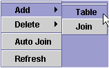
If you right-click on the top panel a popup menu appears:
Figure 27 : The popup menu resulting from a right click on the upper SQL Statement panel.
Click on Add > Table to choose the table name, then click the Close button on the Table Chooser. You'll see the table has been added to the panel, but one further step is required to make the addition permanent. This step is done after formulating the SQL statement.
Figure 28 : The Table Chooser dialog resulting from clicking Add Table.
The bottom panel, also called SQL Statement, is the text area that holds the actual SQL query. The next figure shows the table and a SQL statement. The customizer knows which table to select, but it does not make any assumptions about what columns of the table you want to display. This you do by pointing to a column name in the table to select it, then clicking on Add Selected Column(s). At this point you have a valid SQL statement and you can pass this to the data model by pressing the Set/Modify button.
Now we'll add a detail level, called OrderDetails, using the same connection to the database as its parent.
Figure 29 : Setting the root-level data table.
3.6.1 Summary of the SQL Statement Page Buttons
Meta data design panel
Add - Adds a new entry to the design. The new entry appears as a child of the highlighted level.
Delete - Deletes the highlighted entry. All children of the highlighted node are deleted as well.
Clear - Clears the design. All levels are cleared and all formats are reset.
Description - Brings up an edit window containing the name assigned to the level.
SQL Statement Panel
Add Table... - Launches the Table Chooser window, containing a list of available database tables.
Add Selected Column(s) - After a table has been added to the SQL Statement panel, multiple fields can be chosen by dragging or control-clicking on them. Clicking on Add Selected Column(s) adds the columns name(s) to the SELECT clause of the SQL Statement. The same thing can be accomplished by double-clicking on a field name.
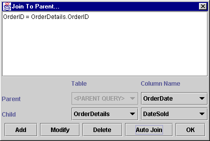
Add Join... - Invokes the Join dialog, whose buttons are Add, Modify, Delete, Auto Join, and OK. It simplifies construction of a WHERE clause when a level contains two or more tables
Join To Parent - Invokes the Join To Parent... dialog, whose buttons are Add, Modify, Delete, Auto Join, and OK. It simplifies construction of a WHERE clause joining parent-child tables.
Set - Sets the parameters that have been chosen for the current level.
Clear - Clears all settings for the current level.
Expert Mode - Only the SQL Statement text area is active. The customizer makes no attempt to parse or modify the query.
3.7 Joining Tables
A join matches common fields in two tables so that meaningful associations are formed. In the example shown, the Orders table has an orderID field that matches the one in OrderDetails. The result of forming a join on these fields is an association of an order with further detailed information about that order. Without the join, all OrderID rows would be listed in the sub-table that follows every Orders row and no useful information is conveyed.
There are three ways of specifying the join. You can type the comparison part of the WHERE clause that will specify the join directly into the edit box, you can choose the dependent table and the join column names from the drop down lists, or you can select the Auto Join feature. The parent table's field must be one of the selected fields for you to be able to specify it in the join but the associated field in the dependent table need not be visible.
Figure 30 : Joining the dependent table to its parent.
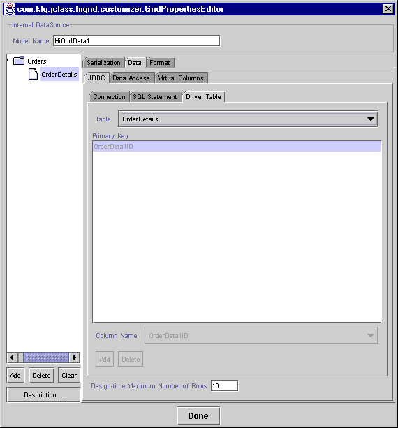
3.8 The Driver Table Panel
A level can be populated by more than one table. If it is, your application should specify which one is the primary table, that is, the one that will be used by the database to drive requeries. Use the Driver Table dialog shown in Figure 31 for this purpose.
3.9 Driver Limitations
Some JDBC drivers do not return a list of table names, therefore, they do not return a table's primary key. For these drivers, you must specify the primary key and those columns that are to be used when performing a requery. The Join To Parent dialog that has just been discussed does not permit you to choose the parent table. Instead, the edit field is disabled and is marked "<PARENT QUERY>", making it impossible to specify which parent table to use there. The Driver Table panel lets you specify the table to be used as the parent in the Join To Parent dialog. Here's the procedure:
As you would expect, the Add and Delete buttons are not active.
Figure 31 : The Driver Table panel, resulting from selecting the Driver Table tab.
3.10 Setting Properties on the Format Tab
There are several actions that can be performed from the Format tab. The most important procedures are explained, including choosing row types, setting level properties, and setting column properties.
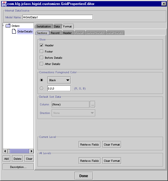
3.10.1 Choosing Row Types
Using the customizer makes it easy to choose which row types you want to include at any level.
You can also perform the following actions from this tab:
- Use the Connections Foreground Color panel to set the color of the connections lines in the Folder Icons column.
- Use the Default Sort Data panel to choose the column on which to sort, and the policy: either Ascending, Descending, or None (no attempt is made to sort the column).
- Click on Current Level > Retrieve Fields after you have modified the data design (the meta data) to refresh the list of column names in the currently selected level that appears under the Record row tab. Note that you will have to fill in the Record, Header, and so on, information again after using Retrieve Fields.
- Choose Current Level > Clear Format if you want to completely redo the data design (the meta data) at the current level and to refresh the list of table names that appears under the row tabs. Note that you will have to fill in the Record, Header, and so on, information again after using Clear Format.
- All Levels > Retrieve Fields is used after you have modified the data design (the meta data) to refresh the list of table names in the currently selected level that appear under the Record row tab. Note that you will have to fill in the Record, Header, and so on, information again after using Retrieve Fields.
- All Levels > Clear Format is used if you want to completely redo the data design (the meta data) at the current level. Note that you will have to fill in the Record, Header, and so on, information again after using Clear Format.
- A refresh mechanism propagates changes made at design-time to the grid so that it can update the view.
Figure 32 : Choosing the types of rows to include.
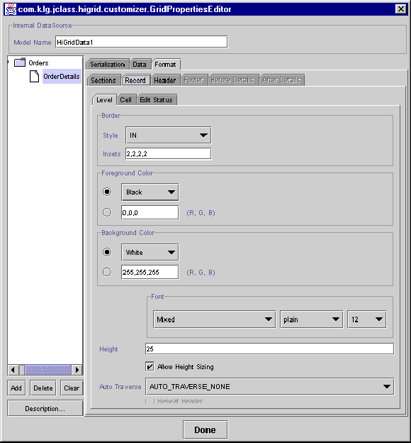
3.10.2 Setting Level Properties
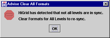
When you first attempt to choose the Format tab, you may see this error dialog:
Figure 33 : An error dialog that might appear on your first attempt to choose the Format tab.
If you encountered this error, you will have to clear all formats, start again, and reformat all levels.
Figure 34 : The General Level properties window where you can clear all formats.
Use this panel to set the properties of all rows of the selected type. The three panels contain these choices:
Border
- Border Style - Choose one from the drop-down list.
- Border Insets - Edit this text field to change their default values. As a general rule, an object appears well positioned in a cell when all border insets have the same value.
Background and Foreground Colors, and Fonts
- Foreground Color - Use the drop-down list to choose one of the standard colors defined in Java's Color class, or type in three comma separated RGB (red, green, blue) values in the lower text field.
- Background Color - Use the drop-down list to choose one of the standard colors defined in Java's Color class, or type in three comma separated RGB (red, green, blue) values in the lower text field.
- Font -Use the font chooser bar to select any font on your system.
Height
- Height - The height of the row in pixels.
- Allow Height Sizing - Ensure that this box is checked if you want to allow the end- user to adjust the height of this type of row. Note that allowing rows at one level to be resized is independent of the resizing policy at any other level.
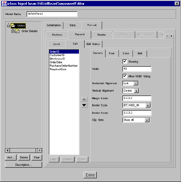
3.10.3 Setting General Column Properties
There are four tabs for setting the numerous properties associated with cells. We'll discuss the ones that are settable on the General tab first. The properties relate to the general layout of the cell, that is, its size and the alignment of data within it.
Follow these steps to set the general cell properties for a single column.
- Click on the Cell > General tab after having defined the grid's meta data.
- Choose one of the meta data levels by clicking on it.
- The text area to the left of the tab lists all the fields for this level. Choose the one whose properties you wish to set.
- Edit any of the parameters that require it.
Figure 35 : Cell properties that are settable using the General tab.
The General Tab
- Showing - If disabled, the column will not appear on the screen. One example of its usefulness is to hide a key field. If you need to join two tables based on a key, it must be mentioned in the SELECT clause for that table, which means it must be one of the fields retrieved from the database. Such a field is usually of no value to an end-user and should be hidden from view.
- Text - For headers, footers, before details, and after details rows, the column label.
- Width - The width of the column. Setting the width of any one cell sets the width for that column. Note that the height cannot be set at design time.
- Allow Width Sizing - If enabled, the column width may be resized at run time.
- Horizontal Alignment - Choices are Top, Center, Bottom
- Vertical Alignment - Choices are Left, Center, Right
- Margin Insets - The insets for the cells in a column.
- Border Style - See the section on Cell Formats and Cell Styles, in Chapter 2, for a list.
- Border Insets - See Border insets and margin insets., in Chapter 2.
- Clip Hints - Choices are Show None, Show Horizontal, Show Vertical, and Show All.
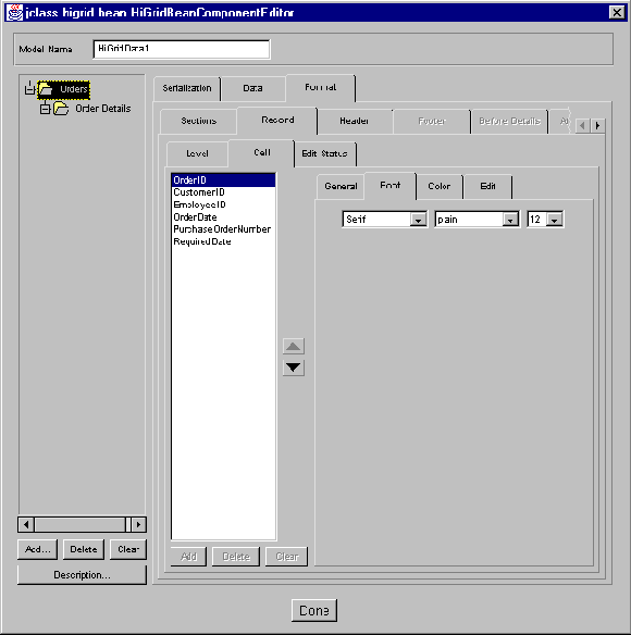
Setting a Column's Font Properties
Figure 36 : The Font tab where you can control the font's appearance.
- Font - The font for the column. The drop-down list contains the standard Java fonts.
- Font Style - Choices are plain, bold, and italic.
- Font Size - Font sizes up to 48 points are selectable.
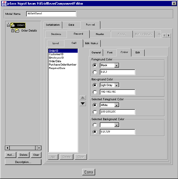
Setting a Column's Color Properties
Figure 37 : The Color tab, where you can set a column's color properties.
You can use the two types of color selectors to choose from Java's standard set of colors or you can specify RGB (red-green-blue) color values as a triplet of numbers between 0 and 255.
Color
- Foreground Color - The foreground color for the column.
- Background Color - The background color for the column.
- Selected Foreground Color - (Record rows only) The color to use when a cell has focus.
- Selected Background Color - (Record rows only) The color to use when a cell has focus.
A table of color values has been included in the Appendix to help you choose color values. See Appendix C, Colors and Fonts, for more information.
Setting a Column's Edit Properties
Figure 38 : The Cell - Edit tab, where you can set a column's edit properties.
Editing
- Value Type - The data type for the column; it depends on the data type that the database defines for the column in question. Standard JDBC data types are allowed.
- Editable - The column may be specified as read-only by un-checking this checkbox.
- Select All - If true, the cell editor causes the entire field to be selected. Any keystroke replaces the entire field with that key. If false, the edit cursor is placed at the end of the field.
- Edit Width Policy - A cell editor's size is not necessarily the size of the cell itself. The options are
SIZE_TO_CELL(the cell editor is fitted within the borders of the cell),ENSURE_MINIMUM_SIZE(the cell editor is sized to some predefined minimum size), andENSURE_PREFERRED_SIZE(the cell editor has a size that is appropriate for its type. For instance, if the cell contains a date and the editor is a calendar popup type, its preferred size is big enough to show all the days of the month.)- Edit Height Policy - Options are the same as for Edit Width.
- Renderer - The cell renderer for the column's data type. Cell renderers are defined for all common database data types. You can define your own cell renderer if you wish. You would type its path name in the lower text field.
- Editor - The cell editor for the column's data type. Cell editors are defined for all common database data types. You can define your own cell editor if you wish. You would type its pathname in the lower text field. See Displaying and Editing Cells, in Chapter 4, for details.
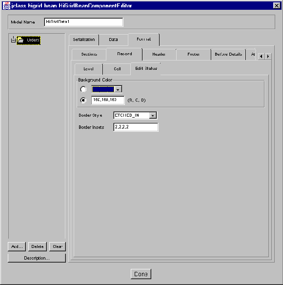
3.11 Setting a Column's Edit Status Properties
All row types have an Edit Status cell so that the grid appears properly aligned, although only record rows use them to show whether edits have been made. If you change a row's appearance, and you want a consistent look, you need to match the edit status cell to the other changes. The properties that may need changing are:
- Background Color - The background color of the Edit Status cell.
- Border Style - Ten choices. For more information, please see Cell Formats and Cell Styles, in Chapter 2.
- Border Insets - The Edit Status cell's border insets. For more information, please see Cell Formats and Cell Styles, in Chapter 2.
Figure 39 : The Edit Status tab, where you can set a column's edit status properties.
3.12 The JCHiGridExternalDS Bean
With most features of the
JCHiGridExternalDSBean, theJCHiGridBean reference applies. However, there are some differences between the two Beans.JCHiGridExternalDSbehaves more like other data bound components, such as JClass LiveTable, in that it does not manage the DataSource. It can access and modify data from different levels of the data hierarchy, but it cannot alter the DataSource structure or set-up. You will have to use a DataSource Bean, such as TreeDataBean, to set up your data source first.In the
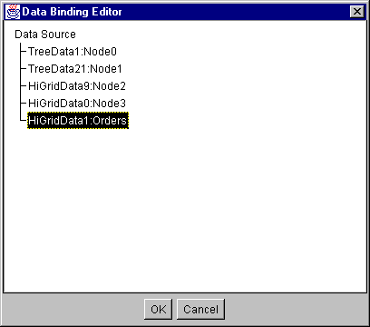
JCHiGridExternalDScustomizer you will notice that the Data tab, Add, Delete, Clear, and Description buttons have been `grayed-out'. This means that you can't create SQL queries, or adjust the structure of the data model.Instead of defining a DataSource, as in
JCHiGridBean, you select a DataSource in the external datasource field, which has an editor that comes up when you click the ... button:
Figure 40 : The External DataSource Field. Click the ... button to bring up the editor.
Figure 41 : The DataBinding Editor, which allows you to select an external data source.
Select a data source from the list. Your data will display in
JCHiGridExternalDSand you can configure the view on the data as you would withJCHiGridBean.For information on configuring the DataSource and the data hierarchy, see JClass DataSource Beans, in Chapter 7.
1In the IDE-specific cases, not as much customization can take place because the connection is not checked at design time, so table and column names are not made available to the customizer. Thus, the customizer cannot be used to format the grid.
|
|