  
|
2
Chart Types and Special Chart Properties
Chart Type: Polar Charts
Chart Type: Radar Charts
Chart Type: Area Radar Charts
Special Bar Chart Properties
Special Area Chart Properties
In this chapter, chart types are discussed and special features of chief JClass Chart charting types are outlined.
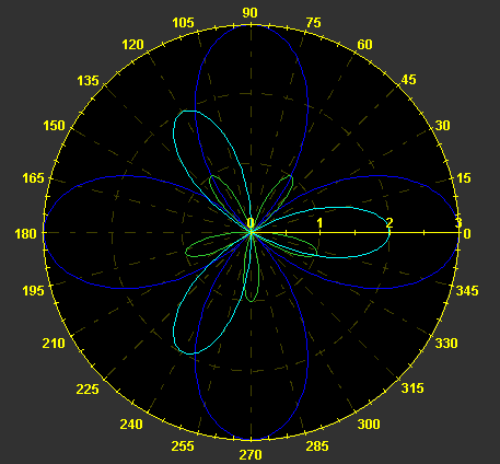
2.1 Chart Type: Polar Charts
A polar chart draws the X- and Y-coordinates in each series as (theta,r), where theta is amount of rotation from the X-origin and r is the distance from the Y-origin. theta may be specified in degrees (default), radians, or gradians. Because the X-axis is a circle, the X-axis maximum and minimum values are fixed.
Using ChartStyles, you can customize the line and symbol properties of each series.
2.1.1 Background Information for the Polar Charts
In order to work efficiently with Polar charts, you should understand the following basic concepts.
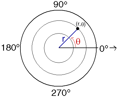
Theta
Theta (q), which is the angle from the X-axis origin, is measured in a counterclockwise direction. In cartesian (rectangular) X- and Y-plots, theta "translates" to the X-axis.
r value
r represents the distance from the Y-axis origin. In cartesian (rectangular) X- and Y-plots, r "translates" to the Y-axis. Multiple r values are allowed.
Angles
Angles can be measured in degrees, radians, or gradians.
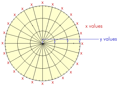
X and Y Values in Polar Charts
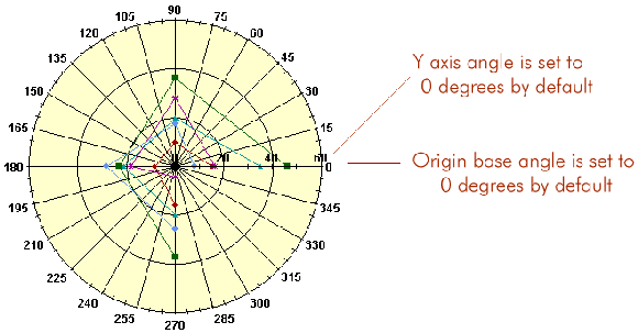
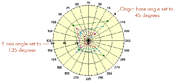
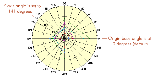
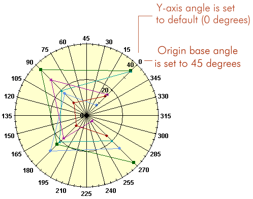
2.1.2 Setting the Origin
All angles are relative to the origin base angle.
The position of the X-axis origin is determined by the origin base angle. The OriginBase property is a value between 0 and 360 degrees (if the angle unit is degrees).
In the Property Editor, the OriginBase property is located on the Polar/Radar inner tab, located in the DataView tab's General tab.
The Y-axis angle is the angle that the Y-axis makes with the origin base.
The origin base angle is set to 0o by default. The Y-axis angle is set to 0o to the origin base by default.
You can change the origin base angle, the Y-axis angle, or both.
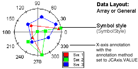
2.1.3 Data Format
The data format for Polar charts is either:
The X-array contains the theta values; the Y-array contains the r values. For array data, the X-array represents a fixed theta value for each point.
For more information on general and array data, please see the discussion in Loading Data From a File, in Chapter 6.
2.1.4 PolarChartDraw class
The
PolarChartDrawclass (which extendsChartDraw) is a drawable object for Polar charts. This object is used for rendering a Polar chart based on data contained in thedataObject.The default constructor is
PolarChartDraw().There are two key methods in this class:
recalc()- recalculates the extents of related objectsdraw()- draws related objects and takes as its parameter the graphics context to use for drawing
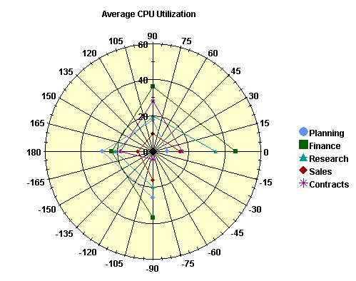
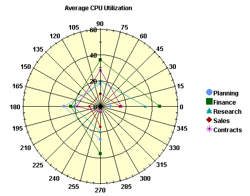
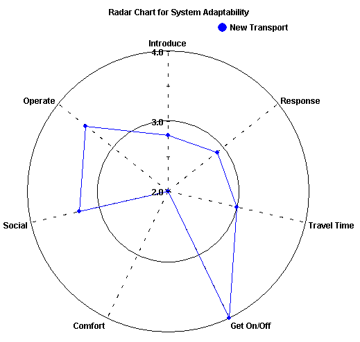
2.1.5 Full or Half-Range X-Axis
Use the HalfRange property to determine whether the X-axis is displayed as one full range from 0 to 360 degrees (HalfRange is
false) or two half-ranges: from -180 degrees to zero degrees to 180 degrees (HalfRange istrue). In interval notation the range would be [0,360) when HalfRange isfalseand (-180, 180] when HalfRange istrue. The default value for the HalfRange property isfalse.
Figure 6 : Half-range is On.
Figure 7 : Half-range is Off.
This property is exclusive to Polar charts.
The HalfRange property is located on the Polar/Radar inner tab on the Property Editor, in the DataView tab's General tab.
2.1.6 Allowing Negative Values
Polar charts do not allow negative values for the Y-axis unless the Y-axis is reversed. A negative radius is interpreted as a positive radius rotated 180 degrees.
Thus (theta, r) = (theta +180, -r)
2.1.7 Gridlines
Polar charts allow for gridlines to be turned on and off.
Use the
JCAXIS.setGridVisible()method to show or hide gridlines. The default is off.For Polar charts, Y-gridlines will be circular while X-gridlines will be radial lines from the center to the outside of the plot.
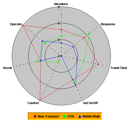
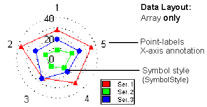
2.2 Chart Type: Radar Charts
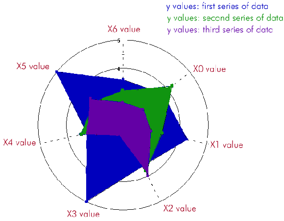
A Radar chart plots data as a function of distance from a central point. A line connects the data points for each series, forming a polygon around the chart center.
A Radar chart draws the Y-value in each data set along a radar line (the X-value is ignored). If the data set has n points, then the chart plane is divided into n equal angle segments, and a radar line is drawn (representing each point) at 360/n degree increments. By default, the radar line representing the first point is drawn horizontally (at 0 degrees).
Radar charts permit easy visualization of symmetry or uniformity of data, and are useful for comparing several attributes of multiple items. Although Radar charts look as if they have multiple Y-axes, they have only one; hence, you cannot change the scale of just one spoke.
Using ChartStyles, you can customize the line and symbol properties of each series.
2.2.1 Background Information for Radar Charts
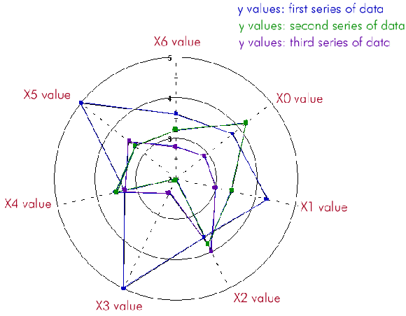
An example of the X- and Y-values of a Radar chart is shown below; in this case, there are seven X-values and three series of Y-values.
2.2.2 Data Format
A Radar chart uses only array data. For more information on array data, please see the discussion in Loading Data From a File, in Chapter 6.
2.2.3 RadarChartDraw Class
The
RadarChartDrawclass (which extendsPolarChartDraw) is a drawable object for radar charts. This object is used for rendering a radar chart based on data contained in thedataObject.The default constructor is
RadarChartDraw().There are two key methods in this class:
recalc()- recalculates the extents of related objectsdraw()- draws related objects and takes as its parameter the graphics context to use for drawing
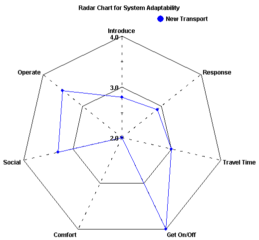
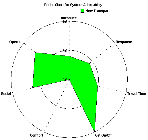
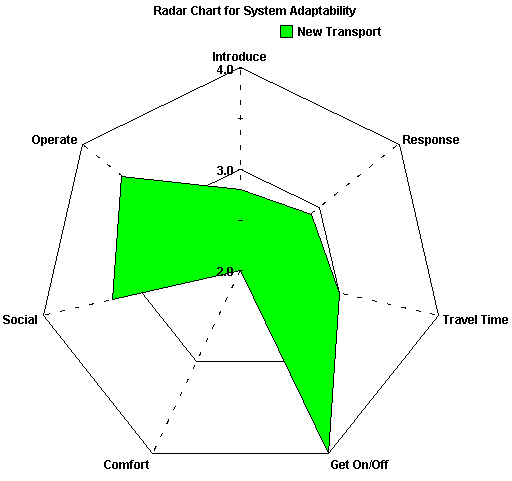
2.2.4 Gridlines
Radar lines are represented by the X-axis gridlines. You may choose normal gridlines (circular) or "webbed" gridlines. As with other chart types, gridlines may be displayed or hidden (default is hidden).
Figure 8 : Circular Gridlines.
Figure 9 : Webbed Gridlines.
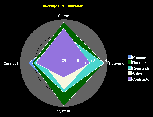
2.3 Chart Type: Area Radar Charts
An area radar chart draws the Y-value in each data set along a radar line (the X-value is ignored). If the data set has n points, the chart plane is divided into n equal angle segments, and a radar line is drawn (representing each point) at 360/n degree increments. Each series is drawn "on top" of the preceding series.
Area radar charts are the same as Radar charts, except that the area between the origin and the points is filled.
Using ChartStyles, you can customize the fill and line properties of each series.
2.3.1 Background Information for Area Radar Charts
An example of the X- and Y-values of an Area Radar chart is shown below; in this case, there are seven X-values and three series of Y-values.
2.3.2 Data Format
An Area Radar chart uses only array data. For more information on array data, please see the discussion in Loading Data From a File, in Chapter 6.
2.3.3 AreaRadarChartDraw Class
The
AreaRadarChartDrawclass (which extendsRadarChartDraw) is a drawable object for Area Radar charts. This object is used for rendering an Area Radar chart based on data contained in thedataObject.The default constructor is
AreaRadarChartDraw().
2.3.4 Gridlines
Radar lines are represented by the X-axis gridlines. You may choose normal gridlines (circular) or "webbed" gridlines. As with other chart types, gridlines may be displayed or hidden (default is hidden).
Figure 10 : Circular Gridlines.
Figure 11 : Webbed Gridlines.
2.4 JCPolarRadarChartFormat Class
The
JCPolarRadarChartFormatclass provides methods to get or set properties specific to Polar, Radar, or Area Radar charts.Origin Base
The origin base is the angle at which the theta axis origin is displayed. A value of 0 degrees corresponds to the 3 o'clock position.
Set or get the origin base using the following public methods:
The
unitsparameter can have values ofJCChartUtil.DEGREES,JCChartUtil.RADIANS, orJCChartUtil.GRADS.Alternatively, you can call the following methods without specifying an angle unit to get or set the origin base. In this case, the angle units are assumed to be the current value of the chart area's
angleUnitproperty:Y-Axis Angle
The Y-axis angle is the angle at which the Y-axis is displayed relative to the theta axis origin. Set or get the Y-axis angle using the following public methods:
Alternatively, you can call the following methods without specifying an angle unit to get or set the Y-axis angle. In this case, the angle units are assumed to be the current value of the chart area's
angleUnitproperty:Half-Range Flag
If the half-range flag is set, the theta axis labels range from -180 to 180 degrees. Set or get the half-range flag using the following methods:
RadarCircularGrid
The
isRadarCircularGridproperty is specific to Radar and Area Radar charts. If the circular grid flag is set, Y-gridlines will be circular; otherwise, the Y-grid will be webbed. Set or get theisRadarCircularGridproperty using the following methods:
2.5 Special Bar Chart Properties
Bar charts display each point as one bar in a cluster. There are several properties defined in
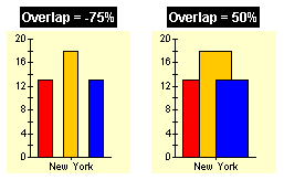
JCBarChartFormatthat control exactly how the bars are spaced and displayed. Use thegetChartFormat(JCChart.BAR)()method to retrieve and set these properties.Cluster Overlap
Use the bar
((JCBarChartFormat)dataView.getChartFormat()).setClusterOverlap(50)ClusterOverlapproperty to set the amount that bars in a cluster overlap each other. The default value is 0. The value represents the percentage of bar overlap. Negative values add space between bars and positive values cause bars to overlap. Valid values are between -100 and 100. The syntax is as follows:
Figure 12 : Negative and positive bar cluster overlap.
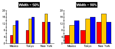
Cluster Width
Use the bar
((JCBarChartFormat)dataView.getChartFormat()).setClusterWidth(100)ClusterWidthproperty to set the space used by each bar cluster. The default value is 80. The value represents the percentage available space, with valid values between 0 and 100. The syntax is as follows:
Figure 13 : Setting different bar cluster widths.
100-Percent Stacking Bar Charts
The Y-axes of stacking bar charts can display a percentage interpretation of the bar data using the
((JCBarChartFormat)dataView.getChartFormat()).set100Percent(true)100Percentproperty. When set totrue, each stacked bar's total Y-values represents 100%. The Y-value of each bar is interpreted as its percentage of the total. This property has no effect on bar charts. The syntax is as follows:
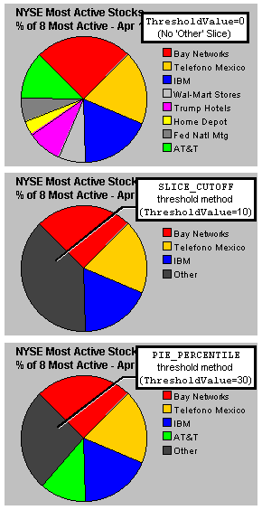
2.6 Special Pie Chart Properties
Pie charts are quite different from the other chart types. They do not have the concept of a two-dimensional grid or axes. They also introduce a special category called "Other", into which all data values below a certain threshold can be grouped.
You can customize your pie charts with the properties of
JCPieChartFormat pcf = (JCPieChartFormat) arr.getChartFormat();JCPieChartFormat. The following code snippet shows the syntax for settingJCPieChartFormatproperties:
pcf.setOtherLabel("Other Bands");
pcf.setThresholdValue(10.0);
pcf.setThresholdMethod(JCPieChartFormat.PIE_PERCENTILE);
pcf.setSortOrder(JCPieChartFormat.DATA_ORDER);
pcf.setStartAngle(90.0);
2.6.1 Building the "Other" Slice
Pie charts are often more effective if unimportant values are grouped into an "Other" category. Use the
ThresholdMethodproperty to select the grouping method to use.SLICE_CUTOFFis useful when you know the data value that should be grouped into the "Other" slice.PIE_PERCENTILEis useful when you want a certain percentage of the pie to be devoted to the "Other" slice.
Figure 14 : Three JClass Charts illustrating how the "Other" slice can be used.
Use the
MinSlicesproperty to fine-tune the number of slices displayed before the "Other" slice. For example, when set to 5, the chart tries to display 5 slices in total. This means that, if there is an "Other" slice, the chart will display 4 slices and the "Other" slice; if there is no "Other" slice, the chart will display 5 or more slices.
2.6.2 "Other" Slice Style and Label
The
OtherStyleproperty allows access to theChartStyleused to render the "Other" slice. UseFillStyle'sPatternandColorproperties to define the appearance of the Other slice.Use the
OtherLabelproperty to change the label of the "Other" slice.
2.6.3 Pie Ordering
Use the
SortOrderproperty to specify whether to display slices largest-to-smallest, smallest-to-largest, or the order they appear in the data.
2.6.4 Start Angle
The position in the pie chart where the first pie slice is drawn can be specified with the
StartAngleproperty. A value of zero degrees represents a horizontal line from the center of the pie to the right-hand side of the pie chart; a value of 90 degrees represents a vertical line from the center of the pie to the top-most point of the pie chart; a value of 180 degrees represents a horizontal line from the center of the pie to the left-hand side of the pie chart; and so on. Slices are drawn clockwise from the specified angle. Values must lie in the range from zero to 360 degrees. The default value is 135 degrees.
2.6.5 Exploded Pie Slices
It is possible to have individual slices of a pie "explode" (that is, detach from the rest of the pie). Exploded slices can be used in both 2D and 3D pie charts.
Two properties of
JCPieChartFormatare responsible for this function:ExplodeListandExplodeOffset.
ExplodeListspecifies a list of exploded pie slices in the pie charts. It takes pts as a parameter, which is composed of an array ofPointobjects. Each point object contains the data point index (pie number) in the X-value and the series number (slice index) in the Y-value, specifying the pie slice to explode. To explode the "other" slice, the series number should beOTHER_SLICE. If null, no slices are exploded.
ExplodeOffsetspecifies the distance a slice is exploded from the center of a pie chart. It takesoffas a parameter, which is the explode offset value.The following code sample shows how
Point[] exList = new Point[3];ExplodeListandExplodeOffsetcan be used to set the list of exploded slices.
exList[0] = new Point(0, 0);
exList[1] = new Point(1, 5);
exList[2] = new Point(2, JCPieChartFormat.OTHER_SLICE);
pcf.setExplodeList(exList);
pcf.setExplodeOffset(10);The following code sample shows how to set up a pick listener such that when a user clicks on an individual pie slice, that slice explodes (and then implodes if the user clicks on it again):
public void pick(JCPickEvent e)
{
JCDataIndex di = e.getPickResult();
if (di == null) return;
Object obj = di.getObject();
ChartDataView vw = di.getDataView();
ChartDataViewSeries srs = di.getSeries();
int slice = di.getSeriesIndex();
int pt = di.getPoint();
int dist = di.getDistance();
if (vw != null && slice != -1) {
JCPieChartFormat pcf = (JCPieChartFormat)vw.getChartFormat();
Point[] exList = pcf.getExplodeList();
if (exList == null) return;
// implode existing exploded slices
for (int i = 0; i < exList.length; i++) {
if ((exList[i].x == pt) && (exList[i].y == slice)) {
Point[] newList = new Point[exList.length - 1];
for (int j = 0; j < i; j++)
newList[j] = exList[j];
for (int j = i; j < newList.length; j++)
newList[j] = exList[j + 1];
pcf.setExplodeList(newList);
return;
}
}
// explode new slice
Point[] newList = new Point[exList.length + 1];
for (int j = 0; j < exList.length; j++)
newList[j] = exList[j];
newList[exList.length] = new Point(pt, slice);
pcf.setExplodeList(newList);
}
}The full code for this program can be found in JCLASS_HOME/examples/chart/ interactions/. For more information on
pick, see Using Pick and Unpick, in Chapter 10.Saving and Loading Exploding Pie Slices
Exploded pie slice properties can be saved or loaded to or from HTML. This is done by passing
JCPieChartFormat'ssetExplodeList()method an array ofPointobjects which correspond to the exploded series and points. For eachPointobject in the array, the X value represents the pie (or point) number, while the Y value represents the slice (or series) number. To specify all of the points or series, use theALLinteger; to specify that the "other" slice should be exploded, useotheras the Y value.In HTML, the code should resemble the following:
<APPLET CODEBASE="../../" ARCHIVE="lib/jcchart.jar" WIDTH=450 HEIGHT=300 CODE="com/klg/jclass/chart/applet/JCChartApplet.class">
<PARAM name="dataFile" value="sample_1.dat">
<PARAM name="data.chartType" value="PIE">
<PARAM name="data.pie.explodeList" value="0,all|all,1|3,3|4,other"> </APPLET>where all slices on the first pie are exploded (
0,ALL), the slices corresponding to the first dataseries are exploded on all pies (ALL,1), the slice corresponding to the third dataseries is exploded on the fourth pie (3,3), and the fifth pie's "other" slice is also exploded (4,other). Note that the pie (or point) number starts at 0; therefore, the first pie is 0, the second is 1, and so on.
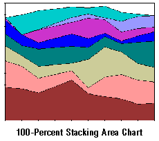
2.7 Special Area Chart Properties
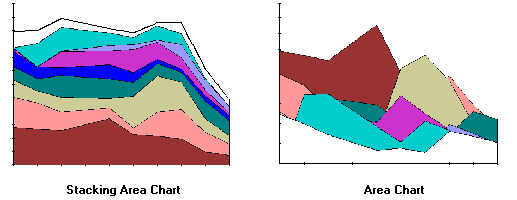
Similar to the stacking bar type, a stacking area chart is provided in JClass Chart. To see an example of a stacking area chart, launch the Area demo from JCLASS_HOME/demos/chart/area/.
Stacking Area Charts
A stacking area chart places each Y-series on top of the last. This shows the area relationships between each series and the total. The following example shows the same set of data as displayed by stacking area and area types:
To create a stacking area chart, set the
dataView.setChartType(JCChart.STACKING_AREA);ChartTypeproperty toJCChart.STACKING_AREA, as follows:100-Percent Stacking Area Charts
When
100Percentproperty is set totrue, the Y-axes display as an area percentage of the total. The top of the chart is 100% (the total of all Y-values).
Use the following syntax to display data in 100-Percent mode:
((JCAreaChartFormat)dataView.getChartFormat()).set100Percent(true)
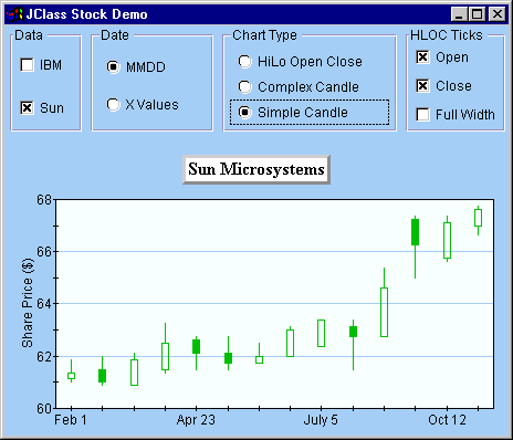
2.8 Hi-Lo, Hi-Lo-Open-Close, and Candle Charts
JClass Chart's Hi-Lo, Hi-Lo-Open-Close, and Candle financial chart types use the Y-values in multiple series to construct each "bar". Hi-Lo charts use every two series and Hi-Lo-Open-Close and candle charts use every four series. Each series defines a specific portion of the bar:
Figure 15 : Simple Candle chart displayed by stock demo.
- First series - High value
- Second series - Low value
- Third series (if needed) - Open value
- Fourth series (if needed) - Close value
It is useful to think of each group of series as one "logical series". But note that most JClass Chart properties or methods that use a series (such as chart labels attached by DataIndex) use the actual series index.
Hi-Lo-Open-Close Charts
When the chart type is
JCChart.HILO_OPEN_CLOSE, several properties defined inJCHLOCChartFormatcontrol how open and close ticks are displayed:
Displays open/close ticks across both sides of the bar. This is useful for creating error bar charts.
Customizing Chart Styles
Because these chart types use multiple series for each "row" of Hi-Lo or Candle bars, it is difficult to determine which chart style specifies the display attributes of a particular row of bars. To make programming the chart styles of financial charts easier, JClass Chart provides several methods that retrieve and set the style for a logical series. These methods are defined in the
JCHiloChartFormat,JCHLOCChartFormat, andJCCandleChartFormatclasses. Eachgetmethod returns theJCChartStyleobject used for the logical series you specify. You can customize the properties in this returned object and then use the appropriatesetmethod to apply them to the same logical series in the chart.Most of the financial chart types use only one or two
JCChartStyleproperties. The following table lists the properties used by each chart type (see Chart Styles, in Chapter 9 for more information on chart styles):For every financial chart type, except complex candle, the actual chart style used is that of the first series.
Simple and Complex Candle Charts
You can choose between a simple and complex candle chart display using the
Complexproperty defined inJCCandleChartFormat.When set to
false, the chart style from just one series (the first) determines the appearance of the candle. The table above shows the properties used. A rising stock price is indicated by making the candle transparent. A falling stock price displays in the color specified byFillColor.Complex candle charts (
Complexistrue), use elements of the chart styles of all four series, providing complete control over every visual aspect of the candles. The convenience methods defined inJCCandleChartFormatmake it easy to retrieve/set the style that controls the appearance of a particular aspect of the candles.The following lists the
JCChartStyleproperties that control each aspect of a complex candle, along with which of the four chart styles is used:
- Hi-Lo line -
LineColorproperty (first chart style).- Rising price candle color and width -
FillColorandSymbolSizeproperties (second chart style).- Falling price candle color and width -
FillColorandSymbolSizeproperties (third chart style).- Candle outline -
LineColorproperty (fourth chart style).Example Code
The following code sets the rising and falling candle styles of a complex candle chart:
JCChartStyle chartStyle;
JCCandleChartFormat candleFormat;
// Set candle to complex type so we can change colors
candleFormat=(JCCandleChartFormat)chart.getDataView(1).getChartFormat();
candleFormat.setComplex(true);
// Change rising candle color
chartStyle = candleFormat.getRisingCandleStyle(0);
chartStyle.setLineColor(Color.green);
chartStyle.setFillColor(Color.red);
// Change falling candle color
chartStyle = candleFormat.getFallingCandleStyle(0);
chartStyle.setLineColor(Color.green);
chartStyle.setFillColor(Color.yellow);Two demo programs included with JClass Chart illustrate creating financial charts: the stock demo, located in JCLASS_HOME/demos/chart/stock/, and the financial demo, located in JCLASS_HOME/demos/chart/financial.
|
|