  
|
1
JClass HiGrid Overview
Introduction
JClass HiGrid's Major Classes and Interfaces
The Data Model for JClass HiGrid
1.1 Introduction
JClass HiGrid provides your users with an intuitive structured visual representation of information retrieved from one or more databases. While a form with data bound fields is a one-record-at-a-time approach, JClass HiGrid lets you present your users with a hierarchically organized grid. The visibility of sub-levels is under the user's control, but it can be under programmatic control as well. Your design can include many sub-levels, resulting in an efficient concentration of information for tasks that require users to have many levels of detail available. Since you choose the detail records to be made available at every level, your design can be quite flexible and it can encompass many differing data retrieval needs. Not only can your users view the information, they can update it, add and delete rows-whatever you choose to permit.
Transaction processing is supported. If your application demands that some operations must be treated as a logical unit of work, the data source part of JClass HiGrid can (with your assistance, of course) execute the sequence as one atomic operation. If any one of the internal units fails to commit, all updates are rolled back and the database is left in its original state. Note that this is not an automatic recovery mechanism using log files, such as would be triggered by some type of system failure.
JClass HiGrid works with JDK 1.3.1 or later. It can contain hierarchical levels of information whose sub-tables the end-user can choose to show or hide dynamically at run time. The HiGrid can be contained in a resizable window, so the user has control over the size of the main level, and whether or not an individual detail level is showing.
1.1.1 The Relationship between JClass HiGrid and JClass DataSource
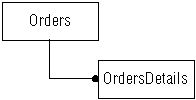
We'll take the simplest possible master-detail scenario to illustrate the way that the two products cooperate to present information extracted from a data source. We assume the existence of a database that contains a table called Orders. It contains the most frequently needed information about all the outstanding orders placed by every customer. Another table, called OrderDetails, contains additional information about these orders.
The entity-relationship diagram for this situation is shown below.
Figure 1 : Entity-relationship diagram for a simple master-detail relationship.
In a master-detail scenario, one or more records of detailed information are displayed for each master record. In our example, the master records comes from the Orders table, while the detail records comes from the OrderDetails table. The database designer has already determined what type of information each of the tables contains, so you simply extract the pieces that you need in your application.
Meta Data
At this stage, you are working with the database's meta data. The meta data contains descriptive information about the tables, including the names of the data fields within each table and the SQL data types of each field. Each node in the entity-relationship diagram stores the
MetaDataof a given table in a simple tree-like structure called theMetaDataTree. The diagram shows that an OrderDetails sub-table will be created for each row of the Orders table, in order to show more detailed information about the specified order.SQL Query
The exact contents of both the Orders and OrderDetails tables as displayed are determined by the SQL query used to retrieve the rows. A simple SQL query names the data fields of interest for a given table. A more complex SQL query adds a "WHERE" clause to restrict the number of records returned by the database. The SQL statement needed to construct an OrderDetails sub-table requires a WHERE clause that is able to select only the subset of records from the OrderDetails table within the database that is related to the master Orders record. This selection process is called a database "join." The join is usually accomplished by matching common fields within each table to each other. In this example, a field called OrderID will be used to construct an OrderDetails sub-table by selecting rows from the database's OrderDetails table where its OrderID field is the same as the
OrderIDfield in the master Orders record.At startup, the grid by default displays a single table called the root
DataTable. The rootDataTableis created by executing the SQL query associated with theMetaDatanode at the root of theMetaDataTree. In our example, the rootDataTablewill display the contents of the Orders table as the master records. Detail records, in the form of OrderDetailsDataTables are exposed at run time by clicking on an expander icon, also called a folder icon, used for that purpose. As the user clicks on more expander icons, moreDataTables are created. Thus, at run time, another tree-like structure called theDataTableTreeis constructed, and it is composed ofDataTables.While there is a 1:1 relationship between Orders and OrderDetails in the meta data diagram, there is a 1:N relationship between the Orders
DataTableand the OrderDetailsDataTables associated with each row of the parent Orders. This occurs because any single order may consist of a number of items, each being described by an OrderDetails record. Both the grid and its underlying data source must be able to deal with structures of this type, and the more general type where the master-detail relationship forms an N-way tree.Result Sets
Once the structure has been defined, and the SQL query has been formulated, the database can return data, called result sets, for the root-level table and for every one of the sub-tables. The queries that return sub-table result sets are performed as needed, when the grid needs to display them. It is the DataTable's job to store the result sets for later retrieval.
Visual Aspects of the Grid
Now that you can retrieve data in a hierarchical fashion, you may wish to control the visual aspects of the fields within the grid. For instance, you may want to adjust the size, color, or other visual property of the data fields. The following list illustrates those items that present information about the state of the grid and those that are under a user's control.
These small icons are present when the size of a cell is too small to display all of the text in it.
The initial position of a column is the same as the order in which they are mentioned in the database SELECT statement. End users can rearrange the order to suit themselves by dragging a column to a new position on the row.
Columns may be resized by dragging on the right-hand border. The resizing operation affects all columns of the same type.
If you place a grid in an Applet, or flush in a frame, the right-hand column lies very close to the frame's border. This might make it difficult for end-users to position the mouse pointer on the column's resizing border. The
setExtraWidth()method inHiGridlets you set more space between the rightmost column's border and the frame's border.The header row disappears off the top of the viewing area when an end-user scrolls down a large table. A method in
HiGrid, calledsetHeaderTipVisible(), lets you control the visibility of a special "tool tip" that exactly replicates the header row and places it in the row above the mouse pointer.The Edit Status Column presents a visual indication that marks the current row, and a pencil icon marks rows that end users have changed by editing one or more cells.
You can control whether the edit status column appears. See the API documentation for
EditStatusCellFormat.setShowing().
EditStatusis now a potentially replaceable public class. So isNodeRenderer, the class that draws the cell. To replace it, you need to extendJCImageCellRendererand implementHiGridNodeRenderer. See Displaying and Editing Cells, in Chapter 4 for more details on JClass HiGrid's cell renderers.These icons present visual clues about the hierarchy of the data.
Levels are indented by a fixed amount, if at all. Indentation is turned on or off using the
setLevelIndent()method inHiGrid.A configurable popup menu gives end users access to frequently used commands. Popup commands are exposed, allowing you to invoke menu commands from your code.
Rows are resized by dragging on the horizontal boundaries of any Edit Status cell. The resizing operation affects all the rows in the corresponding table, not just the one that was dragged.
These indicators appear when an end user clicks on a column header. Since bidirectional sorting is implemented, the icon shows whether the sort is in ascending or descending order.
Figure 2 : Active elements on HiGrid's graphical user interface.
Information about how a given
DataTableis to be rendered is stored within aFormatNode. For each field in aMetaDatanode, there exists a corresponding field within aFormatNodethat describes all visual aspects of that data field.FormatNodes are created at design-time and are stored within aFormatTree. There is oneFormatNodestored in theFormatTreefor eachMetaDatanode, so theFormatTreebears a 1:1 relationship to theMetaDataTreeon a node-by-node basis.A
RowTreeis created to visually depict the contents of theDataTableTreeat run-time. It is able to selectively display the contents of the entireDataTableTree. However, theRowTreeis a logical superset of theDataTableTreebecause it contains rows that are not retrieved from the data source. These are the header, footer, before details, and after details rows which provide places for such things as column headings and summary information. TheRowTreecontains only the essential amount of information needed to reference the data in theDataTableTreeand the formatting information in theFormatTree. It uses this information to manage the display of the grid.Cells
The rows of the
RowTreeare comprised of cells. This is the basic unit of information in the grid. The source of a cell's value is a database field. Thus, within the context of this manual, the words field, cell, and column are used almost interchangeably1. JClass DataSource maintains the values for all these cells within DataTables - the grid does not maintain separate copies. Thus, for any row, theDataTableTreecontains the actual data while the formatting information is drawn from the corresponding node in theFormatTree.Besides specifying simple visual information such as color and font, each
FormatNodealso defines objects to display and edit a given cell. Each cell is drawn by an object called a Cell Renderer and edited by an object called a Cell Editor. This allows tremendous flexibility in terms of displaying and modifying data, since the modification of a cell's value is not tied to its display. For ease of use, a Cell Renderer and Cell Editor are automatically chosen for each field based on the cell's data type (although these choices can be overridden).
1.1.2 JClass HiGrid and the Model-View-Controller Paradigm
The design of JClass HiGrid conforms to the Model View Controller (MVC) paradigm, a technique for managing graphical user interfaces. MVC is a popular object oriented pattern that separates the application object (Model) from the way it is represented to the user (View), and from the way in which the user controls it (Controller). In the case of the JClass data binding products, the separation between the model and the view is achieved by providing two distinct packages. The data model is contained in JClass DataSource (the
jclass.datasourcepackage), and functions as the Model, and JClass HiGrid (thecom.klg.jclass.higridpackage) comprises the View and the Controller. Further separation of function is achieved by having a separateControllerclass within JClass HiGrid to manage user interactions.The
Controllerclass is subclassable and replaceable.The Model part of MVC keeps all the information about the organization and the state of the data. It also implements all the operations that can be used to manipulate the data. It has no responsibility for displaying the data, nor for the GUI actions that are used to manipulate the data. The Model's methods know how to access and modify data; the View methods manage the display of that data. The View object communicates with the Model. It uses the query methods of the Model to obtain data from the underlying database and then displays the information.
Because the View is separate from the Model, multiple views, even different kinds of views, can all draw their data from the same model. This makes it possible to have a form containing JClass Field components, a JClass LiveTable, and a JClass Chart all presenting data from a connection managed by JClass DataSource. Selecting a different cell in any one of the views and modifying its contents there causes all the corresponding cells in the other views to update themselves, thereby maintaining a consistent view of the data everywhere.
In the MVC paradigm, the Model is the object that manipulates the data. The View code relies on a public interface to the data. It does not need to know anything about implementation details. When the data model changes due to an update, it fires an event that is passed on to the View so that the information on the screen can be updated. The View has no memory, except for the layout structure. It refers to the data source whenever it needs to redisplay the data in cells.
The Controller object receives mouse events and keyboard inputs and translates them into commands for the model or the view. For example, a mouse click on a cell selects it and launches its editor, or a mouse click on the folder (expander) icon exposes dependent rows in a hierarchical grid. In some situations the Controller may interact directly with the View without needing to communicate with the Model. For example, the view may consist of a group of rows. Upon receiving a mouse-click on an editable cell in one of these rows, the Controller can request that the View should indicate that the selected cell is being edited, and launch the appropriate editor. The exchange of a cell renderer for a cell editor does not require that the data be updated in the Model. After a successful edit, the Model is informed to update the data source.
HiGrid's View and its Controller work together, but the Controller is also responsible for communicating data access operations back to the data source.
1.1.3 Types of Data Sources Supported
The grid may be bound to any of the common sources of data. Naturally, a JDBC data source is supported, as is any source that can be accessed through a JDBC-ODBC bridge. Unbound data can be presented as well, although you are responsible for adding the necessary code. In-memory data arrays or vectors, where the data has been generated as the program runs, may be used as the data source. The example called
VectorData.javasketches one approach that can be taken.
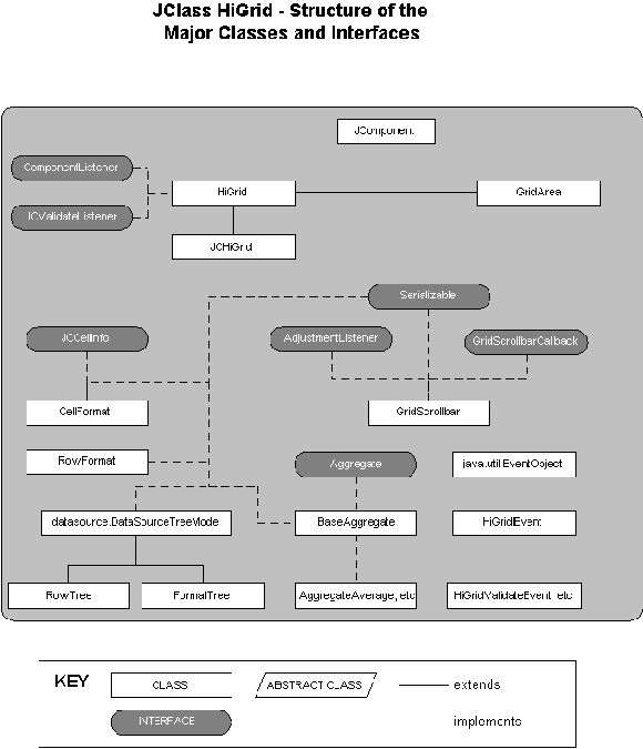
1.2 JClass HiGrid's Major Classes and Interfaces
The diagrams in this and the following two sections show a simplified inheritance hierarchy for the three major groups in the HiGrid family. The inheritance chain is not followed back to the ultimate ancestor; instead, the hierarchy within the packages is shown.
Among the many classes in the JClass HiGrid package, the main one is the
HiGridobject itself. It delegates to another class, normally theDefaultDataModelListenerclass, in the JClass DataSource package, which is for objects that are interested in receivingDataModelEvents. TheDataModelEvent, through the parameter it passes, describes changes to the data source. Interested listeners can then query this data source to reflect the changes in their display. HiGrid implements three other interfaces,ComponentListener, andJCValidateListener. The first two are recognizable as standardjava.awt.eventandjava.awtinterfaces respectively, andJCValidateListener, part of thecom.klg.jclass.cellpackage, is for receiving value change events from a cell editor.
Figure 3 : Major classes and interfaces for HiGrid.
GridAreapasses mouse and keyboard events to theControllerclass where they are handled. This class also positions the cell editors.Class
CellFormatimplements theJCCellInfointerface, which lists the methods that must be defined to return information about the cell.CellFormatrenders a given cell by implementing these methods.RowFormatsets the height of the row, its indent and grid style, and sets up the formats for the row.
GridScrollbarmanages the interaction with the actual scrollbar. The position of the vertical scrollbar can be on either side of the grid, and the position of the horizontal scrollbar can be at the top or the bottom of the grid. SeeHiGrid's API forsetHorizontalScrollbarConstraints()andsetVerticalScrollbarConstraints().
RowTreeis based onTree, which implementsTreeModel, a generic interface for a Tree hierarchy. This tree interface is used for organizing the meta data and the actual data for the HiGrid.For more information on the JClass HiGrid API, see the entries under
com.klg.jclass.higridin the Javadoc API for this product.
1.2.1 A Closer Look at JClass HiGrid
JClass HiGrid consists of one single GUI Component, with sub-tables rendered as necessary. The grid is bound to a database, although this is not strictly necessary, because the grid can be used in unbound mode. Either way, the grid is bound to some source of data. The grid is able to present any hierarchically organized (tree-like) data design. Normally, there will be a parent table (or joined parent tables) and one or more subsidiary tables. These subsidiary tables can themselves contain subsidiary tables, and so on. You can code your design or you can use JClass HiGrid's complete design-time customizer. See the discussion in JClass HiGrid Beans, in Chapter 3, for details on how to create a hierarchical data design using this design aid, the
HiGridBeanCustomizer.
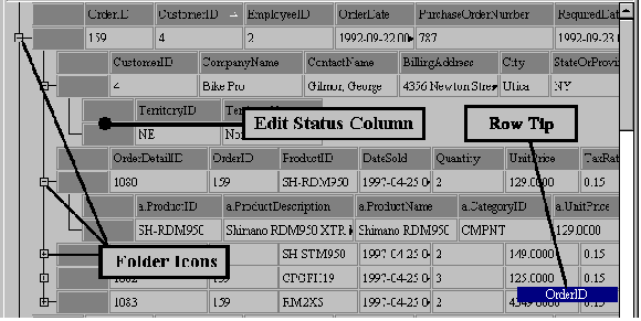
Figure 4 : The general appearance of a grid, showing folder icon and edit status columns. A row tip appears while there is a mouse-down event on the scrollbar thumb.
The grid itself is the visual component for displaying the data model. It is expandable and collapsible through user interaction. The user can choose to expose dependent rows, and, if these rows also contain dependent rows, they too can be exposed. Changes to cells are effected by clicking on a cell to activate its editor. The changes are committed according to three selectable commit policies, ranging from manual to two types of deferred commit. Transaction processing is supported as a special case of the commit policy.
The appearance of a level in the structure can be individually specified. The Customizer can be employed to specify the appearance of a level.
One scrollbar controls the view of the top-level data. One way that end-users locate a row is by scrolling. They click on the scrollbar thumb and a "row tip" appears. The row tip's label is customizable, but by default it displays the contents of the first data column for the row that it is on. Note that there are two columns to the left of the first data column. The first is where the Folder Icons reside and the column to its right, containing initially blank squares, is the Edit Status column. The Folder Icons column shows the grid hierarchy in outline form, while the Edit Status column uses icons to indicate the various ways that a row may have been edited. The various icons are shown in the grid symbols table under Grid Symbols. Scrollbars are not available for sub-tables.
The grid area of the HiGrid is always double buffered. The result is faster updates and flicker-free operation.
1.2.2 Resizing the Grid
Since JClass HiGrid is subclassed from
java.awt.Component, the grid's overall proportions are resized like any other window.Users may resize any column horizontally by placing the mouse pointer at its right hand boundary where it becomes a double-ended arrow, then dragging to the new size. Resizing a column or row affects all columns/rows for that level of the table. Individual cells are selected by clicking on them, or by traversing to them using the arrow keys (unless the cell is in edit mode, in which case the right and left arrow keys position the I-beam in the field). Resize vertically by placing the mouse pointer at the bottom of one of the Edit Status column cells, then holding the left mouse button down and dragging to the new height. You can resize the width of a column no matter what row you are currently on. Drag the cell's left border to resize all cells in that column. By default, vertical resizing is invoked only on cells in the Edit Status Column, but there is a property that allows you to set vertical resizing on any cell if you wish. Once selected, a cell's contents may be modified, assuming that the proper update policy is in effect. Since cells may contain different data types, different cell editors will be invoked to effect the edits.
Jump scrolling is used in the vertical direction. A row is either visible or it is not; there are no half measures except for the last row, and only if the height of the view rectangle is incommensurable with an integral number of rows. On the other hand, horizontal scrolling by dragging the scrollbar is on a pixel-by-pixel basis, resulting in smoother scrolling in that direction. (Clicking on the scrollbar arrows results in jump scrolling by a few pixels at a time.)
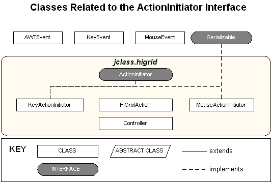
1.2.3 The ActionInitiator Interface
JClass HiGrid uses the
ActionInitiatorinterface as a way of interpreting user input. There is a default mapping between user actions (keystrokes and mouse clicks) and JClass HiGrid responses. Since not all user input is meaningful to JClass HiGrid, some user input is ignored, while other input is associated with a specific command, such as navigating to some specific cell. This section gives an overview of the mechanism used to manage the mapping, starting with theActionInitiatorinterface, whose job is to determine whether a match has been found between theAWTEventresulting from a keystroke or mouse click and a defined mapping currently in effect for the grid.Figure 5 : Classes and Interfaces relating to navigation through the grid.
The two classes that implement
ActionInitiatorareKeyActionInitiatorandMouseActionInitiator. The two classes allow for distinguishing between keyboard actions and mouse actions. They have their own implementations ofisMatch(), which determines whether a user input corresponds to one of the actions meaningful to the grid. Action handling code is contained in theController, which defines a list of default mappings using the constants found inHiGridActionthat the grid uses to allow navigation through the grid. By default, keystrokes are interpreted as navigation commands, whereas a left-clicking on a cell launches the cell's editor, or right-clicking on a cell whose editor is inactive invokes a popup menu that contains database commands as well as navigation and print commands.The various actions possible in JClass HiGrid are discussed in the following sections.
1.3 Operations on Cells
Once a cell is highlighted by left-clicking, an editor appropriate for the cell's data type is displayed. In this manual, it is referred to as the current cell.
There are the usual cell editors for String and numeric types, and a number of custom editors are employed as well, such as calendar popups for editing dates, and editors that perform data validation functions.
If you are a user of JClass LiveTable, it is useful for you to know that the cell editors for JClass HiGrid work in the same manner. They are single instance embeddable components.
Because only one editor at a time is allowed, there is no problem in basing the cell renderer on the data type. There are cell renderers for each different column in a table. Also, programmers can write their own cell renderers if they need to accommodate novel data types. See Displaying and Editing Cells, in Chapter 4, for details.
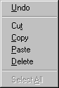
In a Microsoft Windows environment, the end-user modifies the cell's data with the help of an edit popup menu which is accessed by right-clicking on any cell while it is in edit mode.
The
EditPopupMenuclass defines a large number of enums for the possible items that can be chosen to appear in the edit popup menu. You can choose to place any of these in a customized version of the edit popup menu. A new set of popup menu items presents frames that contain instructions on using the mouse and keyboard shortcuts in JClass HiGrid.
Figure 6 : The Edit Popup menu in Windows.
All the standard editing operations are available on the popup.
1.3.1 Cursor Tracking
A new method, called
setTrackCursor, allows you to set a Boolean flag that controls whether you wish to be informed about the position of the cursor. You can then change the default cursor under program control.
1.3.2 Cell Traversal Via the Popup Menu
JClass HiGrid has its own popup menu, quite distinct from the edit popup menu in Windows. Right-clicking on any cell except the one with an active editor activates this HiGrid-specific object. The Popup Menu commands for moving from one cell to another are described in this section and shown in Figure 18, Section 2.5.6. Some of the Popup Menu items contain sub-choices, in which case they are shown in brackets following the main item.
- Move To Grid Record (First, Previous, Next, Last)
Choosing First causes the first cell of the first row to be highlighted. Choosing Previous causes the first cell of the previous row to be highlighted. The action depends on which sub-tables are open because the previous visible row will be chosen no matter what its level is. The same policy applies to Move To Next. Choosing Last causes the first cell on the last open row to be highlighted no matter what its level is. Thus, these operations potentially move the highlighted cell between levels in the master-detail hierarchy.
- Move To Table Record (First, Previous, Next, Last)
This group maintains the selection within the same level (the same data table), but in all other respects functions similarly to Move To Grid Record.
- Move To Parent
Focus moves to the leftmost cell in the parent row from the one on which the command was issued.
- Collapse Parent
Collapse the table containing the highlighted cell. Other sub-tables at the same level as this one but belonging to different parents are not affected.
Edit Operation
- A highlighted cell may be edited unless you have flagged the column as read-only. When the cell has focus it is in edit mode, and right-clicking on the cell in a Windows environment produces a different popup with the usual edit options: Undo, Cut, Copy, Paste, Delete, and Select All.
Operations on Rows
The defined operations for rows are (bracketed items are the sub-choices):
- Insert (A list of names of tables-the names that are available in the current data source)
Inserts a new row in the chosen table.
- Delete (Current or Selected)
Marks the current or selected rows for deletion. When the rows are actually deleted depends on the commit policy.
- Cancel (Current, Selected, or All)
Cancels the edits on the current row, on all selected rows, or all edits that have been done after the last commit.
- Update (Current, Selected, or All)
Updates the edits on the current row, on all selected rows, or all edits that have been done after the last commit.
- Requery (Record, Record and Details, Selected, Selected and Details, or All)
Requeries the database. A requery can be done on an individual record, a record and its dependent tables, selected records with or without their dependent tables, or the whole database can be requeried. All modifications to the grid since the last commit will be lost.
- Select (Current, All In Same Level, All In Same Table, All)
Causes the referenced cells to be selected.
- Row height sizing operation
All rows of the same type must have the same height. Point the mouse at the lower border of the rectangle at the left of the first cell on any row (the Edit Status column). The mouse pointer turns into a double-tipped arrow. Click and drag to resize the height of all related rows to whatever height you selected for the row you are on.
1.3.3 Operations on Columns
- Resizing columns horizontally
Resize the width of a column by placing the mouse pointer on the right hand border of the column header. The mouse pointer turns into a double-tipped arrow. Click and drag to resize the width. All the cells in the chosen column will be resized, even those that are underneath and separated by sub-table rows.
- Resizing columns vertically
A column's height may not be resized individually. Only the row height is adjustable, as described in the previous section.
- Sorting a column
Left-clicking on a column header at any level causes the rows at this level to be sorted in ascending order if the data type for the column is numeric, date, or String. A subsequent left-click reverses the sort order. A sorting indicator is displayed in the header column indicating whether the sort is ascending or descending.
- Truncated fields
If the size of the cell is too small horizontally to display all the data, a small arrow icon appears on its right hand side if the text in the cell is right-justified, indicating that the cell should be resized to make its complete contents visible. Similarly, if the cell's height is too small the arrows appear at the top and bottom of the cell. The position of the arrows depends on which text justification policy (right, center, left) is in effect.
1.3.4 Displaying Images in Cells
Because all standard data types, including byte arrays, are supported, it is possible to display images in cells. In addition, it is possible to display a scaled image in a cell. See Displaying and Editing Cells, in Chapter 4, for details.
1.3.5 Cell Borders
All cells have a border around them. You can choose custom borders for cells, with variable styles and widths. There are ten different border styles to choose from, including a "no border" option.
JClass HiGrid's
CellFormatclass contains the methods that let you choose among the various styles of cell borders.
1.3.6 Keyboard Shortcuts for Grid Navigation
The
HiGridActionclass lets you define a mapping from a user event to an action performed on JClass HiGrid. For example,HiGridActioncan be used to map Control + Left Click to a selection event.These keystrokes control cell traversal:
- Alt+Page Up, Alt+Page Down - Scroll horizontally (Alt+Page Up = left) if the width of the grid is larger than the width of its window.
- Ctrl+Home, Ctrl+End - Move to the first or last cell in the table. If the last row of the main table has been expanded to show sub-tables, move to the last cell of the last visible sub-table.
- Ctrl+Number Pad Plus(+), Ctrl+Number Pad Minus (-) - Expand the current row to make the detail levels visible, or hide the detail levels by collapsing them.
- Enter - If pressed after an edit, the current row is marked as changed if the cell's value did indeed change.
- Esc (Escape key) - Cancel the current edit and return to the value the cell had before editing began, that is, return to the last updated value.
- Home, End - Move to the beginning or end of a row.
- Page Up, Page Down - Move to the corresponding cell on the previous or next page. A page is defined as the number of rows that are visible in a window, and thus it is dependent on the window height. If some rows have been expanded to show sub- tables, the Page Up and Page Down commands will show the rows of these sub-tables and ensure that none are bypassed.
- Tab, Shift+Tab - Move forward or backward one cell. Wraps from one row to the next.
1.3.7 Mouse Actions
HiGrid supports most of the standard mouse actions. The following list describes mouse actions in the Windows environment.
- Left-Click on a cell - Selects that cell for editing. If the cell contains a graphic, show its full size.
- Left-Click on an expander button (if there is one, it is the small square containing a + sign at the extreme left of a row) - Expands the table by making sub-tables associated with that row visible. If the sub-rows are visible, the button contains a - sign. Clicking on it collapses the table by hiding the sub-rows.
- Right-Click on a selected cell (Windows only) - When the button is released, shows a popup menu containing the editing choices Undo, Cut, Copy, Paste, Delete, and Select All.
- Right-Click anywhere else - Shows a popup menu containing the following choices. (The bracketed items are the sub-choices for each choice.)
- Insert (List of Table Names) - Inserts a new row at the level specified by the table name.
- Delete (Current or Selected) - Deletes the current or selected row(s).
- Cancel (Current, Selected, All) - Cancels uncommitted changes to the specified row or rows.
- Requery (Record, Record and Details, Selected, Selected and Details, All) - Refreshes the grid's values by requerying the database.
- Update (Current, Selected, All) - Commits changes (deletes/inserts/updates).
- Select (Current, All In Same Level, All In Same Table, All) - Selects rows in the grid.
- Print (As Displayed..., As Expanded...) - Prints the exposed levels or all the levels.
- Print Preview (As Displayed..., As Expanded...) - Invokes the printer driver window. After selecting a printer, show a print preview on the screen rather than actually printing.
- Move To Grid Record (First, Previous, Next, Last) - If First (or Last) is chosen, focus is transferred to the leftmost cell of the first (or last) cell in the grid. A row in a collapsed table cannot be a target of a Last operation; instead, the last row of the last open table is the target. If Previous (or Next) is selected, the motion will, if possible, preserve the column that initially holds the current cell.
- Move To Table Record (First, Previous, Next, Last) - Similar to the above, except that motion is restricted to the table that initially holds the current cell.
- Move To Parent - Moves to the leftmost cell of the parent row for the table containing what was initially the current cell.
- Collapse Parent - Hides the level containing the current cell. The new current cell is the leftmost one of the parent row.
- Ctrl+Left-Click - Selects the row. Multiple rows may be selected by repeating the operation on rows that need not be adjacent.
- Shift+Left-Click - After choosing Select, Current from the popup menu or selecting a row with Ctrl+Left-Click, this action selects all intervening rows between and including the first chosen and the one on which the shift-click occurred. The action can be used to select a parent and all its children, so long as these tables have been expanded.
1.3.8 Grid Symbols
Graphic
Meaning
The expander button indicates that there are sub-tables associated with this row.
Note: Other icons are available. See Section 1.3.16, Folder Icon Styles.
The appearance of the expander button when the row has actually been expanded
This icon appears near the border of a cell when its size is too small to hold all the data.
One of these icons appears after a left-click to indicate that the column has been sorted.
1.3.9 Bookmarks
The data source needs a mechanism for keeping track of all open rows. This is accomplished by assigning a row identifier, called a bookmark, to every row. Using this scheme, each cell is uniquely identified by its bookmark and by a column identifier which names the column within that row. The assignment of a bookmark to a row is dynamic because rows themselves are dynamic. A row's bookmark may change as a result of requery operations. In fact, selecting the Requery, All option from the popup menu replaces all bookmarks with new ones. Other requery operations cause the replacement of the bookmarks of the affected rows.
1.3.10 A Note on Public Methods in HiGrid
There are a number of public methods in HiGrid that are not intended for use by the application programmer. They must be public so that they can be used by Bean editors and the like. As a general rule of thumb, consult the API documentation.
1.3.11 Editing Cells
Once a cell is highlighted, an editor appropriate for the cell's data type is instantiated. There are the usual cell editors for String and numeric types, and you can employ a number of custom editors, such as calendar popups for editing dates and editors that perform data validation functions.
1.3.12 Changing the Grid's Appearance
You can customize the grid's appearance by changing fonts, border styles, and colors. You can select from a set of predefined folder icons - the symbols that indicate whether a level is expanded - or you can design your own, and you can change the color and thickness of the connecting lines. These changes can be made programmatically, or they can be done in an IDE using the
HiGridBeanCustomizer, which includes functionality for setting these properties one level at a time.
1.3.13 Adding Headers and Footers
Another way of customizing your grid's appearance is by adding header, footer, and detail rows. These rows can contain items that are not drawn directly from the data source yet are related to it, such as text fields that introduce summary columns, and computed results that the database itself does not supply.
1.3.14 Displaying More of the Grid
Imagine an idealized monitor so large that it is capable of accommodating a window of any size. It is useful to define the "visible" grid as that which would be seen in a virtual monitor's window spacious enough to hold all of its open tables. Any real monitor's window containing a grid can be thought of as one through which you can view a portion of the virtual screen that holds the entire grid. The concept of a visible grid is essential for understanding how the aggregate classes work. This topic is discussed in a later section. Also, the visible grid determines how much data must be retrieved from the data source. The grid requires all the data necessary to display the visible grid, not the collapsed layers. Thus, if the root-level table contains ten thousand rows, the data for all those rows must be retrieved because the root level is always visible.
The implication for displaying more of the grid is that simply resizing the view area causes the grid to be repainted with cached data. On the other hand, exposing sub-tables requires that a query be sent to the database, which is potentially more time-consuming.
1.3.15 The HiGrid Class
This central class in the package defines the overall look of the data grid. It sets up various parameters and controls such things as whether pop-up menus, row selection, and sorting are allowed. It sets colors, border sizes and styles, indents, spacing, and initializes print parameters. It manages the look of the GUI as levels are opened and closed, and as edits are made on cells, rows, or a group of rows. Instantiate this class to create a visible grid. Its signature is
public class HiGrid extends JComponent
implements java.awt.event.ComponentListener, JCValidateListenerBecause it is a subclass of
javax.swing.JComponent, it inherits properties from theContainerandComponentclasses as well. Naturally, it responds to window resizing and closing events. Among the methods contained inHiGridare the following:
levelIndent- a Boolean that controls whether a sub-table is left-indented.width,height- the width and height of the entire component.verticalScrollbar,horizontalScrollbar- in GridScrollbar, gets the scrollbars for the grid.selectedObjects- an array of references toRowNodes for the currently selected rows.gridArea- the double buffer for the grid area.rowSelectionMode- you may wish to prevent certain rows from being selected. Possible values areROW_SELECT_ANY(the default),ROW_SELECT_IN_SAME_LEVEL, andROW_SELECT_IN_SAME_TABLE.dataModel- sets the data source for the given level, which may be an instance ofHiGridDataorTreeData.allowRowSelection- sets whether or not row selection is allowed.drawingConnections- indicates whether or not the connector lines that join rows of sub-tables to their parents are to be drawn.borderSize- sets the size of the border to be drawn around a cell.formatTree- a format tree sets the visual characteristics for each level.
1.3.16 Folder Icon Styles
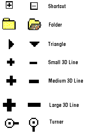
HiGrid has seven predefined folder icon styles. These are:
FolderIconStyle.FOLDER_ICON_STYLE_SHORTCUTFolderIconStyle.FOLDER_ICON_STYLE_FOLDERFolderIconStyle.FOLDER_ICON_STYLE_TRIANGLEFolderIconStyle.FOLDER_ICON_STYLE_SMALL_LINE_3DFolderIconStyle.FOLDER_ICON_STYLE_MEDIUM_LINE_3DFolderIconStyle.FOLDER_ICON_STYLE_LARGE_LINE_3DFolderIconStyle.FOLDER_ICON_STYLE_TURNERThe icons are shown in Figure 7.
Figure 7 : The seven pre-defined image icon choices.
You specify the folder icon style through the call:
HiGrid.setFolderIconStyleIndex(style);where
public void setFolderIcon(Image icon, int type)styleis one of the aforementioned constants. You have the option of using your own icons. In this case, you use thesetFolderIconmethod:where you supply an icon and a type.
1.3.17 The Aggregate Classes
These classes are designed as a convenient way to calculate the information that is often required in summary records. The main class, called
AggregateAll, implements theAggregateinterface. It contains methods common to all the different types of calculations that the "Aggregate" specialty subclasses define. TheSummaryColumnclass, through its parametersidentifier(sets the column identifier),columnType(one ofCOLUMN_TYPE_UNKNOWN,COLUMN_TYPE_LABEL,COLUMN_TYPE_DATASOURCE,COLUMN_TYPE_AGGREGATE,COLUMN_TYPE_UNBOUND), andaggregateType(one ofAGGREGATE_TYPE_NONE, AGGREGATE_TYPE_COUNT,AGGREGATE_TYPE_SUM,AGGREGATE_TYPE_AVERAGE,AGGREGATE_TYPE_MIN,AGGREGATE_TYPE_MAX,AGGREGATE_TYPE_FIRST,AGGREGATE_TYPE_LAST), sets up the column object for the summary record types. The individual Aggregate classes compute results. For instance,AggregateAveragecomputes the average value of a given column.These classes are not used directly. Instead, you set up the meta data for footer rows as a list (Vector) of summary columns using the
columnTypeenums (class constants). Here are some examples:Setup:
MetaDataModel orderDetailMetaData = null;
RowFormat orderDetailFooterFormat = null;
SummaryMetaData orderDetailFooterMetaData = null;
RowFormat orderDetailBeforeDetailsFormat = null;
SummaryMetaData orderDetailBeforeDetailsMetaData = null;
TreeIterator ti = node.getIterator();
if (ti.hasMoreElements()) {
node = (FormatNode) ti.get();
node.setDefaultSortData(new SortData("prod_id",
SortGrid.DESCENDING));
orderDetailMetaData = (MetaDataModel)
node.getRecordFormat().getMetaData();
orderDetailFooterFormat = (RowFormat) node.getFooterFormat();
orderDetailFooterMetaData = (SummaryMetaData)
orderDetailFooterFormat.getMetaData();
orderDetailBeforeDetailsFormat = (RowFormat)
node.getBeforeDetailsFormat();
orderDetailBeforeDetailsMetaData = (SummaryMetaData)
orderDetailBeforeDetailsFormat.getMetaData();
}
SummaryColumn column = new SummaryColumn("Total Quantity: ");
orderDetailFooterMetaData.appendColumn(column);
SummaryColumn column = new SummaryColumn(orderDetailMetaData,
"LineTotal",
SummaryColumn.COLUMN_TYPE_AGGREGATE,
SummaryColumn.AGGREGATE_TYPE_SUM);
orderDetailFooterMetaData.appendColumn(column);
SummaryColumn column = new SummaryColumn(orderDetailMetaData,
"ProductID",
SummaryColumn.COLUMN_TYPE_DATASOURCE);
orderDetailBeforeDetailsMetaData.appendColumn(column);
1.3.18 Virtual Columns
A Virtual Column performs an analogous aggregation operation by using row data to produce a derived value. In the case of a virtual column, mathematical operations are defined on the cells of a row, such as applying a sales tax calculation to a cell containing the purchase price of an item. The computed total price with the sales tax added on is displayed in a newly defined cell. When all rows of the table are taken into account, these cells form a column that we are calling a virtual column. The virtual column may be computed from the values of two or more cells in the row. In turn, its value may be aggregated by the methods described in this section to produce a footer detail.
Note: Please see Virtual Columns, in Chapter 6, for an extended discussion of the use of virtual columns.
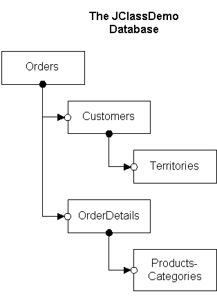
1.4 The Data Model for JClass HiGrid
JClass HiGrid is capable of displaying hierarchical data structures because its underlying data model is also capable of maintaining actual data tables that imitate the structure of a hierarchical design. The relationship that one table bears to another is called meta data to distinguish it from the actual data that the grid displays. To be specific, we present a design for a sales order system shown diagrammatically in Figure 8. The root data table is extracted from a database table called Orders. Each row consists of the fields OrderID, CustomerID, EmployeeID, OrderDate, PurchaseOrderNumber, and RequiredDate. Sales orders are more fully described in two separate sub-tables, Customers and OrderDetails. The Customers table is linked to its parent by matching the CustomerID fields in each. The field OrderID in the OrderDetails
table is the same as OrderID in the Orders table so a join on these two fields properly associates an Orders row with OrderDetails. Additional information about an OrderDetails row is obtained by a detail row called Products-Categories consisting of product information and the category this product falls into.
Figure 8 : The meta data design of a sales order tracking system.
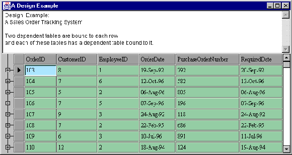
This structure can be captured in the data model and displayed using JClass HiGrid. The programming example based on this model is called
DemoData, injclass.datasource.examples.Running the program produces output similar to this:
Figure 9 : JClass HiGrid retrieves and displays the root table called Orders.
Clicking on any one of the folder icons marked "+" exposes the related tree-structured data. This example has three levels in its meta data. The second sub-level is accessed in the same way as the first, by clicking on the "+" expander button at the left hand side of the row.
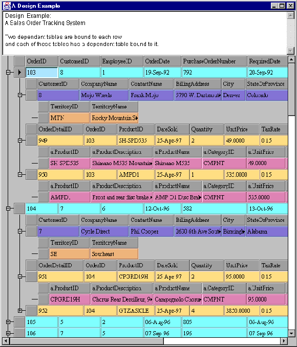
When these levels are opened, the grid looks like this:
Figure 10 : The expanded view of the sales orders tracking system with all levels of the first two rows opened.
The example shows that JClass HiGrid gives your application the ability to present a multi-layered view of the tables in your corporate databases. Compared to a design based on forms, the hierarchical grid allows you to present considerable data in a relatively small space, while also providing the organization that makes it easy for end-users to navigate to detail levels.
1.4.1 A Closer Look at the Data Model
There are two main areas in the design of the data model, the design-time meta data and the run-time data tables. Of these, the most apparent to the end-user is the data table mechanism that stores the data for subsequent display by a grid component, like JClass HiGrid, or on a form using data bound components like those provided by JClass Chart, JClass Field, JClass LiveTable, or JClass DataSource. Since JClass HiGrid defines a mechanism for describing data relationships in a hierarchical way, a parallel structure is needed to describe the way that various tables relate to each other. This is accomplished by using Swing's interface called
TreeNodewhich describes the nodes of aTreeModel, a generic interface for aTreehierarchy. This tree interface is used for organizing the meta data and the actual data for the JClass HiGrid. (Note:TreeModelcontainsTreeNodeModel, andTreeis a container for tree nodes.) TheDataSourceTreeNodeclass, combined with theMetaDataModelinterface, helps to define abstract classBaseMetaData, and then the concrete classMetaData. It is only this last one that is source data format dependent. This forms the meta data definition mechanism.On the data side, we also subclass from
DataSourceTreeNode, but theDataTableModelinterface is used to defineBaseDataTable.DataTableModelis the interface for data storage for the JClass HiGrid data model. The data model will request data from instances ofBaseDataTableand will manipulate that data through theDataTableModelinterface. That is, rows can then be added, deleted or updated through this DataTable.BaseDataTableis a default implementation of the methods and properties common to various implementations of theDataTableModel. This class must be extended to concretely implement those methods not implemented in it. The class that accomplishes this is in the DataTable category, and is one of a number of specially constructed classes specifically tailored to the source data format. A copy of the data returned in a JDBC result table will be copied into one of these result tables so the data can be cached. Rows can then be added, deleted or updated through thisDataTable.
1.5 Internationalization
Internationalization is the process of making software that is ready for adaptation to various languages and regions without engineering changes. JClass products have been internationalized.
Localization is the process of making internationalized software run appropriately in a particular environment. All Strings used by JClass that need to be localized (that is, Strings that will be seen by a typical user) have been internationalized and are ready for localization. Thus, while localization stubs are in place for JClass, this step must be implemented by the developer of the localized software. These Strings are in resource bundles in every package that requires them. Therefore, the developer of the localized software who has purchased source code should augment all .java files within the /resources/ directory with the .java file specific for the relevant region; for example, for France, LocaleInfo.java becomes LocaleInfo_fr.java, and needs to contain the translated French versions of the Strings in the source LocaleInfo.java file. (Usually the file is called LocaleInfo.java, but can also have another name, such as LocaleBeanInfo.java or BeanLocaleInfo.java.)
Essentially, developers of the localized software create their own resource bundles for their own locale. Developers should check every package for a /resources/ directory; if one is found, then the .java files in it will need to be localized.
For more information on internationalization, go to: http://java.sun.com/j2se/1.4.2/docs/guide/intl/index.html.
1Field is used to emphasize the origin of the data (in a database field), cell is used when the emphasis is on the display, and column is used when referring to the group of cells in a
DataTablethat have the same field name.
|
|